
10 of the Best DTC Tools for 2026: The DTCUP Toolkit for Building, Launching and Learning
Explore nine DTCUP website and marketing tools plus Intelligence, with hands-on examples for drawing pages, planning launches, tagging links and reviewing orders.

7 years of experience building and operating brand websites, specializing in website development, paid advertising and SEO. Built a brand website from launch to US$10 million in annual sales.
The Short Answer
The DTCUP toolkit combines nine focused utilities with Intelligence: draw a website, inspect a 3D asset, check a page, research related questions, plan market timing, prototype code, prepare schema, inspect crawler rules, label campaign links, and investigate connected reporting. Choose the tool that resolves your current task. This is a guide to DTCUP’s own products, not an independent industry ranking.
Key takeaways
- Start with one task and choose the smallest useful output.
- Use verified content and deliberate handoffs between tools.
- Check access requirements and separate previews, automated findings and attribution from production or causal proof.

A direct-to-consumer business can accumulate software the way a kitchen drawer accumulates mysterious cables. Every item arrived with a good reason. Nobody quite remembers what three of them connect to. Meanwhile, the one thing you actually need is probably underneath the instruction manual you promised to read.
The answer is not always another enormous platform. Sometimes you need a smaller tool that makes one decision easier: show a designer what you mean, inspect a product model, find a broken assumption in a campaign schedule, or understand why two reports disagree. A useful tool leaves you with something you can use, rather than a fresh subscription and a motivational dashboard.
This is our 2026 guide to ten DTCUP tools for those jobs: nine website and marketing utilities, plus DTCUP Intelligence. We built them, so this is an opinionated guide to our own toolkit, not an independent ranking of every product on the market. “Best” here means a good fit for a specific task. We will explain the fit, the practical advantage, and the point at which you need a different kind of help.
You do not need to use all ten. A small brand preparing its first campaign has different needs from a team investigating a year of orders. Start with the question slowing you down, choose the relevant tool, and stop when you have a useful answer. Finishing a job is a considerably better metric than achieving maximum browser-tab coverage.
Throughout the guide, imagine a fictional homeware brand preparing a new collection. It needs a landing page, clear product information, an international announcement, traceable links, and a way to learn afterward. The examples describe a workflow; they are not customer case studies or promises of improved sales. Your products, audience, permissions, and available evidence determine what happens next.
The ten-tool shortlist: choose by the job in front of you
Use this table as a starting point, then read the sections relevant to your next decision. The order follows a practical path from making an idea visible to examining what happened after launch. It is not a competitive scorecard, and the numbers do not imply that a drawing tool is objectively better than a reporting workspace. That would be a lively argument with very little useful output.
| Tool | Best fit in this guide | Useful output |
|---|---|---|
| 1. Sketch to Website | Turning a rough layout into a website design direction | A reviewable design preview and downloadable work |
| 2. Online 3D Viewer | Inspecting a supplied product model | Clear feedback on the asset and its presentation |
| 3. Website Page Checker | Finding a practical website repair starting point | SEO, laboratory speed and accessibility findings |
| 4. Query Fan-Out Explorer | Organizing customer questions before writing | A topic map and content research plan |
| 5. Campaign Time Zone Planner | Coordinating launches across markets | A schedule with explicit time-zone context |
| 6. HTML, CSS & JavaScript Editor | Testing a specific frontend idea | An interactive prototype and downloadable code |
| 7. Website Schema Generator | Describing verified page content in structured data | JSON-LD or a supported Shopify Liquid template |
| 8. AI Bot & Robots Checker | Understanding declared crawler rules | A path-specific policy interpretation |
| 9. UTM, QR & Campaign Links | Keeping marketing touchpoints identifiable | Reviewed campaign URLs and static QR output |
| 10. DTCUP Intelligence | Investigating orders, channels and available journey evidence | A better-supported business question and next action |
The website tools directory brings the nine utilities together. Intelligence has its own reporting workspace because it involves connected business data, permissions, and source coverage. These are related parts of a workflow, not ten tabs that magically share everything. Where a handoff requires copying a URL, downloading a file, or connecting a source, make that step deliberately.
Before choosing, identify the input you possess. A rough idea belongs in a design conversation. A finished model belongs in an asset inspection. A public page can be checked. An attribution question needs connected evidence. Asking the wrong tool to solve the wrong problem is rather like using a measuring tape to make coffee: impressively committed, unlikely to help.
1. Sketch to Website: best for showing the website you mean
Draw any website you imagine. That is the invitation behind Sketch to Website. Instead of describing a layout through an increasingly emotional paragraph, you can draw its structure on a full-screen canvas, label the important areas, add written direction, and generate a website design preview.
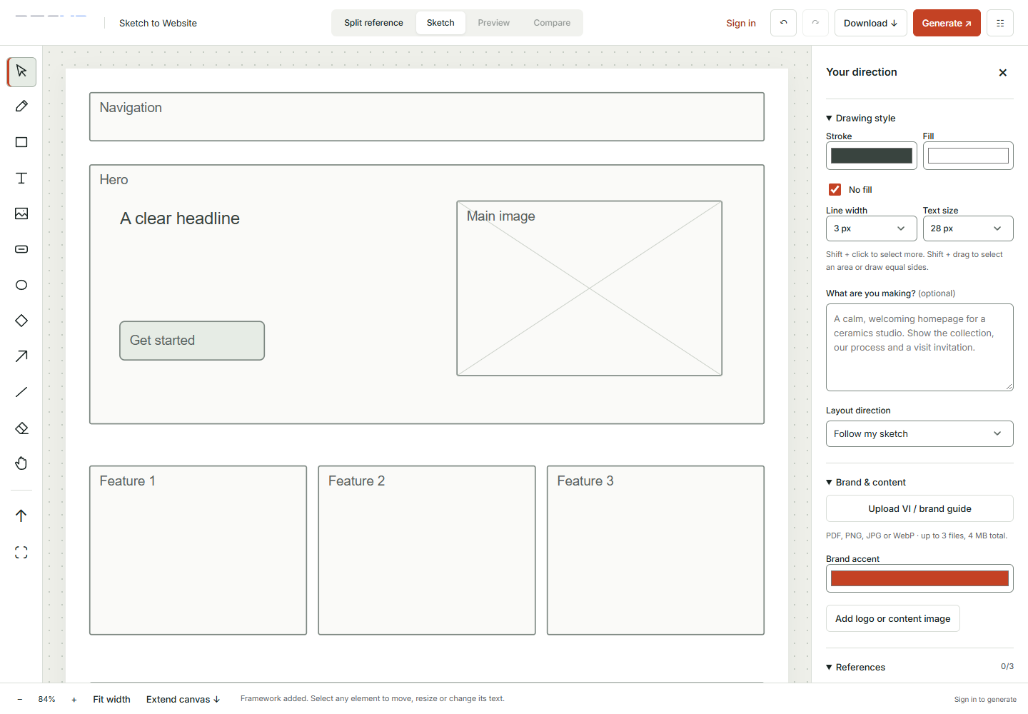
The practical advantage is the combination of spatial and verbal direction. A sketch shows that the headline should sit beside the product image, that the primary action belongs above the comparison section, or that reassurance should appear before the final invitation. Words explain the audience, tone, brand, and factual boundaries. Each input does a job the other handles less comfortably.
For the homeware launch, start with a simple arrangement: an opening collection story, a featured product area, material and care information, delivery guidance, and a final shopping action. Label the boxes by purpose. “Explain how to care for the glaze” gives the design more useful direction than “nice section.” The drawing can be rough. The thinking should be specific.
The toolbar supports freehand drawing and common shapes, text, arrows, selection, and arrangement controls. You can work with a wider canvas, extend it downward, and use a reference beside your sketch. These features help you draw an actual reading path rather than squeezing an entire website into a tiny white rectangle with the determination of someone packing for a month with one sock.
Brand input gives the draft a more specific identity. Add a relevant VI or brand guide, an accent color, a logo, and suitable content images within the displayed upload limits. Optional website references and screenshots can help communicate a visual direction. Choose the references that participate in generation, and explain what each contributes: typography, spacing, a navigation idea, or a particular way of presenting products.
Treat a reference as inspiration with a named purpose. Copying a competitor’s entire page is neither a useful brand strategy nor a shortcut to understanding your own customers. A short note such as “use the calm spacing, but keep our warmer palette and our actual product photography” gives a much clearer brief. Reference snapshots are static; they do not reproduce every interaction on the original website.
Visitors can prepare a sketch before signing in; generating the design requires login. That means you can explore the workspace and organize the idea before taking the generation step. Review the resulting desktop and mobile design, then download the appropriate project or website output. Keep your own copy of work you need to retain.
This tool is especially helpful when a founder, marketer, and designer are talking past one another. A visible arrangement turns “make it feel more premium” into something discussable. It does not automatically supply a finished checkout, a connected database, or every production integration. Use the draft to agree on direction, then implement and test the real customer journey. The full drawing guide walks through that handoff in more detail.
2. Online 3D Viewer: best for checking the model before it becomes a promise
A product model arrives in a folder. The filename says “final,” which is encouraging, although its neighbors say “final_new” and “final_actual.” Before putting it anywhere near your product page, open it in the Online 3D Viewer and inspect what you actually received.
The viewer opens supported GLB, glTF, OBJ, and STL files in the browser. Include companion files when the format needs them: missing textures or material files can make an otherwise useful asset look unfinished. GLB often packages related resources together, while other formats may depend on a set of files. The tool’s format notes explain the supported behavior and current limits.
Its useful distinction is the focused inspection workflow. You do not need to begin by learning an entire modeling application just to rotate an asset and tell a colleague that the back panel is missing. Model files stay on your device, and opening them does not require an account. You can rotate, zoom, pan, reset the view, and compare the model against different simple backgrounds.
For our homeware brand, this could mean checking whether a vase handle connects cleanly, whether the underside is present, and whether the supplied material reads plausibly under the preview lighting. Inspect several angles instead of approving the one flattering view that accompanied the delivery email. A product is a three-dimensional object, inconveniently including the side nobody photographed.
Write feedback that the asset creator can act on. “The rim appears angular at this distance” is clearer than “it feels low quality.” “The supplied texture is absent when opening this file set” is better than “the color is wrong,” especially when a missing companion file may be the reason. Separate geometry, texture, lighting, and presentation issues so the next person knows where to look.
The viewer is an inspection aid, not a geometry repair service or a certification system. It does not prove real-world dimensions, confirm manufacturing tolerances, or invent the material information missing from an STL. Some advanced extensions may behave differently from the original modeling software. Large assets can also stress browser memory, even when their file size falls inside the stated upload selection limits.
The next handoff is often back to the designer, not directly to the live store. Once the asset is approved, decide whether it genuinely helps the buyer understand the product. If it does, plan its placement in your Sketch to Website draft. After implementation, use the Website Page Checker to investigate the page experience, while separately testing rotation and touch behavior. An impressive object that prevents someone reaching the purchase button has won the wrong competition.
3. Website Page Checker: best for turning a vague concern into a repair list
“The website feels a bit slow” is a reasonable concern and a difficult task description. The Website Page Checker gives you a more concrete place to begin by inspecting a public HTML page through SEO, speed, and accessibility checks. Choose a URL, select mobile or desktop, and decide which checks are relevant.
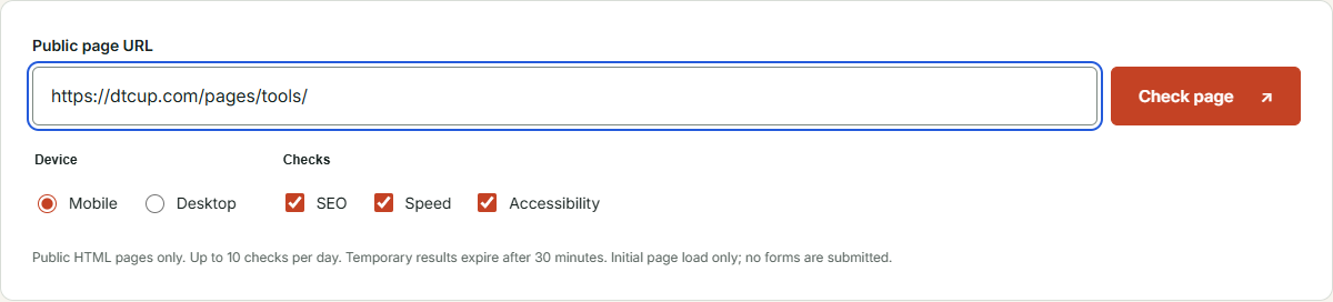
The advantage is seeing several kinds of friction together while retaining their different meanings. A title or canonical finding is not the same thing as a laboratory performance measurement. An automated accessibility finding is not a complete account of whether a person can use the website. Keeping those distinctions visible helps you assign the right fix instead of treating one score as a universal certificate of goodness.
For the collection launch, inspect the implemented landing page before sending campaign traffic to it. Start with the mobile setting if that is the experience you need to review. Read the reported evidence and test conditions. Then choose a short list of changes that affect the actual customer task: a missing descriptive title, a large visual causing a slow first view, or an interactive control that needs a clearer label.
Give each item an owner and an acceptance check. A useful task might say, “Replace the oversized opening image, then repeat the mobile test and inspect its visual quality.” Another might say, “Add an accessible name to the menu control and verify keyboard use.” Neither requires a dramatic presentation. Both tell the person doing the work how to recognize completion.
The tool is designed for public pages and the initial page load. It does not submit your forms or perform a complete checkout journey. At the time of this guide, the interface states a daily check allowance and a short lifetime for temporary results. Read those details before starting a review session; do not assume a permanent report archive will be waiting next month.
Speed results are laboratory evidence and may vary with the environment and page conditions. They do not replace real-user measurements. Accessibility automation identifies detectable issues, but a clean result is not proof of legal compliance or of a completely usable site. Test keyboard operation, visible focus, form feedback, and important journeys with the appropriate human review as well.
This is where the tool earns its place beside a larger monitoring system rather than trying to replace one. It helps answer, “What should we investigate on this page now?” If the finding points to markup, the HTML, CSS & JavaScript Editor can provide a small place to try a correction. If it points to crawler instructions, move to the robots checker. A repair list should lead somewhere more useful than another screenshot of the same orange score.
4. Query Fan-Out Explorer: best for finding the questions around the question
People rarely make a buying decision through one perfectly tidy search. A shopper considering a ceramic serving bowl may wonder about capacity, dishwasher use, storage, gifts, delivery, and whether the color in the photo resembles anything found outside a photography studio. Query Fan-Out Explorer helps organize related questions and intent around a topic.
Its strength is giving the team a research structure before it starts producing pages. Enter a focused topic, choose relevant market and language context, and examine the related questions. Use the map and query views to understand relationships. You can then compare the research with what your existing content already explains, rather than deciding that every phrase deserves a fresh article and its own tiny kingdom.
Begin with a question that connects to a customer decision. “Choosing serving bowls for a small kitchen” is more productive than “homeware,” because it gives the research a person, a constraint, and a use case. Add context when you have it. A business selling handmade ceramics has a different content responsibility from a marketplace selling disposable party supplies, even when both use the word “bowl.”
Next, group questions by the kind of answer they need. Product-specific care information may belong on the product page. A comparison between sizes may need a guide. Shipping timing belongs with current delivery information. Consolidate overlapping questions instead of manufacturing ten articles that say nearly the same thing with different headings. Search visibility is not improved by making your own website argue with itself.
The tool’s map is a research aid. It does not expose a search engine’s private internal query sequence, and its modeled questions are not search-volume measurements. Browse the available examples to understand the approach; account access is required for the API-powered research flow. Validate a proposed content opportunity against customer questions, existing pages, and other evidence available to your business.
The practical benefit over an unstructured brainstorming document is that relationships and intent become easier to discuss. You can ask whether a question is already answered, whether the answer requires product evidence, and whether several questions share one useful destination. Export the relevant working output when you need to hand the plan to a writer or designer.
For the homeware launch, the research might reveal that care guidance belongs earlier in the landing page, not buried in a footer link. Carry that insight into Sketch to Website as a labeled section. Once the answer is written and verified, the schema generator may help describe the page’s actual content. The sequence matters: understand the question, publish a useful answer, and only then describe it to machines. Markup cannot rescue a paragraph that avoids the question with enthusiasm.
5. Campaign Time Zone Planner: best for launches that cross a clock boundary
An announcement that says “launching at nine” sounds wonderfully clear until five colleagues in four countries agree with it. The Campaign Time Zone Planner combines time conversion with country calendars so you can plan a campaign in the context of both clocks and local dates.
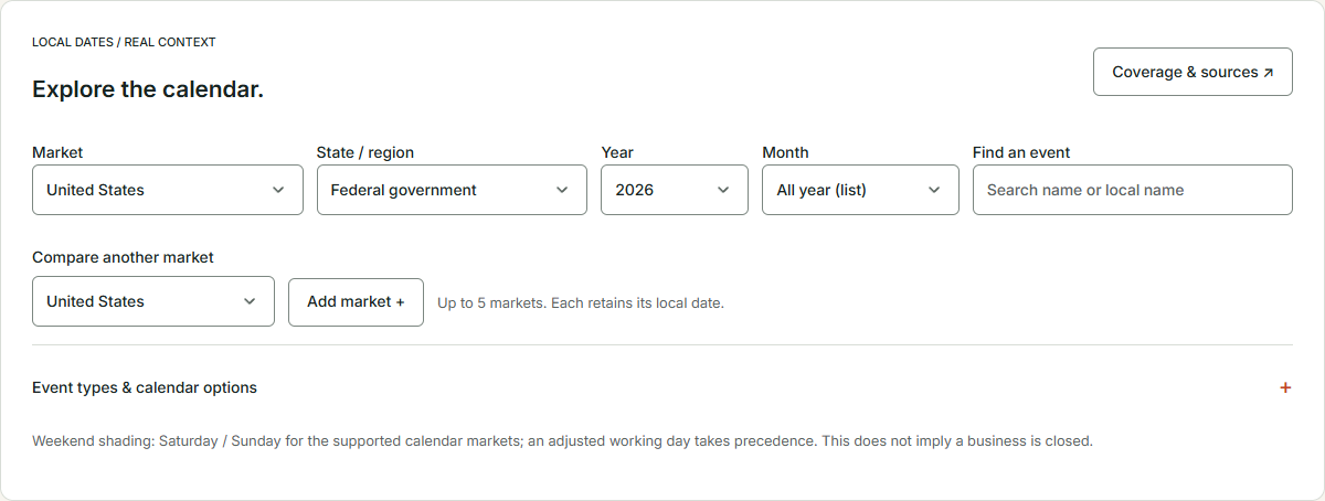
Start by choosing the event you actually mean. A single global launch happens at one instant, which appears as different local times. A campaign repeated at nine in the morning in each market happens at different instants. These are different schedules. Decide which one serves the audience before asking a converter to make the ambiguity look beautifully aligned.
Enter a meaningful title, the source location, and the start and end of the event. Review the corresponding times for the markets involved. Use the city and date context rather than assuming that a fixed offset remains correct throughout the year. Daylight-saving transitions are particularly good at revealing the difference between a thoughtful schedule and a spreadsheet somebody copied from April.
The country calendar adds another layer: local events, holidays, and regional context can affect when a message is useful. Choose the market and region, then inspect the relevant period. The current calendar covers supported markets across 2025 through 2030 and allows comparison between selected markets. Coverage does not mean every commercial promotion, school holiday, or future official arrangement is already known.
Read the event’s source and status when making a commitment. Some future dates follow established rules, while official holiday breaks or adjusted workdays may still be pending. The tool makes these distinctions relevant to the planning decision. A predicted date is helpful for preparing a draft calendar; it is not a reason to promise a delivery schedule before operations has confirmed it.
For the homeware launch, marketing may want a morning announcement in each target market while customer support wants one global coordination call. Build those as separate decisions. Check whether a local holiday changes staffing or customer expectations, then share the agreed schedule with the people operating the campaign. Exported calendar files are snapshots; later changes need to be communicated and reflected in the places where the campaign is actually scheduled.
The useful advantage is having timing and calendar context near each other. It reduces the manual handoff between “what time is that?” and “is that even a sensible day?” It does not automatically schedule an email or update an advertising account. Once the timing is agreed, use UTM, QR & Campaign Links to prepare identifiable destinations, and include the reporting time zone in the eventual Intelligence review. That small note can prevent an entire meeting about an order that happened on two different Tuesdays.
6. HTML, CSS & JavaScript Editor: best for testing one frontend idea properly
Sometimes a sketch answers the layout question but leaves an interaction unresolved. Should a size comparison expand in place? Can a long label wrap without pushing the button outside its card? What happens when somebody opens the menu with a keyboard? The HTML, CSS & JavaScript Editor gives you a focused workspace for trying these frontend ideas.
HTML describes the content and structure, CSS controls presentation, and JavaScript supplies behavior. The editor places those inputs beside a preview, with options for arranging the workspace and running changes. The visual editor supports content work, while Preview is the place to inspect styling and scripted interaction. The console helps you investigate when the prototype does something unexpected or declines to do anything at all.
The practical advantage is a short feedback loop. You can explore an idea without immediately changing the production website or setting up a large application project. That makes it useful for a developer explaining a behavior, a marketer reviewing copy in context, or a small team testing whether an interaction is worth implementing. A prototype can settle an argument much faster than six people describing the same accordion with their hands.
For the homeware collection, test a care-information panel with real-length text. Include a short heading and a long one. Try a narrow preview. Check what happens when someone tabs to the control and opens it without a mouse. The useful result is not merely that the panel moves; it is that the information remains readable and the control behaves predictably.
Keep the experiment small. If the question concerns a comparison card, build the card and enough surrounding context to assess it. Recreating an entire storefront introduces distractions and makes the result harder to evaluate. Use verified sample copy, and clearly distinguish any demonstration behavior from a real connected service. A button displaying “success” has not necessarily sent an email, saved an order, or booked anything.
Download code you want to retain and review it before implementation. A browser preview is not complete device testing, and a frontend prototype does not establish backend security, payment behavior, or production performance. Those checks belong to the actual application and its environment. Treat the editor as a working bench, not a certificate that the furniture can now support an elephant.
The editor pairs naturally with the drawing tool: agree on the page’s reading order first, then prototype the interaction that needs closer attention. After the final version is integrated, return to the page checker and test the customer journey in the real site. This separation keeps design approval, interaction approval, and release approval from collapsing into one optimistic thumbs-up emoji.
7. Website Schema Generator: best for giving verified content a clear structure
Your page may be obvious to a person and still need a more explicit machine-readable description. The Website Schema Generator helps build structured data for supported content types, including products, organizations, articles, breadcrumbs, and other common website entities. It offers standard JSON-LD and supported Shopify Liquid output.
The useful starting point is the page, not an empty form begging to be filled. Decide what the page is actually about and choose the corresponding type. Then map fields to real information: the published product name, the maintained price, the actual brand, the correct image, or the article’s genuine author. Missing information is a reason to investigate, not an invitation to develop a more adventurous relationship with facts.
For the homeware brand, a product page might have verified material and care information but no customer reviews yet. Describe what exists. Do not invent a rating because a field is available, and do not confuse a product’s decorative color name with its material. Structured data should clarify the same product visitors can see, not introduce a second, more glamorous product living invisibly behind the page.
The generator’s advantage is making the content-to-field relationship easier to inspect. Instead of starting with a large copied code block and hoping every property applies, you work through the supported fields and examine the output. Built-in checks help with the work, but syntax, completeness, and search-feature eligibility remain different questions. A valid document does not guarantee a special display in search results.
Changing facts require particular care. Price and availability should follow their maintained source rather than a forgotten pasted value. Supported Shopify Liquid templates can help express dynamic values in the appropriate context, but they still need to be reviewed in the actual theme. Inspect existing markup before adding more: a theme or app may already describe the same product, and contradictory versions do not become more persuasive through quantity.
A sensible workflow is to generate, review, install in a controlled change, and inspect the rendered page. Check that the values match visible content and that the intended markup appears once in the appropriate form. Ask who owns updates when a product, policy, or organization detail changes. The prettiest JSON in the world cannot compensate for a price nobody is responsible for maintaining.
This tool fits after the content decisions made through Query Fan-Out Explorer and before a final page review. It complements clear writing rather than replacing it. If you need a fuller explanation of the field decisions and implementation boundaries, the structured data guide provides a practical walkthrough. Use markup to describe a good answer, not to dress up an absent one.
8. AI Bot & Robots Checker: best for understanding what your crawl policy says
Robots rules are easy to ignore until somebody asks whether a crawler can reach an important page. They are also easy to misunderstand because words such as “allowed,” “indexed,” and “visited” sound related while describing different things. The AI Bot & Robots Checker helps you inspect declared rules and test how they apply to paths and crawler groups.
Use it when reviewing a launch, investigating a suspected restriction, or considering a change to an AI crawler policy. Read the policy for the correct origin, or paste proposed text for inspection. Check representative paths, not only the homepage. A rule that leaves the front door open can still affect a collection or resource area further inside the website.
The tool’s practical advantage is turning a compact but easily misread text file into a more understandable decision. You can examine the relevant crawler purpose and the paths you care about before making a production change. This is particularly useful when the team wants to distinguish search discovery, retrieval, and training-related policies rather than treating every bot as the same visitor wearing a different hat.
For the collection launch, choose the landing page, a product path, and an intentionally restricted area. Compare the results with the team’s intent. If the new page is restricted unexpectedly, inspect the applicable rules before editing anything. If a restricted area appears allowed, remember that robots instructions are not authentication. Private content needs actual access control, regardless of how sternly the text file expresses its feelings.
Do not replace the entire policy simply because a generated suggestion looks clean. Existing rules may support legitimate site behavior. Review the proposed change, preserve unrelated restrictions, and test the actual published file afterward. Keep the person responsible for the website involved, especially when themes, platforms, or other services also influence the policy.
The checker interprets instructions; it does not prove that a bot obeyed them or that a URL has been indexed. A firewall, response status, page-level directive, canonical choice, or other condition may affect the outcome. Actual visit evidence and indexing reports answer different questions. Separating those questions is the difference between investigating a problem and confidently solving the wrong one.
Pair this tool with the Website Page Checker when a public page appears to have a discovery issue. Use the schema generator only for the separate task of describing the content. Crawl permission, meaningful content, structured data, and search visibility are connected, but none is a magic substitute for the others. The goal is a coherent website, not a collection of green badges that disagree in private.
9. UTM, QR & Campaign Links: best for giving every invitation a readable label
A link can carry a visitor to the right page and still leave the marketing team wondering where that visitor came from. UTM, QR & Campaign Links helps prepare destinations with consistent campaign parameters and, when appropriate, turn them into static QR codes for physical touchpoints.
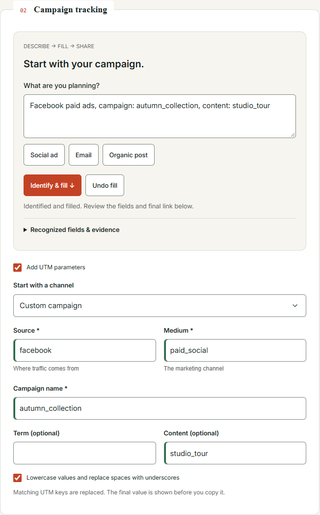
Start with the destination. Open it and confirm that it is the page the audience needs, including any relevant existing query parameters or section anchor. Then give the UTM fields distinct jobs. Source identifies where the invitation comes from, medium describes the delivery category, campaign connects related activity, and content can distinguish a placement or creative version. Consistency matters more than inventing an exquisitely complicated naming system.
The campaign-description input offers a convenient starting point. Describe the activity or use explicit labels, then ask the tool to identify and fill the parameters. Review what it proposes before applying or sharing the result. A sentence such as “collection launch, Facebook paid ads, content: video_a” contains clearer signals than “that thing we discussed for next week.” The tool can organize recognizable direction; it cannot attend your meeting retroactively.
The useful advantage is keeping destination preparation, parameter review, and QR design in one workflow. You can work from a common naming approach rather than switching between unrelated generators and hoping the copied values still match. Existing query parameters and section links are handled visibly, and matching UTM fields are replaced in the generated result. Always inspect that final result before copying it into a campaign.
For the homeware brand, create separate links for the launch email, a paid social creative, and a printed package insert. Let them share the same campaign name while using appropriate sources, media, and content labels. Do not put personal information in those values. The purpose is to identify the marketing invitation, not to turn a URL into a customer record that travels through logs and screenshots.
Static QR codes are useful when a physical object needs a digital next step: a care guide on packaging, a product demonstration at an event, or a collection page on a card. Follow the displayed email and subscription-consent flow for QR access. Choose colors and sizing for readability, then test the exported design on the actual material and at the actual scanning distance.
A static code contains its destination directly. It is not a promise that the destination will remain available forever, nor is it a dynamic redirect service you can casually retarget after thousands of cards have been printed. Keep the destination useful and stable. A QR code can be perfectly valid while pointing to a page your team retired during a spring cleaning spree.
After launch, use the shared naming approach when reviewing available source information in Intelligence. UTM parameters help preserve context, but they do not guarantee that every visitor, session, or order will be linked. Consent, collection coverage, and the receiving systems still matter. The campaign-link guide explains how to keep those labels useful without asking them to perform analytical miracles.
10. DTCUP Intelligence: best for investigating the story behind a total
The campaign has launched. Orders have arrived. Three dashboards now offer three different revenue totals, each with the posture of someone who is absolutely certain. DTCUP Intelligence is the reporting workspace in this toolkit, helping connect available business data with order, channel, and journey questions.
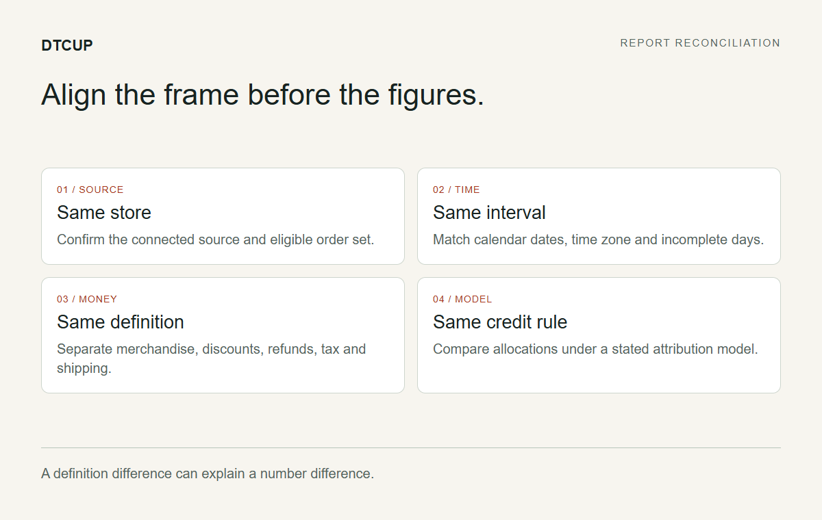
Unlike the public utilities, Intelligence depends on workspace access, connected sources, permissions, and data availability. Check the current access and connection flow rather than assuming every reader can immediately open a complete reporting account. A recognizable channel name does not mean its advertising account is connected, and a recorded website visit does not automatically provide that platform’s spend or campaign metadata.
The useful distinction is the ability to move from a grouped result toward the evidence behind it. Start with the intended store or website, choose the date range, and read the revenue and attribution definitions. Then investigate channel and source details or an order’s available journey. This approach helps the team ask why a number has its current value instead of simply deciding which number looks most agreeable.
For the homeware launch, ask a narrow question: which channels participated in eligible orders during the campaign, and where is the evidence incomplete? Confirm the time zone, whether the current day is partial, and whether the selected money figure includes the components you expect. Compare like with like before deciding that a difference between systems is an error.
Channel identity and traffic medium serve different purposes. Google can be the broad source identity while the medium distinguishes paid, organic, or unknown traffic where the evidence supports that distinction. Drill into available source details when a grouping seems surprising. A unified label is useful, but the retained source evidence is what allows you to examine how that label was reached.
Attribution models assign credit under different rules. Changing the model changes the allocation; it does not change the historical order itself. A reporting date range chooses which period to inspect, while a lookback window limits which earlier qualifying touches may participate. Neither setting recreates browser events that were never collected. Historical information supplied by a connected provider can help where available, but it should not be described as a complete reconstruction of an unknown past.
Order journeys require the same care. An observed page view can show activity without qualifying as an acquisition touch. Missing evidence is not automatically direct traffic, and an unattributed order is not proof that marketing had no role. Inspect coverage before drawing a conclusion. A dashboard is most useful when it makes uncertainty visible enough to work with, rather than hiding it under a confident decimal place.
The next action might be improving campaign labels, checking a connection, clarifying a landing page, or designing a more controlled test. Attribution credit alone does not prove incremental sales or justify a budget change without further context. Use the Intelligence guide for a deeper walkthrough, then bring a specific question back to the relevant tool. Reporting should help choose the next improvement, not become a particularly attractive place to postpone it.
Three practical combinations that make the toolkit more useful
The strongest reason to use related tools is continuity of thinking. You can carry a customer question into a layout, a layout into a prototype, and a campaign label into a reporting review. That does not require every tool to share an automatic integration. It requires the team to understand what it is handing over and why. Here are three useful combinations for different stages of work.
A new collection needs a page, not another vague brief
Begin with Query Fan-Out Explorer and a focused customer question. Decide which answers belong on the launch page and which need a supporting guide. Then draw the reading order in Sketch to Website. Add approved brand material and real product imagery, explaining the role of any reference. Use the resulting preview to agree on the direction before implementation starts.
If the collection includes a supplied product model, inspect it in the Online 3D Viewer before proposing it as the centerpiece. If one interaction remains uncertain, prototype that part in the HTML editor. These are selective steps, not mandatory rituals. A collection of simple products with clear photographs may not need a three-dimensional presentation, and a straightforward landing page may not need custom JavaScript.
Finish with verified content, appropriate schema, and a check of the implemented page. Test the actual shopping path manually. The output should be a page whose purpose, facts, and behavior have been reviewed, rather than a design everyone approved at a size nobody will use. The idea-to-launch workflow expands this sequence when you need a more detailed project plan.
An international promotion needs timing and traceable destinations
Start with the Campaign Time Zone Planner. Decide whether the promotion begins at one global instant or at the same local time in several markets. Inspect the relevant country and region calendar, and flag future arrangements that are not yet confirmed. Give the final schedule to the people who actually operate the email, advertising, support, and website changes.
Next, prepare campaign URLs in the link builder using an agreed naming dictionary. Open each final destination and verify that the offer, language, and next step match the invitation. If printed materials are involved, test the QR output in its physical context before approving the print run. A perfectly synchronized launch cannot compensate for an email that politely delivers everyone to the wrong collection.
Record the intended reporting period and time-zone context for the Intelligence review. After launch, inspect the available evidence with those definitions in mind. If two sources disagree, compare their order eligibility and attribution rules before drawing a performance conclusion. The useful handoff is a shared understanding of the campaign, not merely a spreadsheet containing several dates that happen to look official.
A disappointing result needs an investigation before a redesign
Begin with the observation in Intelligence or your available reporting source. Perhaps campaign traffic reached the destination, but the evidence does not explain what happened next. Separate the observation from the hypothesis. “The page needs a stronger headline” is a proposal; it is not the same fact as “these visits did not produce linked orders under this reporting definition.”
Check the relevant destination and collection coverage. Use the Page Checker to investigate visible technical issues, and review robots rules only if there is a specific discovery question. Use query research if the content seems to miss an important customer concern. Then draw or prototype a focused change. Choosing a tool because it addresses the uncertainty is more productive than opening every tool until one produces a dramatic-looking output.
Agree on what would make the change worth keeping and what other conditions may affect the review. Promotions, stock, audience mix, and timing can all complicate a comparison. A small team can still make disciplined decisions: state the hypothesis, implement the change, inspect the result, and acknowledge when there is not enough evidence. That is less glamorous than a sweeping redesign, but it often makes the next week considerably more useful.
How to choose your first tool without turning this into another project
Write one sentence beginning with “We need to understand…” or “We need to make…”. Then identify the smallest output that would let the work continue. If you need agreement on a page, draw it. If you need to inspect an asset, open the model. If you need to prepare an invitation, build the link. If you need to investigate a result, establish the reporting context.
Consider the input and access requirements before scheduling a team session. Bring the actual model files, approved brand material, public page URL, or connected workspace access. Respect the login step for generation and API-powered research, and the displayed consent flow for QR access. These differences are easier to manage when they are understood before five colleagues gather to watch one person discover them.
Decide how the output will be retained and who will use it. Download the project, export the relevant code, copy the reviewed campaign URL, or give the responsible person the findings they need. Do not assume every utility maintains a permanent cloud archive. Deliberate handoffs are especially important when the useful result is a decision or a piece of feedback rather than a file.
Finally, resist the temptation to measure the toolkit by how much it can produce in an afternoon. A hundred content ideas, six page drafts, and a folder of QR codes can still leave the original question unanswered. The better measure is whether a customer can understand the page, whether a colleague can execute the campaign, or whether the next decision rests on clearer evidence.
For 2026, that is the kind of DTC toolkit worth keeping close: practical enough to use for one task, connected enough in purpose to support a larger workflow, and honest enough about its limits that you can trust the next step. Explore the nine website tools, start with the job in front of you, and bring DTCUP Intelligence into the process when connected reporting is the question. Your browser can keep a few mysterious tabs. Your working process does not have to.
Sources
- dtcup.com — sketch-to-website
- dtcup.com — 3d-viewer
- dtcup.com — page-checker
- dtcup.com — query-fan-out-explorer
- dtcup.com — campaign-calendar
- dtcup.com — html-editor
- dtcup.com — schema-generator
- dtcup.com — robots-ai-bot-checker
- dtcup.com — marketing-link-builder
- app.dtcup.com —
- dtcup.com — intelligence-orders-channels-journeys
Try a related toolWebsite Tools ↗
Still have a question?Ask the DTCUP Community ↗