
Campaign Links That Keep Their Story: UTM Parameters, Plain-Language Fill and QR Codes
Describe a campaign, review UTM suggestions and prepare links for email, ads or print. Learn naming habits, static QR limits and the checks that prevent confusing campaign reports.

7 years of experience building and operating brand websites, specializing in website development, paid advertising and SEO. Built a brand website from launch to US$10 million in annual sales.
The Short Answer
Build the destination first, then give each UTM field a consistent job. The link builder can suggest parameters from common campaign phrases and explicit labels, but you should review every value and test the finished link. For print, choose a useful destination, generate the static QR through the displayed flow and check the actual placement on a phone.
Key takeaways
- Use a small shared naming dictionary.
- Keep campaign labels descriptive and free of personal data.
- Test the final destination and printed QR rather than only its preview.
A campaign link has two jobs. It needs to take someone to the right place, and it should help your team remember how that person was invited. The first job gets most of the attention because broken links are wonderfully obvious. The second usually reveals itself three weeks later, when a report contains email, Email, newsletter, Newsletter_Final, and an exciting new channel called test2.
None of those labels is necessarily malicious. They are the fossil record of a busy marketing team. Someone copied an old link, someone improvised, and someone believed the campaign would be so memorable that a naming convention was unnecessary. Future reporting has a different opinion.
The DTCUP UTM, QR & Campaign Link Builder brings the destination, campaign parameters, and optional QR design into one workspace. You can describe a campaign, review suggested fields, adjust the final link, and prepare a static QR code for a physical touchpoint. The useful part is the continuity between those steps. You do not have to mentally carry an unverified URL through several disconnected tabs and hope the last one still contains the right offer.
This guide uses an illustrative ceramics studio launching a collection through email, social promotion, and a printed card inside orders. The studio is fictional; its need for clear campaign labels is not. We will build a small naming system, use the description helper, inspect the result, and decide when a QR code is worth adding. We will also keep one important distinction intact: labeling a link is not the same thing as proving what caused a sale.
Start with the destination, not the tracking
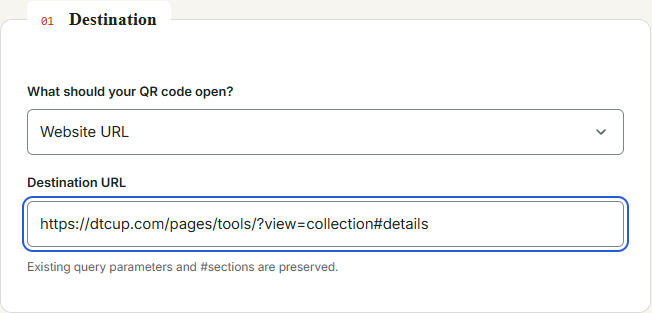
Choose the actual page that should open. For the ceramics launch, that might be a collection page explaining the new pieces, rather than the homepage. If a customer clicks an email about a specific collection and lands on a general introduction, the link may be technically valid while the experience feels like being invited to dinner and handed a street map.
Open the destination yourself before adding parameters. Check the page title, the collection or product shown, and the action available. If the page is not ready, tracking does not make it ready. You can prepare the campaign naming now, but the final distribution should wait until the destination fulfills the promise made by the message.
The builder supports several destination types, including website links and non-web QR content such as email, phone, SMS, Wi-Fi, and plain text. Choose the type that matches the intended action. A phone-call QR and a campaign landing-page URL solve different problems; do not add website analytics expectations to content that does not open a website.
For ordinary links, existing query parameters and section fragments are preserved while matching UTM fields can be replaced. Review the final output so you know which values are being carried forward. A preserved parameter might be useful, such as a selected option, or it might be an old campaign value that needs deliberate revision. Preservation is helpful; unexamined inheritance is how test2 becomes a family tradition.
If you need to redesign the destination before launch, Sketch to Website can help you draw the page structure and communicate the next action. Keep the campaign promise visible in the sketch: what the visitor expects, what information supports it, and what they should do next. The link builder then labels a journey that already makes sense.
Give each UTM field one job
Source identifies where you are distributing the link. Medium describes the marketing route or type. Campaign gives related activity a shared name. Term and content are optional fields for more specific distinctions when your reporting plan needs them. The point is a consistent division of labor, not filling every box because empty space looks suspicious.
For our illustrative studio, an email announcement could use a source that identifies the newsletter, an email medium, and one collection-launch campaign name. A social advertisement can share the campaign name while using its actual platform source and paid medium. A packaging card can use a packaging source and QR medium. The exact convention belongs to the team; the consistency belongs to everyone who creates a link.
Write the convention before distributing the work. A short example for each route is often enough. Decide whether the campaign includes a year, how you name a market, and how you distinguish creative versions. Prefer labels a colleague can understand without reading your mind. Campaign parameters are not a suitable place to preserve an inside joke that only two people remember.
Avoid using the same field for two different concepts. If source sometimes means platform and sometimes means audience segment, later comparisons become difficult. If content sometimes means button position and sometimes means a product category, write that distinction explicitly or choose a clearer scheme. Reporting confusion often begins as naming ambiguity rather than a problem with the reporting tool.
Do not put personal information into campaign labels. A link can be copied, forwarded, displayed, and recorded by systems along the journey. Use campaign-level descriptors rather than a customer’s name or email address. You need to identify the invitation, not attach a private dossier to the envelope.
Describe the campaign in ordinary language
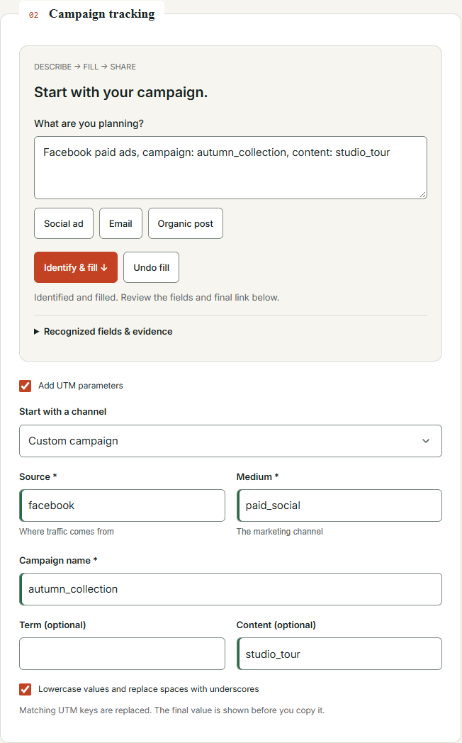
The Start with your campaign area gives you a faster way to begin. Describe the activity, then choose Identify & fill. A useful description names the platform or route, whether the activity is paid or organic when relevant, and the campaign itself. Include a content label when you have a specific version to distinguish.
For example, our studio could describe a Facebook paid campaign for a named autumn collection, with a video variation called studio_tour. That gives the helper concrete clues. “We are doing marketing next month” gives it considerably less to work with, although it does accurately describe the emotional state of many planning meetings.
The helper recognizes supported common phrases and explicit field declarations. It does not infer every possible campaign meaning, translate every invented name, or obtain real advertising IDs from the platform. Treat the result as a useful first pass. The responsibility for choosing the final labels remains with the person preparing the campaign.
When the description includes several possible channels, inspect the candidates and choose the one appropriate to the link you are building. One link should describe one intended distribution context clearly. A paragraph mentioning an email, a social ad, and a printed poster is a campaign plan, not a single unambiguous URL specification.
The practical advantage is reduced blank-page work. You can start with the campaign idea already in your head, then refine the structured fields. This is especially helpful for a colleague who knows what the activity is but does not yet think in parameter names. The interface bridges that gap without requiring the colleague to become an analytics specialist before sending a sensible link.
Review the suggestions before applying your signature
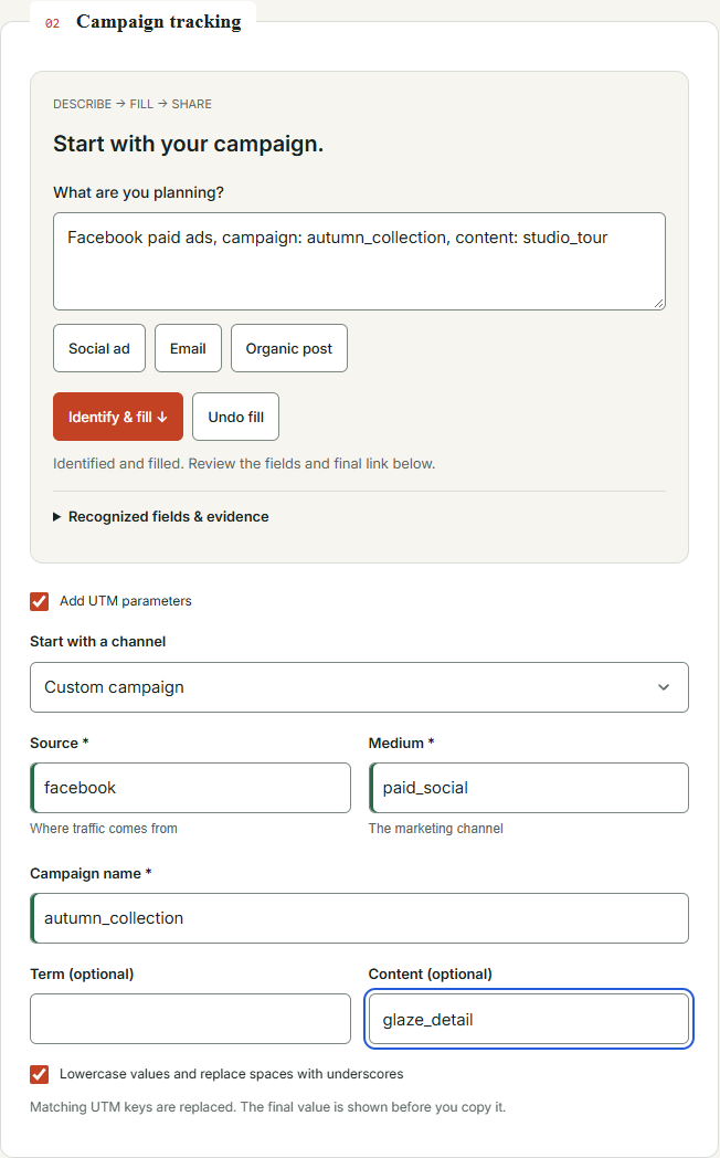
After identification, inspect the populated fields and any explanation or unresolved choice. Check that source represents the actual route, medium reflects the intended activity, and campaign matches your naming convention. If a suggestion is plausible but wrong, correct it now. Plausibility is not a quality-control process, even when it arrives in a neat form.
The tool protects existing manual values and can present suggestions for individual replacement. This is useful when you have already settled part of the link. You might trust your approved campaign name while wanting help with the source and medium. You should not have to sacrifice a reviewed value simply to use a helper for another field.
Existing UTM values in an entered URL also deserve attention. The builder can read and protect them, so the final state may combine inherited values with new suggestions until you deliberately resolve the differences. Look for old campaign names that survived from the copied URL. Reusing a destination is efficient; accidentally reusing last spring’s reporting identity is less charming.
Undo fill provides a way to reverse the helper’s fill operation while preserving later manual edits where supported by the interaction. Use it when the interpretation was not what you intended, then simplify the description or edit the fields directly. Undo is not a substitute for reading the final URL, but it makes experimentation less frustrating.
For the ceramics studio, the final review can be shared with the person sending the campaign. Ask them to confirm the route and creative label rather than approve a string they do not understand. “This is the paid Facebook studio-tour video for the autumn collection” is a much better review prompt than “Does this long URL look okay?”
Make a small naming dictionary your team can actually use
A naming dictionary does not need to become a hundred-page manual. Begin with your recurring sources, the media you actually use, and a campaign-name pattern. Add examples that reflect real distribution work. The best convention is the one a teammate can apply correctly while preparing a campaign under normal time pressure.
For the studio, a small dictionary might distinguish newsletter, packaging, and specific social platforms as sources. It can define which label represents paid promotion and which represents an organic post. It can state that the collection name is shared across channels, while content distinguishes a studio-tour video from a product-detail image. The labels are illustrative; adapt them to your existing analytics conventions instead of replacing a working system casually.
Decide how much detail you genuinely need. A label for every sentence in an email is rarely helpful if nobody intends to analyze it. A label distinguishing the main collection button from a footer link might be useful when there is a specific question about placement. Let the reporting question determine the granularity rather than treating parameter length as a measure of professionalism.
The normalization option lowercases values and replaces spaces with underscores. That can reduce accidental variations, but review how it interacts with your existing convention. Consistency across the team matters more than a personal preference for hyphens or underscores. If a working convention already exists, make a deliberate migration decision before introducing a different one.
Keep the dictionary close to the people who create links. A perfect document hidden in an abandoned folder has roughly the same practical value as a beautifully labeled empty box. Include the few examples most people need and a named person to ask when a new channel appears. That is enough structure to prevent common mistakes without slowing every campaign to a committee meeting.
Use one campaign name across related invitations
The studio’s email, paid social post, and packaging card can belong to the same collection campaign while retaining different sources and media. That shared campaign identity makes it easier to discuss the launch as a whole. The route-specific fields preserve the distinctions needed to compare how the invitations were distributed.
Create the links separately and verify each one. Do not assume that copying the final email link into a social advertisement automatically updates its meaning. The browser will happily open it, but the label may still say email. A working destination and a correct reporting label are separate checks, and both deserve a place in the release routine.
For content variations, use names that remain understandable after the creative file has been archived. studio_tour and glaze_detail may be more useful than v7 and final_final. If your team already has stable creative IDs, align with that system. The goal is not poetic naming; it is the ability to trace a report row back to the actual invitation.
When planning the questions behind the launch, the Query Fan-Out Explorer can help organize topics customers may need explained. The studio might explore care instructions, size comparisons, or gift suitability. Use those ideas to improve the content, then label the distribution of that content clearly. Topic exploration and campaign tracking support each other without being the same task.
Avoid promising that the labels alone will reconcile every analytics platform. Different systems may apply different definitions, identity rules, and attribution windows. A consistent link is a better input, not a universal agreement treaty between dashboards. It reduces one source of confusion while leaving the other sources available for honest investigation.
Build an email link that survives a real send
Start with the approved collection URL, select the email route or fill the fields according to your convention, and inspect the final output. Open that URL in a browser and confirm the destination. Then place it into the email draft and test the actual link from the draft or preview used by your sending platform.
This second test matters because the link you created is not always the last version distributed. Email software may wrap links for its own tracking, editors may paste an older value, and a button may still contain the placeholder from a previous campaign. Check the link as the recipient will encounter it rather than only the string in the builder.
For the studio’s announcement, review the main collection button, any image link, and the text link in the body. If they are meant to share one label, keep them consistent. If you are deliberately distinguishing placements with content values, verify those differences. An accidental mismatch is not a useful experiment simply because it creates additional rows in a report.
Test the landing experience on a phone as well as a desktop. The invitation might be clear while the mobile destination hides the collection information beneath a large image. The Website Page Checker can provide selected SEO, speed, and accessibility findings for the public destination. Follow its automated findings with a real reading and interaction check; a campaign is experienced by people, not just validators.
Finish with a short send-ready note: destination confirmed, labels confirmed, actual draft links tested, and mobile destination reviewed. That note is more useful than a screenshot of a green button. It gives the sender confidence about the specific things checked while leaving no impression that tracking guarantees a particular commercial result.
Make paid and organic links tell different stories
A platform can host paid promotion and organic posts. Using the same platform name as the source does not mean the medium should be identical. Describe the actual distribution route so later reporting has a chance to distinguish the two. If you are unsure how your existing analytics classifies a medium, check that convention before distributing a new label widely.
The description helper can recognize supported paid and organic phrases, but it cannot resolve a genuinely contradictory brief for you. “Organic paid launch” is not a sophisticated hybrid strategy when it was typed accidentally. Simplify the description, choose the correct route, and review the resulting fields.
For our studio, the paid studio-tour video and an organic behind-the-scenes post may share a destination and campaign. Their medium or other approved route distinctions should reflect the different invitations. The content field can identify the creative when useful. This makes the reporting labels correspond to decisions the team actually made.
Do not infer a real ad account, campaign, ad-set, or ad ID from a friendly phrase. If your advertising workflow needs platform identifiers or macros, handle that requirement through the appropriate platform process. The public builder’s plain-language helper is not secretly connected to your ad account, and it should not be described as if it were.
Before launch, compare the ad’s visible promise with the destination’s first screen. If the ad emphasizes a limited collection, the page should explain that collection accurately. A link with immaculate labels cannot repair a mismatch between the invitation and the offer. The visitor does not see your naming spreadsheet; they see whether the next page makes sense.
Turn a printed card into a useful digital invitation
The packaging card is where a QR code can earn its space. Our studio wants customers to reach a care guide after opening their order. A card that says “Care for your new ceramics” gives the scan a clear purpose. A card that says only “Scan me” asks for trust without explaining the reward, which is a bold strategy for a small square.
Choose a durable destination before printing. A useful care guide should remain available beyond the week of the launch. If the destination is temporary, plan what happens later. A static QR code encodes the supplied content; it is not a hosted dynamic redirect service that automatically lets you change the encoded destination after printing.
Use campaign labels that identify the actual touchpoint, such as the packaging route in your approved convention. This can help distinguish visits invited by the card from visits invited by an email. It does not count every person who looked at the card, and it does not prove that a scan alone caused a subsequent purchase.
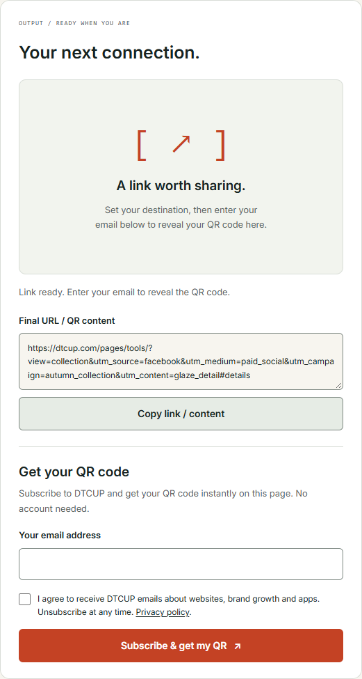
In the current DTCUP flow, you can build and copy the campaign link, while revealing and downloading the QR code requires the displayed email subscription step and consent. No account is required for that step. Read the choice as presented and decide whether it fits your needs; the guide should not pretend the QR flow has no email requirement when the interface clearly does.
Keep the printed instruction close to the code, use a destination description people understand, and include another reasonable way to find the information when practical. The code is a convenience, not a test of whether the customer brought the right phone to the unboxing ceremony.
Design the QR for scanning before styling
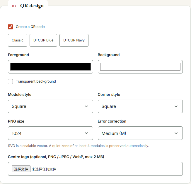
The tool offers foreground and background controls, module and corner styles, a transparent background option, and an optional center logo within the displayed upload limit. Those controls can help the code feel at home in your brand materials. They should serve the scan, not turn it into an obstacle course with excellent art direction.
Start with a simple, high-contrast design. Keep the surrounding quiet zone intact; the tool preserves a minimum quiet zone automatically. When the exported image is placed into a layout, do not crop that breathing room away or crowd it with decorative elements. A graphic can leave the builder correctly and become difficult to scan after an enthusiastic designer introduces three nearby ornaments.
If you add a logo, test the resulting code rather than assuming a familiar brand mark improves reliability. The center image changes the visual pattern. Likewise, a transparent background depends on the surface behind it. A code that looks clear on your white editing canvas may become weak when printed over a textured photograph or a dark package.
The error-correction setting is one part of the design, not a promise that any amount of decoration is safe. Choose a restrained treatment, verify the generated code, and test it in the final context. The practical goal is a quick, ordinary scan by a customer who has no interest in appreciating your technical bravery.
For our ceramics card, a simple dark code with generous space and a short care-guide label is a sensible starting point. The brand can appear in the typography, paper, and surrounding design. The QR does not need to carry the entire visual identity on its tiny shoulders.
Test the finished placement, not just the generated image
The tool’s scan check can help verify the generated image in its supported checking flow. That is useful evidence, but it is not the same as testing the final printed object under real conditions. Keep those two checks distinct. A clean digital decode does not tell you how a glossy fold, a curved package, or a dim room will affect a customer’s camera.
Print a sample at the intended size and place it where it will actually appear. Try scanning from the expected distance and angle with more than one ordinary device when available. Confirm that the opened content is the exact final destination, including the intended campaign labels. A code that scans reliably to the wrong page has passed the wrong test very efficiently.
Check the entire path after scanning. Does the mobile page load? Is the care guide readable? Does a banner cover the first instructions? Is the customer asked to navigate through several unrelated pages? The scan is only the beginning of the experience. The destination should repay the small amount of effort you requested.
If the physical layout includes a product rendering, inspect the source asset before it reaches print. The Online 3D Viewer can help review a supported model’s presentation and visible limitations. It does not validate the QR or the product’s real specifications; it supports a separate media-review step in the same packaging workflow.
Repeat the relevant checks after changing the destination or QR design. The tool invalidates an old code when its content changes, which helps prevent downloading a stale result. Your layout process should follow the same logic: a revised final image deserves a revised scan test, not inherited confidence from yesterday’s version.
Choose PNG or SVG for the actual production job
PNG is useful when you need a raster image at a defined size. The tool offers size choices and a custom option. Choose dimensions appropriate to the final placement, then avoid stretching a small export far beyond its intended use. A crisp preview at one size is not a guarantee that the same file will look good across a large display.
SVG is a scalable vector format and can be useful in design and print workflows that support it. Confirm that the receiving application and production process handle the file as expected. Do not assume that every upload field accepts SVG simply because your design software does. File-format compatibility is a remarkably persistent source of last-minute surprises.
Give the downloaded asset a useful name that identifies the touchpoint and campaign. Keep the final URL in the handoff note so a colleague can verify the encoded destination without guessing from the image filename. The artwork and the link should travel together through review, especially when several similar codes are being prepared.
If you are mocking up the digital destination or the card’s web-based instructions, the HTML, CSS & JavaScript Editor can help test the layout and interaction. It is a prototype environment, not a printing certification service. Use it to clarify the page experience, then perform the appropriate checks in the actual production channel.
Before approving the final artwork, ask a reviewer who did not create the link to scan it and describe what opened. Independent eyes are useful because the creator already knows what should happen. A fresh reviewer is more likely to notice that the guide is correct but the campaign value still refers to an earlier test.
Handle Shopify discount links with an extra reality check
The builder includes a Shopify-oriented destination option for products, collections, or discounts. This can make it easier to assemble the intended route, but building a discount link does not create a discount in Shopify. The actual offer must exist and work under its real conditions. A URL is not authorized to negotiate your pricing policy on your behalf.
Test the link against the intended product or collection and verify the redirect behavior. Then confirm the actual discount conditions in the commerce system: the relevant products, dates, eligibility, and any limitations your business has set. Do not describe an offer in campaign copy until those facts are established by the source system.
For the studio, a printed card promising a future offer creates an ongoing obligation to maintain the destination and explain the terms accurately. If the offer ends, the visitor still deserves a useful page. Planning that experience before printing is much easier than explaining a dead link to customers after the cards are already inside shipped boxes.
Coordinate the timing with the Campaign Time Zone Planner. Clarify whether the launch happens at one shared instant or at a particular local time in each market. The planner can help communicate those times; it does not change the discount settings in Shopify. Verify the actual commerce configuration separately.
This division of responsibilities keeps the workflow honest. The builder assembles the invitation. The planner clarifies the schedule. The commerce platform enforces the offer. The team checks that all three describe the same customer experience before the campaign leaves the building.
Keep tracking labels out of places they do not belong
Campaign parameters are useful for identifying distribution, but they are not the right answer to every navigation question. Think carefully before adding campaign tags to ordinary internal links between pages of your own site. If the goal is to understand internal button use, define that measurement requirement through the appropriate analytics setup rather than casually relabeling the visitor’s journey.
Likewise, do not create a new campaign name every time a colleague changes a button color. A campaign should represent a meaningful activity in your reporting plan. Too many arbitrary variations create noise, while too little distinction hides useful context. The right balance depends on the questions you intend to answer.
Avoid using campaign values as a place to store customer-specific data or operational secrets. A URL is visible and portable. The fact that a field accepts text does not make all text appropriate. Use stable, descriptive campaign labels and keep sensitive information in the systems designed to protect it.
For the studio, a care-guide link inside the site’s main navigation can remain a normal internal link, while the printed-card invitation uses the packaging campaign route. That distinction reflects two different contexts. It keeps the ordinary website architecture clean while preserving the identity of a specific external invitation.
When uncertainty appears, ask what you want to learn. If you cannot state the question, adding another parameter probably will not clarify it. It may simply give the eventual confusion a longer address.
Maintain the destination after the launch excitement fades
A useful campaign link outlives the meeting where it was approved. Customers may open an email later, revisit a saved message, or scan packaging months after purchase. Keep durable destinations available where possible and plan sensible handling for retired content. A static QR code will continue to contain its original information, whether or not your team still remembers the campaign.
If the care guide changes, update the actual page responsibly. Make the instructions accurate and easy to find. If the page describes a product or service with an appropriate supported structured-data type, the Website Schema Generator can help prepare a truthful description of that content. Do not add unsupported claims or assume valid markup guarantees a special search display.
Check the site’s public access expectations as well. The AI Bot & Robots Checker can help examine crawler policy for the relevant origin, but it does not determine whether a QR scan works for a human visitor. These are separate checks within destination maintenance: people need a working page, and your publishing policy should express the discovery choices you intend.
Assign an owner to important evergreen destinations. A card inside a product box should not depend on the continued employment of the person who made the original artwork. A simple ownership note makes it easier to review the page when products, instructions, or offers change.
The maintenance burden is one reason to keep the destination strategy simple. A clear page with a durable purpose is easier to support than a chain of temporary campaign pages. Simplicity is not glamorous, but it has an excellent record of being available when a customer finally scans the code.
Read the results without asking the link to prove too much
Once the campaign is running, use the labels to organize the evidence your analytics actually captures. A tagged visit can help identify an invitation route. It does not reveal every earlier exposure, every conversation, or every unobserved device switch. The parameters are context, not a complete biography of the customer.
If you use DTCUP Intelligence, review the connected data, selected dates, attribution model, and available journey coverage before comparing channels. Historical gaps remain gaps, and an attributed order is a result under a particular model rather than proof of causal lift. Clear campaign inputs make the analysis easier without removing those distinctions.
For our studio, a useful review might compare the invitations sent, the visits observed, and the orders or other actions recorded under the available data. If packaging visits appear lower than expected, investigate the card placement, scan experience, destination usefulness, and measurement coverage. Do not immediately conclude that customers disliked the product or that the QR failed.
Ask whether naming mistakes affected the report. Look for unexpected variations, old campaign values, or links distributed through a different route than intended. Correct the process for the next send and document what can be understood about the current data. Avoid rewriting the story to make the numbers look more orderly than the evidence allows.
The most useful outcome is a specific improvement. Perhaps the care-guide promise needs clearer wording. Perhaps the main email button deserves a different destination. Perhaps the team should stop copying old links without reviewing them. Each is an actionable lesson that a well-labeled campaign can help expose.
Before comparing two creative versions, check whether their distribution was comparable enough for the question you are asking. A newsletter sent to existing customers and an advertisement shown to a broader audience are different contexts, even when both point to the same collection. The labels help you see that difference; they do not remove it. Write down the audience and placement alongside the creative name so the review does not accidentally become a competition between unlike invitations. This extra context makes a modest result more useful than an impressive percentage with no clear basis.
Make link review a small, repeatable habit
Before sharing, verify the destination, the campaign fields, and the final link in its actual distribution context. For QR use, add a final-image scan and a test of the physical placement. For an offer, verify the source-system conditions. These checks are short enough to become routine when they are attached to the work rather than stored in a distant checklist nobody opens.
The DTCUP tool’s advantage is that it keeps several practical steps together: a destination-aware builder, a description helper with reviewable fields, manual control, and a QR workflow for physical invitations. You can use only the part you need. A newsletter link does not need a logo-styled code, and a Wi-Fi QR does not need a fictional acquisition campaign.
Compared with assembling parameters manually, the interface makes the fields and final output easier to inspect. Compared with treating QR design as a separate activity, it keeps the encoded destination close to the campaign decisions. Those are workflow benefits you can evaluate directly, without relying on unsupported claims that every competing tool lacks the same features.
Start with one real invitation. Give it a sensible destination and a name your future self can understand. Test the path, share it, and review the evidence it actually produces. Your reporting may still raise interesting questions, but at least it will not begin with an archaeological investigation into the lost civilization of Newsletter_Final_Final2.
Sources
Try a related toolFree UTM Builder, QR Generator & Campaign Links ↗
Still have a question?Ask the DTCUP Community ↗