
From Website Idea to Launch: A Practical Workflow Using the DTCUP Toolkit
Move one page from customer questions to sketch, prototype, checks and launch. Coordinate the DTCUP tools with clear handoffs, verified content and a manageable release decision.

7 years of experience building and operating brand websites, specializing in website development, paid advertising and SEO. Built a brand website from launch to US$10 million in annual sales.
The Short Answer
Move a website idea through a sequence of decisions: audience question, reading order, sketch, design review, interaction prototype, implementation and release checks. Use each DTCUP tool where it resolves an actual uncertainty. Keep verified content and ownership attached to the handoffs, then use early evidence to choose the next improvement.
Key takeaways
- Start with one page and a clear visitor task.
- Separate design approval from production acceptance.
- Launch with working destinations, campaign labels and a review question.
A website project rarely fails because the team cannot find another tool. More often, it fails in the space between tools. The research document contains a good question that never reaches the wireframe. The wireframe contains a useful explanation that disappears from the build. The finished page gets a QR code pointing at the old URL. Everyone worked hard, and the handoffs quietly ate the result.
A coordinated workflow makes those handoffs visible. Each step should produce something the next step can use: a clear page purpose, a verified fact, a labeled layout, a testable interaction, a checked destination, or a campaign link whose meaning survives the launch. The goal is not to run every available tool like an airport security tray. The goal is to move one useful website idea into a reliable visitor experience.
The DTCUP toolkit supports that work through focused tools for research, drawing, prototyping, media inspection, page checks, structured data, crawler policy, campaign timing, and links. You can use them together without pretending they form an automatic conveyor belt that publishes a perfect website while everyone goes for lunch.
This guide follows an illustrative furniture studio preparing a page for a new compact writing desk. The studio and product are fictional teaching examples. We will not invent a price, certification, customer review, or performance result. Instead, we will show how a team can keep real product facts, design decisions, technical checks, and campaign preparation connected from the first question to the first live review.
Choose one page and one visitor task
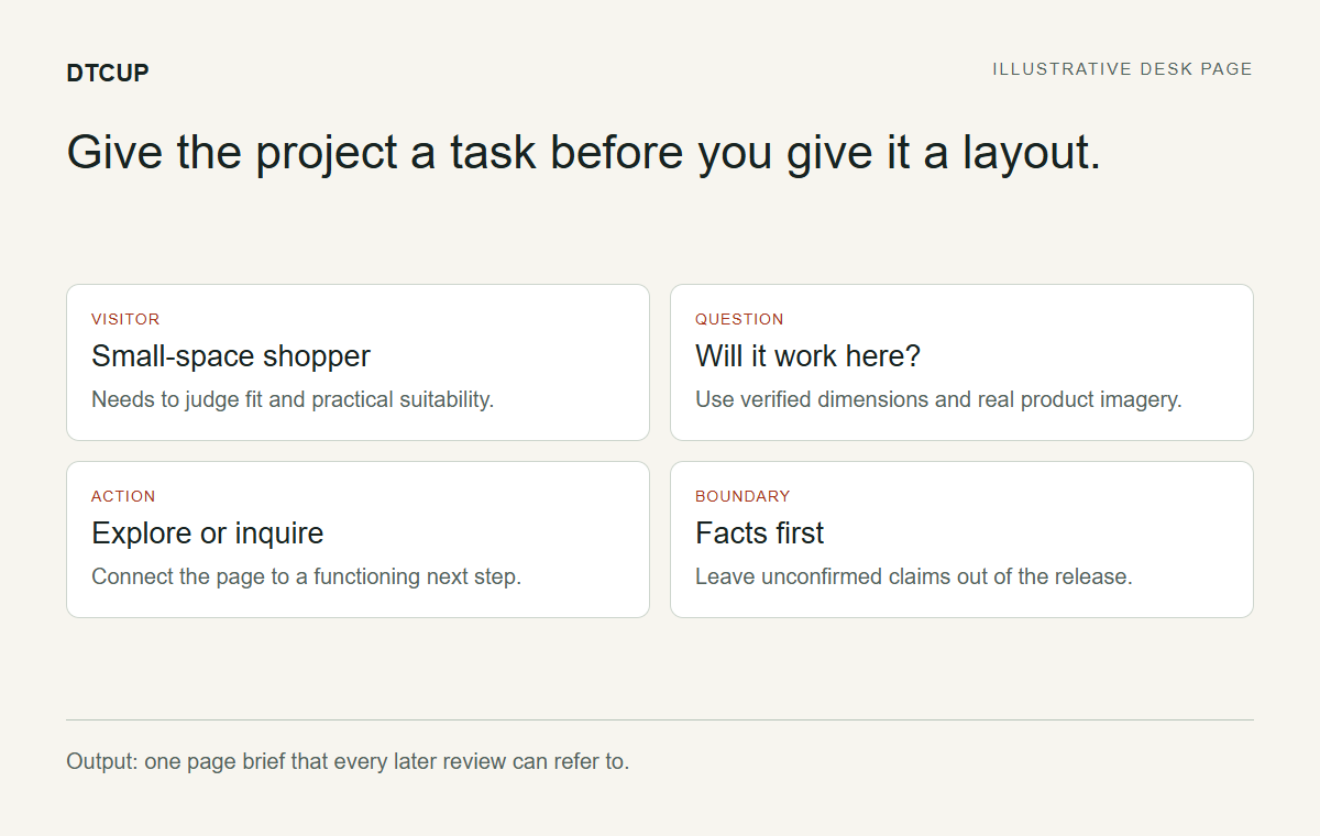
Begin by naming the page you are making. Our studio needs a product-introduction page that helps people decide whether a compact desk fits their space and needs. That is specific enough to guide the work. “A premium digital experience for modern living” may sound impressive, but it leaves the designer wondering whether to draw a desk, a manifesto, or a very expensive gradient.
Name the visitor’s task in practical terms. They need to understand the desk’s dimensions, appearance, useful features, and purchase or inquiry route. The page should help them make a decision, not simply admire the studio’s enthusiasm. Write down the action you expect after the information has done its job.
Then define what this first release will include. Perhaps it introduces one product, explains available information, and connects to an existing commerce page. Perhaps it is a campaign landing page with a verified inquiry process. Keep the scope tied to systems you actually have. A drawn checkout is not a functioning checkout, however politely the button asks for payment.
Assign a page owner who can resolve content questions and a person responsible for implementation. They can be the same person in a small team, but the responsibilities should still be clear. The project will move faster when someone can answer “Is this claim true?” and someone can answer “Does this interaction work?” without assuming those are the same question.
The first handoff is a short page brief: intended visitor, task, next action, scope, and known constraints. This document is not a ceremonial kickoff artifact. It is the reference you will return to when a later design suggestion looks attractive but does not help the page do its job.
Gather the facts before gathering inspiration
Collect the product information from the people or systems that own it. For a desk, that may include verified dimensions, materials, finish options, assembly information, care instructions, and the actual purchase route. Mark anything that is not yet confirmed. An empty field is easier to fix than a confident invented sentence that has already reached three mockups.
Separate facts from proposed copy. “The desk is designed for smaller rooms” is a positioning idea that needs support from dimensions and context. A precise measurement belongs to the product source. A claim about suitability should be reviewed against the actual product and intended use. Do not let polished language blur the distinction.
Create a small evidence sheet with each important fact, its source, and the person who can resolve changes. Keep it close to the design brief. When someone asks for a comparison, the team can see which differences are established and which need research. This is particularly useful when a page is being prepared before every commercial detail is final.
List the assets available now: product photographs, a logo, a brand guide, a model file, and any approved diagrams. Identify missing assets early. If the only image is a rough prototype, label it appropriately in internal work and avoid presenting it as the final product. Asset truth matters more than filling every image rectangle by Friday.
This fact-gathering step makes later AI-assisted design more useful. You can ask for a layout using known content and explicitly prohibit invented specifications or testimonials. The model can help arrange the story, while your source material remains responsible for what the story claims.
Explore the questions a visitor will bring
Use the Query Fan-Out Explorer to explore related questions around the product and task. For our example, a starting topic might concern choosing a desk for a small room. Treat the output as a set of research directions, not a measurement of search demand or a hidden transcript of a search engine’s internal process.
Look for questions that affect the decision. How much surface space is available? What should someone measure before ordering? Where do cables go? What assembly information is needed? Verify which questions apply to the real product. The tool can help broaden the conversation; it cannot establish product facts that the studio has not supplied.
Group the useful questions by the moment they belong in the page. Some belong near the introduction because they determine immediate relevance. Others belong beside product imagery or in a practical details section. A few may deserve a separate guide rather than making the product page carry an entire furniture encyclopedia.
Compare the suggestions with customer inquiries or support questions your business actually receives. If customers repeatedly ask about a particular measurement, that evidence deserves weight. If an exploratory suggestion concerns a feature your product does not have, do not build content around it merely because the phrase sounds searchable.
The output of this step is a prioritized question list with a proposed content location. It becomes the input to the wireframe. This is where research starts paying rent: a question either changes the page, informs another useful resource, or is set aside with a reason. It does not need to become a slide deck that nobody opens during design.
Turn the question list into a reading order
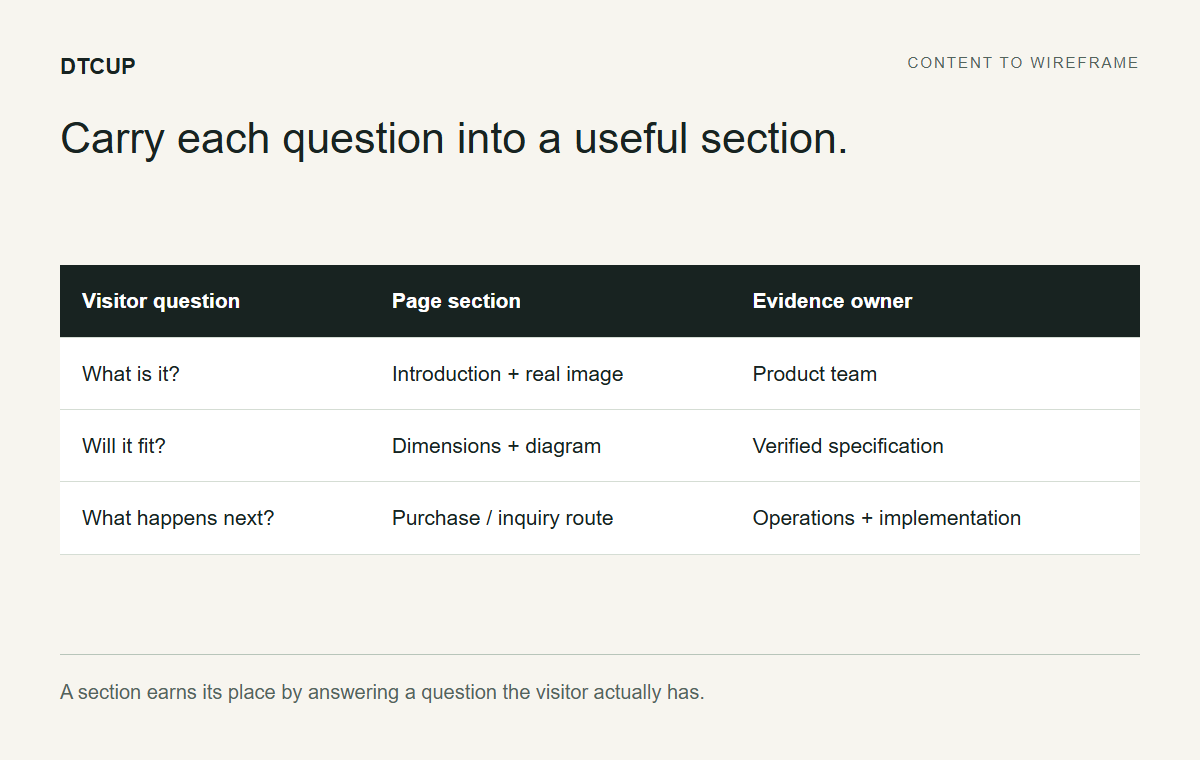
Before drawing detailed elements, arrange the page’s main jobs. Our desk page might begin with the product and its intended context, then show dimensions and usable surface, explain verified details, address practical arrangements, and provide a clear next action. The exact order depends on the offer, but each section should have a reason to exist.
Write a short sentence for each section’s job. “Help the visitor judge fit” is more useful than “cool feature section.” “Explain what happens after inquiry” is more useful than “conversion block.” Functional labels help the team evaluate a design without arguing only about taste.
Identify where proof belongs. A measurement diagram should sit where someone is judging dimensions. A real detail photograph should support the relevant construction point. If evidence is missing, do not fill the space with an invented review. A page can be persuasive through clarity and truthful detail without borrowing credibility from imaginary customers.
Keep the first screen focused. The visitor should understand what is being offered and why the page is relevant. They do not need every technical detail immediately, but they need enough context to continue. A dramatic headline with no product explanation can make a visitor feel as if they arrived halfway through someone else’s conversation.
The reading order is a hypothesis about how to help the visitor. It can change during review. Making it explicit now gives the team something concrete to test instead of treating the first attractive arrangement as inevitable.
Draw a layout that explains your intent
Open Sketch to Website and draw the main sections as labeled shapes. Use the full canvas when you want maximum room, and extend the drawing downward when the page needs more space. You are communicating an arrangement, not competing for a place in an illustration exhibition.
Label the important areas with their actual jobs: product introduction, dimensions, detail image, practical questions, and next action. Add a short note where the relationship matters. For example, keep the dimension explanation beside the diagram on desktop and directly after it on mobile. That note tells the design process more than an unlabeled rectangle ever will.
Use a framework if it helps you begin, then replace its generic content with the page’s priorities. A starter layout is a convenience, not a requirement to include every block. Remove sections that do not support the visitor task. The page does not become more useful simply because the wireframe looks busier.
Add written direction alongside the sketch. Describe the audience, tone, important facts, and boundaries. State that unconfirmed information must remain a placeholder for review rather than an invented specification. If the layout should follow the drawing closely, choose the corresponding direction; if you allow more variation, explain what must still remain clear.
The handoff from this step is a labeled visual brief. A colleague should be able to point at a section and explain what it contributes. If they cannot, revise the labels or arrangement before asking the generation process to interpret the ambiguity for you.
Use brand material and references with specific purposes
Upload the relevant VI or brand guide within the tool’s displayed limits, and add approved brand assets where appropriate. Focus on the parts that matter to this page: color, typography direction, imagery, spacing, and tone. A long manual can contain useful guidance, but it may also contain instructions for packaging or signage that are irrelevant to this screen.
Choose references for particular qualities. One site might demonstrate a clear product-information hierarchy. Another might show restrained typography. A third might provide a useful example of image pacing. Explain which aspect you want to learn from rather than asking for a vague imitation of everything visible.
The reference workflow lets you decide which references are included for generation. Keep those choices deliberate. A page you opened for comparison should not necessarily influence the final design, and an excluded reference should remain excluded. The split workspace can help you draw beside a selected visual reference while keeping brand controls available.
Use explicit capture or uploaded screenshots where appropriate rather than assuming every public URL will render as an interactive embedded website. A static capture is a visual reference, not a functioning copy of the site. Review what it actually shows, especially when comparing desktop and mobile layouts.
For our studio, a good direction might ask for quiet product presentation and clear measurement information while preserving the studio’s approved accent and typography category. It should not ask the model to borrow another company’s claims, product images, or customer reviews. Inspiration can guide the arrangement without becoming a shortcut around factual ownership.
Inspect the product model before it becomes persuasive media
If the studio has a supported model file, open it in the Online 3D Viewer. Inspect the orientation, visible surfaces, materials, and missing dependencies. Rotate and zoom to understand the asset before deciding where it belongs in the page. A model that opens successfully is not automatically a model ready for customer communication.
Look for obvious presentation problems: an awkward default angle, missing textures, a neutral material where a finish should be visible, or geometry that does not match the approved product. If the source format has limitations, note them. Do not compensate by inventing a finish or changing the product’s proportions to make a screenshot more attractive.
For a desk, the useful viewing angle may need to show the surface, legs, and overall depth clearly. The goal is comprehension. A dramatic close-up that conceals the product’s shape may look premium while answering none of the visitor’s questions. Choose media based on the job identified in the reading order.
Keep the media review separate from specification verification. A model can help you see a shape, but the product source remains responsible for dimensions and other factual claims. If a dimension diagram is needed, build it from verified measurements rather than estimating from the viewport.
The handoff is an asset decision: use this file for this purpose, with these limitations, or request a better source. That decision prevents a weak asset from quietly becoming the centerpiece of the page simply because it was the only file somebody could find before the review call.
Generate a design draft and review it against the brief
When the sketch and direction are ready, use the generation flow. Visitors can prepare their work before signing in; generation requires login. Keep a downloadable project for work you want to retain, rather than assuming the drawing has been automatically saved as a cloud project.
Review the generated design against the original visitor task. Does the first screen explain the product? Are the key questions answered in a sensible order? Are unconfirmed facts still treated honestly? Check the layout and the content together. A beautiful page can still be wrong if the copy invents a material or hides the practical information.
Inspect the mobile arrangement, not just a smaller screenshot of the desktop idea. Text, images, and actions need a useful reading sequence when columns collapse. A dimensions section that works side by side may need a different order on a narrow screen. The review should follow the visitor’s task rather than count how many elements fit above the fold.
List a small number of specific revisions. “Move the measurement explanation before the inquiry action” is actionable. “Make it more premium” may need translation into spacing, hierarchy, or image choices before anyone can implement it. Keep the feedback tied to the brief so the project does not become an endless tour of attractive alternatives.
Treat the output as a design draft. Forms, commerce, account behavior, and other backend functions need real implementation and testing. A preview that displays an inquiry form has not proved that an inquiry reaches the correct person. That distinction belongs in the handoff, not in the customer’s eventual error message.
Prototype the interaction that needs a decision
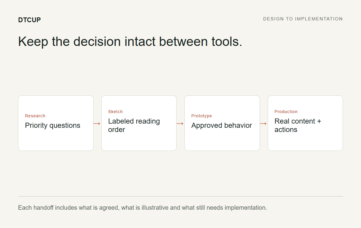
Use the HTML, CSS & JavaScript Editor when a small frontend behavior needs to be tested before integration. Our desk page might need a compact detail switcher or a responsive measurement layout. A focused prototype can make that question concrete without requiring the whole production site to be rebuilt first.
Keep the experiment narrow. Define the interaction, the expected response, and the states that matter. What happens before selection? What changes after it? How does keyboard focus behave? What does the narrow viewport show? A prototype is most useful when it answers a decision rather than accumulating unrelated features because coding is going well.
Use the preview and viewport controls to inspect the behavior at relevant sizes. Remember that fitting a preview into the workspace is a viewing convenience, while changing the viewport width tests a layout condition. A scaled desktop view is not the same thing as a mobile layout.
Read the console and basic checks, then perform manual interaction review. A script that runs without an obvious error can still create confusing behavior. Click, tab, read, and resize. The tool helps you experiment, but the visitor task remains the standard against which the experiment should be judged.
Download the useful prototype and describe what is approved versus provisional. External dependencies still need attention in production, and a frontend demo does not supply commerce or other backend services. Give the implementer a clear behavior to reproduce, not an implied promise that a downloadable HTML file is a complete business system.
Integrate the page into the real website
The production build needs to use the site’s actual navigation, templates, forms, commerce routes, and content system. This is where the approved design becomes a maintained page. Preserve working structures unless the project explicitly calls for changing them. A new landing page should not accidentally redesign the entire footer because the prototype contained a placeholder.
Replace illustrative content with verified assets and final copy. Confirm that the actual buttons go to the intended destinations. Connect forms through the approved backend process and test the resulting messages or records. The interface should reflect real outcomes: submitting, success, failure, and any next step the visitor needs.
Check the page title, headings, canonical URL, and indexability according to the page’s purpose. Write metadata from the actual content instead of copying a neighboring page’s description and changing the product name. Distinctive content deserves a distinct explanation in search and sharing contexts.
Review the page in the live template or a faithful preview. The surrounding header can affect the available space. Global styles can change a control. Third-party elements can cover an action. A component that behaved well in isolation still needs to be inspected in the environment where customers will use it.
The handoff from implementation is a reviewable page with a list of known limitations. Do not call it finished because it resembles the design image. Call it ready for checking when the real content and real interactions are present enough to evaluate.
Use automated findings to build a fix list
Run the Website Page Checker against the public page when it is appropriate to inspect it. Choose the relevant device context and checks. The output can help identify selected SEO issues, a laboratory speed result, and detectable accessibility findings. It is a starting point for prioritization, not a complete audit of every journey.
Read the finding, affected element, and suggested next check. Separate clear defects from items requiring human review. A missing label may lead to a direct fix. A contrast finding may need inspection in context. A speed result should be interpreted with its test environment rather than promoted as a permanent property of the website.
Prioritize by visitor impact and confidence. A broken primary action deserves attention before a minor visual adjustment. An issue affecting the product explanation deserves more urgency than an optional flourish. Keep the list small enough that the team can complete the important fixes and verify them rather than admire a very long backlog.
Perform manual checks alongside the tool. Read the page on a phone, operate it with a keyboard, inspect error states, and follow the actual inquiry or purchase route. Automated accessibility checks cannot certify the whole experience or legal compliance. The page should work for people whose interaction does not resemble your favorite test path.
After a material fix, rerun the relevant check and repeat the affected manual task. You do not need to rerun everything indefinitely when nothing changed. The goal is evidence that the issue was resolved, not a ritual in which the team repeatedly asks the same scanner for emotional reassurance.
Describe the page accurately with structured data
Use the Website Schema Generator when a supported type fits the actual page and publishing context. Start by checking whether the theme or an existing app already produces relevant markup. Adding a second conflicting description is not an improvement simply because the new code is neatly formatted.
Fill the fields with verified facts and review the generated output. For product information, the source of truth should remain the commerce or product system. Do not enter a made-up rating, unavailable price, or assumed availability to satisfy a field. Missing facts require a decision, not creative writing.
Distinguish syntax, structural checks, and eligibility for particular search features. Valid JSON is useful, but it does not prove that every property is appropriate or that a search engine will display a rich result. Follow the current official requirements for the feature you actually intend to support.
If you use a supported Shopify Liquid output, test it in the actual theme and market context. Dynamic code needs to produce correct rendered values, not just look sensible in a preview. Confirm the final page after installation and resolve conflicts with existing markup sources.
The handoff here is an accurate machine-readable description that has been checked in context. It supports the content; it does not replace the visible explanation. If the visitor cannot find the desk’s dimensions on the page, a structured-data block is not a satisfying substitute for the information they came to read.
Review crawler policy without confusing it with a launch switch
Open the AI Bot & Robots Checker for the relevant origin when reviewing public discovery policy. Read the purpose of supported agents and the applicable rules. Search discovery, training choices, and other documented uses should be discussed separately rather than grouped into one vague request to “allow AI.”
If changes are needed, review suggested additions with the complete existing file. Preserve relevant exclusions when adding specific groups, and test representative paths. The generator does not deploy the policy for you, and a fragment should not be pasted blindly over a working configuration.
Keep the conclusion narrow. A permissive policy does not guarantee crawl access, indexing, ranking, or inclusion in an answer. An inaccessible fetch is not proof of a particular policy choice. Use the tool to understand what the file expresses and investigate other layers separately when needed.
For our studio, the public product page may be intended for discovery while operational areas follow different requirements. The policy owner should express that intention accurately. Do not use robots.txt as a security mechanism for private information; access controls belong in the systems responsible for protecting it.
After publishing an authorized change, check the live response again. The evidence should refer to the served file, not only the proposal. This gives the launch team a specific verified statement about policy while leaving downstream visibility to its own observation process.
Coordinate the launch across real calendars
Use the Campaign Time Zone Planner to decide whether the launch happens at one global instant or at the same local clock time in selected markets. Those are different plans. The first coordinates everyone around one moment; the second creates different moments that share a local time.
Enter the source time and review the resulting local times. Check date changes as well as hours. A launch that is Monday afternoon for one colleague may fall on Tuesday for another. The calendar date is not a decorative label, particularly when someone is responsible for answering questions after the page goes live.
Use the country calendar for relevant planning context, including the displayed distinction between confirmed, rule-based, and tentative information. Public holidays and selected retail dates can inform a discussion, but they do not automatically describe your customers’ behavior or your team’s working arrangements. Future official schedules may remain pending in some markets.
Plan preparation and review time as well as the launch moment. Who checks the page before distribution? Who monitors the real inquiry route? When will the team review early observations? A schedule that contains only the exciting publish button leaves the less glamorous work to chance.
Export a calendar snapshot if it helps the team coordinate, while remembering that an export is not a live subscription. If the plan changes, communicate the revised time clearly. The best time-zone conversion in the world cannot rescue a calendar attachment that everyone believes is still current after the meeting moved.
Prepare distribution links that match the plan
Use the UTM, QR & Campaign Link Builder to create the links for the launch routes you control. Keep a shared campaign name where appropriate and distinguish sources and media according to your existing convention. Review any description-based suggestions before copying the final URL.
For our studio, the email announcement, a social promotion, and a showroom card may point to the same page while representing different invitations. Build and verify each link separately. A copied email link does not turn into a social link merely because it appears beneath a different logo.
If the showroom card uses a QR code, choose a durable destination and test the final design in the intended physical placement. The code is static, so plan for the page’s life after the launch week. Include a clear reason to scan, such as exploring the desk’s dimensions or viewing the product details.
Test the actual distributed version of each link. Email software, advertising interfaces, and artwork files can introduce their own mistakes after the builder output was correct. Open the final button or scan the final image and confirm the destination and labels. The last mile of distribution deserves its own check.
Keep the campaign labels focused on the invitation, not private customer information or imagined results. The reporting system needs a clear source story. It does not need a parameter named guaranteed_sales, however motivational that might look in a planning document.
Release with a short list of observable checks
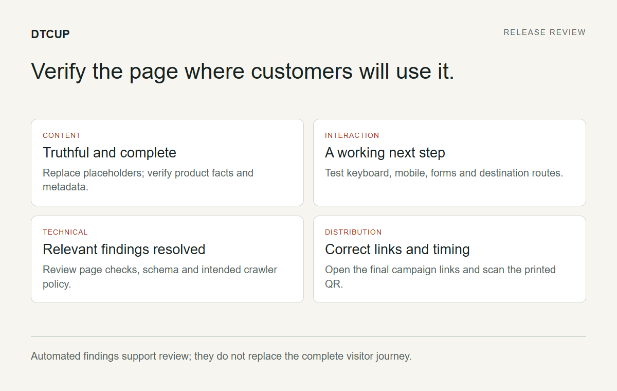
Before publishing, confirm the final content, real actions, mobile reading order, and relevant technical fixes. After publishing, open the actual public URL and repeat the critical path. A preview can be correct while a live cache, redirect, or integration introduces a difference. The release is verified when the real page does what the team approved.
Keep the checks tied to the page’s purpose. Can a visitor understand the desk, find the dimensions, and reach the next action? Does the action complete correctly? Are the campaign links arriving at the right place? These questions are more useful than an undifferentiated checklist of every setting the team has ever encountered.
Confirm the visible metadata and image descriptions in the rendered page. Alt text should describe informative imagery accurately and concisely; decorative images should not be forced into a keyword exercise. The goal is a usable, truthful page, not a competition to repeat the product name in every available field.
Name the person responsible for responding to a release problem and the specific change they would reverse or correct. Keep that operational plan proportionate to the work. A page update needs a clear recovery path, but it does not justify unnecessary copies of unrelated data or a pile of automatic reports.
Then distribute the approved links. The launch message should describe what is actually available, not every feature imagined during the brief. A focused first release with honest boundaries is easier to support and improve than a grand announcement whose most exciting promises still live in a sketch.
Learn from the first evidence without rushing to a verdict
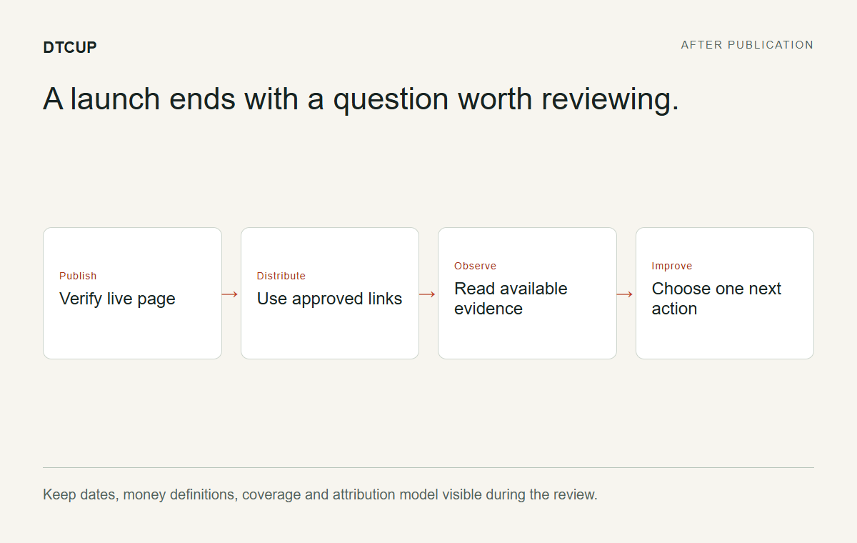
Where sources are connected and available, use DTCUP Intelligence to inspect orders, channels, and retained journey evidence under clear definitions. Align the dates and money measures before comparing results. Read the coverage context and attribution model rather than assuming the first channel table is a complete account of customer influence.
The first review should ask whether the launch operated as intended. Did the invitations reach the correct page? Were there obvious interaction failures? Is the available evidence sufficient to ask a performance question? A small early sample may help identify a defect without supporting a confident commercial conclusion.
If a channel appears in a journey, treat that as recorded participation under the report conditions. Do not automatically call it causal lift. If history is missing, leave the gap visible. The project gains more from an accurate limitation than from a confident story built to celebrate the launch meeting.
Bring the findings back to the original brief. Perhaps the dimensions need clearer placement, or the next action creates uncertainty. Perhaps the content works but the campaign naming needs cleanup. Choose one improvement that follows from the evidence and can be checked after implementation.
This is where the toolkit becomes a repeatable workflow rather than a collection of bookmarks. Research informs the brief, the brief informs the drawing, the drawing informs the build, and the live evidence informs the next question. The connections between steps are what keep the work useful.
Decide what can wait without weakening the first release
A coordinated workflow also needs a way to say “later” intelligently. During the desk-page project, the team may suggest an elaborate configurator, a comparison tool, or an animation that explains every component. Some of those ideas may be valuable. None should automatically delay a clear first page if the essential visitor task can already be completed reliably.
Evaluate each addition against three questions. Does it solve a demonstrated visitor problem? Do you have the facts and implementation capacity to deliver it honestly? Can you verify that it works in the real website? An idea that passes only the first question may belong in a future phase while the team gathers the missing inputs.
Keep the deferred list specific. “Interactive dimension comparison, pending verified measurements and mobile interaction review” is useful. “More wow” is not a scope item; it is a mood. Specific deferred work can be revisited when the necessary evidence or resources become available, without reopening every design decision from the beginning.
Do not defer essential clarity under the name of speed. If the product cannot be understood, the action is broken, or the page contains unverified claims, those are release problems. The distinction is between optional enrichment and the work required for a truthful, usable experience. A smaller complete page is a sensible first release; an incomplete page with a grand roadmap is still incomplete.
This discipline protects both momentum and quality. The team can publish the useful core, learn from real conditions, and choose the next improvement with better information. It also gives future tool sessions a purpose: you open the drawing canvas or prototype editor to answer a named question, rather than to wander around hoping inspiration arrives before the next deadline.
Make the next handoff easier than the last one
At the end of the launch, keep the approved page brief, the final source assets, and the decisions that a future maintainer will need. Separate completed work from ideas that were deliberately postponed. A clear record prevents the next person from mistaking a rejected prototype for the current design direction.
Note which facts need future maintenance, such as commercial details or product instructions. Name the owner rather than relying on the memory of the person who happened to publish the page. Durable websites are maintained by clear responsibilities, not by hoping the original project chat remains searchable forever.
The DTCUP toolkit’s practical advantage is that it supports several connected jobs without pretending any one of them is the whole project. You can draw a clear idea, test a frontend behavior, inspect media, review technical findings, organize launch timing, and label distribution. Use the tools that answer the next real question, and skip the ones that add no value to the current task.
Start with one page and one visitor task. Carry the evidence forward at each handoff, and verify the result where customers will actually encounter it. A good launch does not require every tool to perform magic. It requires the team to stop losing useful decisions between tabs.
Sources
Try a related toolWebsite Tools ↗
Still have a question?Ask the DTCUP Community ↗