
From Campaign Click to the Next Website Improvement: A Toolkit Workflow for Learning
Follow campaign labels, source details and visitor questions into a focused page change. Combine DTCUP tools to test a hypothesis and review results without overstating attribution.

7 years of experience building and operating brand websites, specializing in website development, paid advertising and SEO. Built a brand website from launch to US$10 million in annual sales.
The Short Answer
Begin with something you observed, then form a small hypothesis about what the website could explain or do better. Reconcile campaign labels and reporting context, inspect relevant source evidence, and choose a tool for the specific uncertainty. Implement a focused change and review it under comparable conditions without treating attribution as causal proof.
Key takeaways
- Separate observation, hypothesis and proposed change.
- Choose the smallest response that addresses the uncertainty.
- Keep, adjust or seek more evidence based on what the result supports.
The campaign has launched. The links work. The team has posted a celebratory message containing at least one rocket. Now comes the less photogenic question: what should happen next?
One tempting answer is to change everything that looks imperfect. Another is to wait until a dashboard produces a number large enough to settle the matter. Neither is a particularly reliable learning process. A website improves when the team connects an observation to a plausible problem, makes a focused change, and checks what happened under conditions it can explain.
The DTCUP toolkit can support that cycle. Intelligence helps inspect connected evidence. Research tools help sharpen questions. Drawing and frontend tools make a proposed response concrete. Page checks, schema, and crawler-policy review help verify relevant parts of the implementation. Campaign planning and link tools help keep the next round of activity understandable.
This guide follows an illustrative specialty-food brand reviewing a campaign for a gift collection. The business is fictional, and the examples do not claim measured sales improvements. We will work through a question about whether the landing page explains the offer clearly enough. The aim is to show a disciplined workflow that remains useful even when the evidence is incomplete, the sample is small, and the first idea turns out to be wrong. Especially then, actually.
Start with an observation, not a redesign request
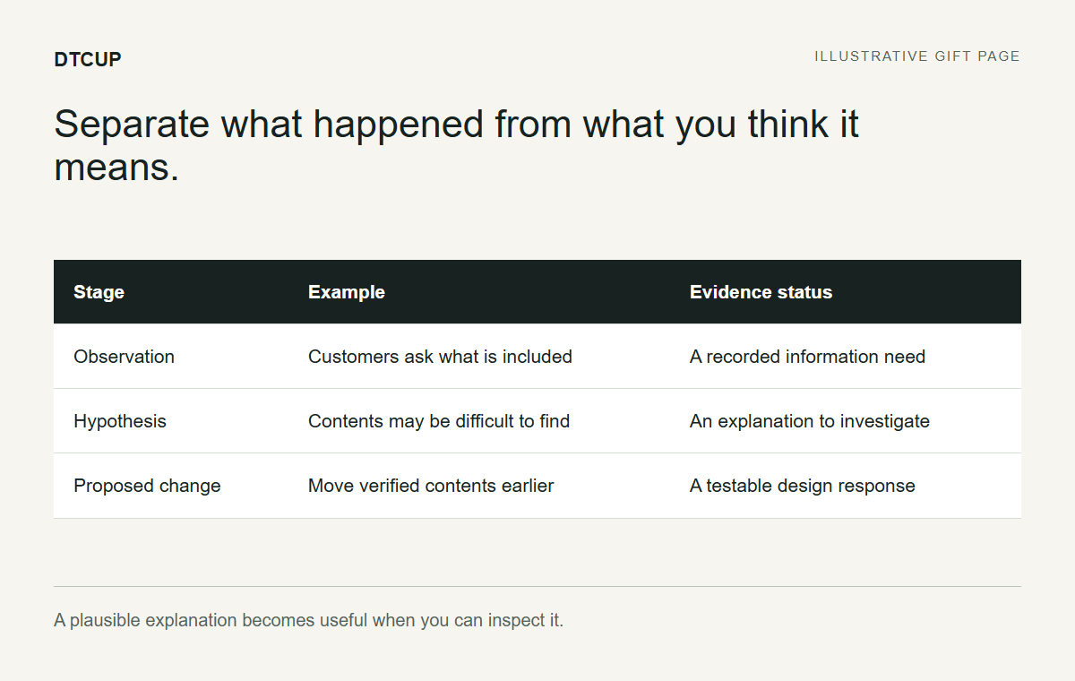
Our example team notices that people are reaching the gift-collection page, but colleagues disagree about whether the page makes the contents and next step clear. That is a starting observation and a design concern. It is not yet proof that the layout is reducing sales or that a new hero section will solve the problem.
Write down exactly what prompted the concern. Was it a support question, a repeated usability issue, a recorded journey, or a change in a defined metric? Separate the direct observation from the interpretation. “Several customers asked what is included” is different from “the page has too much text.” The first is evidence of an information need; the second is one possible explanation.
Avoid beginning with a solution disguised as a question. “Should we make the button orange?” has already narrowed the conversation to color. “Can visitors identify the next step after reading the offer?” leaves room to investigate wording, placement, competing actions, and the offer itself. Better questions often save more work than faster editing.
Give the investigation a boundary. Choose the page, the campaign period, and the visitor task you want to understand. The gift page does not need to become a site-wide redesign project merely because the footer also looks a little tired. Scope keeps the learning cycle short enough to produce a useful result.
The first output is a neutral problem statement: “We need to understand whether the page clearly explains the gift contents and purchase route for visitors arriving from this campaign.” It contains neither a guaranteed diagnosis nor a predetermined design. That leaves the team free to learn something other than what it already wanted to believe.
Verify that the campaign labels describe the real invitations
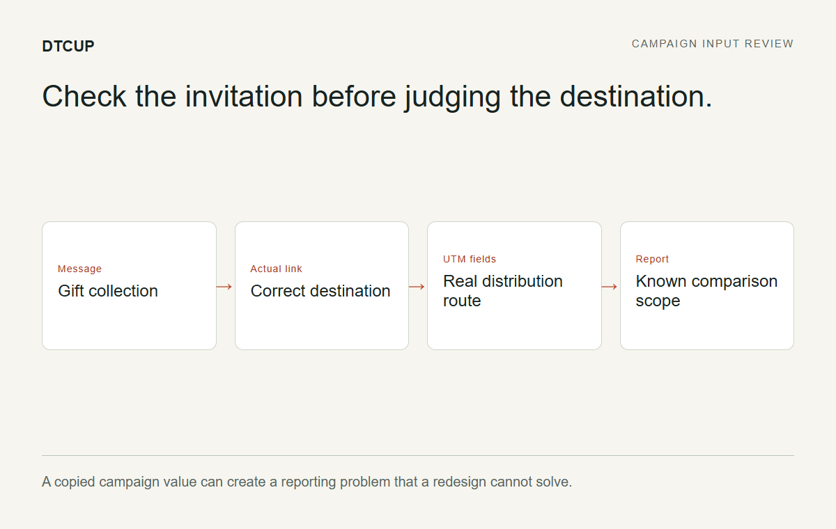
Before interpreting channel differences, inspect the links that were actually distributed. The email button, social promotion, and printed insert may all lead to the same page while carrying different campaign labels. Confirm that those labels match the real routes. A misplaced medium can create a reporting mystery that no amount of landing-page redesign will solve.
Use the UTM, QR & Campaign Link Builder to prepare consistent links for the next round and inspect the meaning of the fields. Source, medium, campaign, and optional content labels should follow an agreed convention. If a copied link retained an old campaign value, record that limitation when reviewing the current data.
Test the actual distributed version, not only the original builder output. Open the link from the email preview, the campaign setup, or the final artwork. A button can be updated visually while still pointing at an earlier destination. This is one of the internet’s less charming magic tricks: the label changes, the problem remains.
For the gift brand, the team might discover that the email and paid social invitations share a campaign name as intended, while their content labels distinguish two creative approaches. That gives the review useful context. If the labels are inconsistent, fix the process for the next distribution and avoid overstating what the existing report can separate.
Do not retroactively pretend uncertain labels were precise. The honest conclusion may be that the current period supports a campaign-level view but not a reliable creative comparison. That is still useful. A limited comparison stated clearly is better than a detailed one built on labels nobody verified.
Align the reporting conditions before interpreting movement
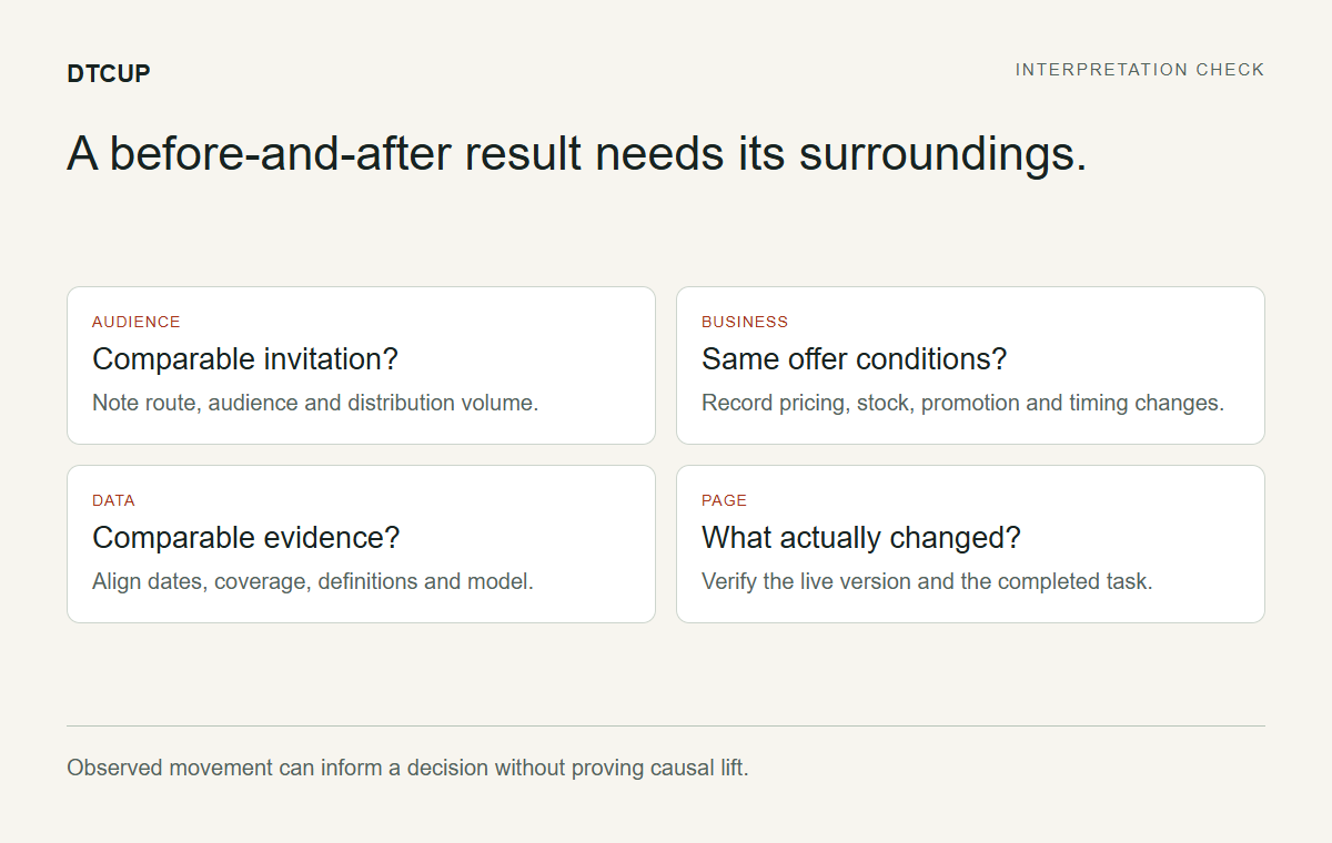
Open DTCUP Intelligence where the relevant sources are connected and available. Confirm the workspace, source, date range, time zone, and selected attribution model. Read the money definition and eligibility context before comparing totals. This is the analytical equivalent of checking that both rulers use the same units.
If you compare periods, ask whether the earlier period has similar coverage. A newer tracking installation can make the current period appear richer simply because more journey evidence exists. An incomplete current day can make a recent period appear weaker. Neither is a persuasive reason to redesign the page immediately.
Note business conditions that changed: the offer, inventory, distribution volume, pricing, market mix, or a major site update. You do not need to explain every variation perfectly. You do need to avoid treating the page design as the only moving part when the campaign context changed around it.
Choose the comparison that fits the question. A previous period can be useful, but it may not be comparable during a seasonal campaign. A same-weekday comparison can help with a different question. Read what the control actually selects and keep the exact interval in the review note so colleagues can reproduce the view.
The result of this step is a defined evidence frame. It tells the team what is being compared and what remains qualified. Without that frame, a chart is easy to admire and difficult to interpret. With it, even a modest amount of data can support a more careful next question.
Follow the channel total into its source detail
If a channel looks unusual, open the details rather than explaining the top-level name from memory. A provider-level channel can contain paid, organic, or unknown traffic types in its supporting medium evidence. The shared channel identity helps keep the interface consistent, but it does not remove the need to read the original source fields.
For our gift campaign, a recognizable provider total may include more than the paid activity the media team is discussing. Inspect the recorded source, medium, and campaign combinations. If a medium is missing, leave it unknown rather than treating every recognizable provider visit as paid. The data does not become more useful when uncertainty is relabeled as confidence.
Where connected provider campaign or ad-group data is available, compare it with the website evidence under clear definitions. Provider conversions and DTCUP’s model-based order credits remain different measures. The point is to understand how they relate, not to force them into agreement through creative arithmetic.
Check whether the apparent problem is a source issue before making a content change. A campaign-name mismatch, unavailable spend, or partial connection can affect the interpretation of a row. The correct next action may be a data or naming correction rather than a new landing page.
This source-first habit is one of the practical benefits of a connected workflow. You can move from the question “Why is this row different?” to the evidence that explains the row. That is more useful than treating the dashboard as a fortune-teller whose answer must be accepted because it arrived in a table.
Inspect a few journeys for questions, not universal truths
Order journeys can help reveal the retained sequence of relevant actions and qualifying touches. Use them to identify questions worth investigating. Do not assume a few visible paths represent every customer or establish what caused a purchase. The sample is evidence of those recorded journeys, not a documentary about the entire audience.
Suppose an illustrative journey includes a product view, a visit to a gift-information page, and a later order. That may suggest the information page plays a useful role. It does not prove that moving the page link will increase orders. There may be several plausible explanations, and some parts of the customer’s experience may not be retained.
Distinguish observed actions from acquisition touches. A page view can provide context without receiving attribution credit. First, last, and assisted roles also have specific meanings that can overlap. Read the labels and model explanation rather than treating every timeline item as an equally weighted marketing event.
If page information is limited or a sensitive path is hidden, do not invent the missing context. Note the limitation and use other appropriate evidence, such as a manual page review or support questions, to investigate the visitor task. A readable narrative is not worth manufacturing a detail that was never observed.
For the gift brand, the useful output might be: “We should inspect how the page explains contents and delivery arrangements because those questions recur in available evidence.” That is a focused design investigation. It remains useful without overstating what the journeys prove.
Ask what the visitor still needs to know
Use the Query Fan-Out Explorer to broaden the question set around the gift-selection task. The tool can help organize related topics and possible content gaps. Treat suggestions as candidates to evaluate, not measured demand or guaranteed search opportunities.
The team might explore questions about what is included, who the collection suits, how it is presented, and what practical arrangements apply. Verify every answer with the real business. Do not turn a generated topic into an invented promise about allergens, delivery, substitutions, or availability. Those facts belong to the product and operational sources.
Compare the exploratory questions with the actual page. Is the answer missing, difficult to find, or simply phrased in a way that assumes too much knowledge? These are different content problems. A missing answer needs verified information. A buried answer needs a clearer location. An unclear answer needs better writing.
Prioritize questions that affect the next decision. If someone cannot tell what the gift contains, a poetic brand story may be less urgent than a clear contents section. The story can still matter, but it should not arrive at the expense of the practical information the visitor needs to choose.
Create a short question-to-section map. Each priority question should have a proposed place on the page and a verified source for the answer. This converts research into an implementable plan and prevents the team from collecting ideas indefinitely as a substitute for improving anything.
Separate a content problem from an interaction problem
A visitor may fail to find information because it is absent, because the layout hides it, or because a control does not work as expected. Diagnose which kind of problem you have before choosing the tool for the next step. Rewriting a paragraph will not repair a broken accordion, and rebuilding an accordion will not supply facts that nobody has written.
Read the page in the same order a new visitor would. Avoid using your internal knowledge to fill gaps. Ask a colleague unfamiliar with the campaign to describe what is included and what they would do next. Listen for hesitation and misunderstandings rather than coaching them toward the intended answer.
Inspect the mobile experience specifically. A contents list that is obvious beside an image on desktop may appear far below the action on a phone. A sticky element may cover the button. A label may wrap into an awkward fragment. These are concrete observations that can be addressed without claiming they explain all performance movement.
Write the problem at the level you observed. “The contents heading appears after the primary action on mobile” is actionable. “Mobile users are impatient” is a broad theory about people you have not interviewed. Useful design work gets easier when the description names the page behavior rather than diagnosing the audience’s personality.
The output is a focused hypothesis: making the verified contents explanation easier to find may help visitors understand the offer before choosing. That hypothesis can guide a sketch and a review without pretending the improvement has already been measured.
Draw the smallest useful response
Open Sketch to Website and draw the affected part of the page. You do not need to redesign the whole website to improve the placement of a contents explanation. A small, labeled sketch can show the proposed relationship between imagery, information, and the primary action.
For the gift collection, the team might place a clear contents summary directly after the introduction, keep a verified product image nearby, and move practical details into a readable sequence before the final action. Label the purpose of each section. The drawing should explain the change, not merely show that the team has discovered rectangles.
Add written direction that preserves the existing brand and factual boundaries. State which information is verified and which details must not be invented. If you add references, choose specific qualities such as spacing or information hierarchy. Do not ask a reference to donate its claims or product imagery to your page.
Use the full canvas or split reference view according to the task. Keep selected generation references deliberate, and retain a project download for work you want to keep. Preparing the sketch is available before login; generation requires the account step. The process should remain clear about what is a draft and what is a functioning website.
Review the proposed arrangement against the hypothesis. Does it make the contents easier to find? Does it preserve a clear next step? Has it introduced new clutter or duplicated information? A good response solves the named problem without creating three unrelated ones as a bonus feature.
Check the media before asking it to explain more
Sometimes the page’s information problem is partly visual. The gift image may not show the included items clearly, or a product view may emphasize atmosphere at the expense of detail. Choose media according to the question it needs to answer rather than assuming the most dramatic image is always the best one.
If a supported product model is available for a relevant item or package, the Online 3D Viewer can help inspect its orientation, visible materials, and limitations. It is a review tool for the asset, not a source of unverified product facts. A neutral or incomplete model should not be presented as proof of the final finish.
For our specialty-food example, real product and packaging photographs may be more appropriate than a model. That is a valid decision. A coordinated toolkit workflow does not require using every tool on every asset. Use the viewer when there is a real supported model and a useful inspection question, such as whether the packaging geometry is presented clearly.
Check that captions and alt text match what the image actually shows. If a photograph is styled with props that are not included, explain the relevant distinction in the product content where needed. Do not let the layout imply that every visible object arrives in the order.
The media handoff should say which asset to use, where it belongs, and what it demonstrates. That keeps the proposed page improvement tied to evidence rather than a general instruction to “make the visuals stronger,” which can mean almost anything and often produces exactly that.
Prototype the uncertain behavior before integrating it
Use the HTML, CSS & JavaScript Editor if the proposed change includes an interaction that needs review. Perhaps the page uses expandable practical details or a compact contents selector. Build the smallest example that lets the team test the behavior at relevant widths.
Define the states before writing the interaction. What is visible initially? What happens when the control is activated? How does the user return? What does keyboard focus do? These questions prevent a prototype from looking finished in one state while becoming confusing as soon as someone actually touches it.
Inspect both the visual editor or source workflow and the running preview as appropriate to the task. Use viewport controls to test the layout, and read console output or basic checks when something behaves unexpectedly. A clean console does not establish a good experience, but an error can provide a useful clue about a broken one.
Keep the prototype separate from production responsibilities. It does not supply real inventory, checkout, or messaging systems. Download the approved frontend example with a short note about what needs integration and what remains illustrative. The next implementer should not have to guess whether the “Order now” button was a real commerce connection or an optimistic rectangle.
If the interaction adds little value, simplify it. A visible contents list may work better than an elegant selector that hides the very information the team wants people to find. Prototyping is allowed to conclude that less interaction is the better answer. That is a successful experiment, not a failure to use enough JavaScript.
Turn page checks into specific implementation tasks
Run the Website Page Checker against the relevant public page to inspect selected SEO, speed, and accessibility findings. Choose the device context that matters to the investigation. Keep the report’s scope in mind: it checks the initial public page and does not perform every possible customer journey.
For each finding, write the affected element and the next verification step. A missing accessible label might lead to a direct implementation task. A speed opportunity may require inspecting the actual asset or loading behavior. A review item may need a person to determine whether the page context satisfies the requirement.
Prioritize findings that affect the visitor task being improved, while addressing clear critical defects. Avoid burying the contents explanation behind a long list of minor cleanup tasks that are easier to count than to value. The goal is a better experience, not a larger ticket collection.
Treat a laboratory speed score as one measured run under stated conditions. Do not use a single change in score as proof that customers experienced the same improvement. Likewise, automated accessibility findings are useful but do not certify legal compliance or complete usability. Manual review remains part of the work.
After implementation, repeat the relevant checks and inspect the actual behavior. If the issue was a hidden button on mobile, verify the button in the real page. A screenshot of a resolved code warning is not the same evidence. Match the verification to the problem you set out to fix.
Keep structured data aligned with the revised content
When the page content changes, review any machine-readable description that depends on it. Use the Website Schema Generator where an appropriate supported type fits the page. First inspect existing markup sources so the new work does not create conflicting duplicates.
For the gift collection, do not invent product offers, ratings, or availability merely because those fields could make the output look more complete. Use verified source information and the right page context. If a fact is dynamic, consider how the actual publishing system will keep it current rather than manually entering a value that becomes stale next week.
Validate the generated code and the rendered page after installation. Syntax, selected structural checks, and eligibility for search features are different questions. A valid block can still describe the wrong thing, and a correct description does not guarantee a particular search appearance.
Keep the visible page useful on its own. Structured data supports interpretation; it does not replace the contents list or practical explanation the visitor needs. If the team finds itself writing more detail into markup than into the customer-facing page, pause and ask where the information belongs.
Record which system owns the markup so future changes have a clear maintenance path. A content editor should not need to discover three separate schema sources by accident while updating one product fact. The learning cycle becomes more sustainable when improvements reduce future ambiguity instead of adding another hidden dependency.
Review discovery policy only when the question calls for it
If the revised content is intended for public discovery, or if the team suspects a policy issue, inspect the relevant origin with the AI Bot & Robots Checker. Read the purpose of the supported agents and the rule explanations. Separate search discovery from training choices and other documented uses.
Do not treat a robots change as a general cure for disappointing campaign results. A paid visitor already arriving at the page has a different problem from a crawler being restricted by policy. The tool is useful when the policy question is real, not as a ritual performed whenever a chart looks underwhelming.
If a change is appropriate, review it against the complete existing file and representative paths. Suggested additions need context, especially when specific groups affect how general exclusions apply. Publishing the fragment blindly can create an unintended policy even when the fragment itself looks reasonable.
Verify the live response after an authorized update. Keep the conclusion limited to what was checked. Policy meaning is not proof of server access, indexing, or selection in an AI answer. The workflow benefits from separating these layers rather than combining them under the appealing but vague heading “visibility fixed.”
For our example brand, the review may conclude that no policy change is needed. That is a useful result. The team can return to the page clarity question instead of manufacturing a configuration task simply because another tool is available.
Schedule the next round so the comparison has context
Use the Campaign Time Zone Planner to coordinate the revised campaign and its review window. Decide whether distribution occurs at one global instant or at the same local time in different markets. Keep that choice explicit so the team can interpret the resulting dates later.
Consult relevant country-calendar context without treating public holidays as a complete forecast of customer behavior. Read the status of future dates and the source coverage. A rule-based date can be useful for planning while still differing from a confirmed official arrangement. Your team’s staffing and customer context require their own judgment.
Avoid changing the page, audience, offer, and distribution timing simultaneously if the goal is to understand the page change. Sometimes business needs require several changes together; when that happens, acknowledge the limitation rather than presenting the outcome as a clean test of one element.
Choose a review point that fits the available volume and decision. An early check can catch a broken action. A later review may provide more evidence about behavior. These are different purposes, and neither should be forced into a fixed schedule simply because the calendar offers a convenient date.
Tell the team what will be reviewed and under which definitions. The schedule should connect to the original question, not merely say “check performance.” A useful review invitation names the page change, the campaign context, and the evidence that could support the next decision.
Decide what success would look like before seeing the result
Write the expected observable improvement in plain language. For our gift page, the immediate usability goal might be that a new visitor can identify the included items and locate the purchase route without guidance. That is a task you can inspect directly. A commercial outcome may require a different measurement approach and more evidence.
Choose a small number of relevant measures or observations. Too many measures make it easy to declare success by selecting whichever one improved. Too few can hide an important tradeoff. Pair the main question with a check for obvious harm, such as whether the new content makes the mobile page difficult to navigate.
Be careful with denominators. Counts, rates, and attributed values answer different questions. If the distribution volume changes, a higher order count may not mean the page works better. If the audience changes, a rate difference may reflect the audience. Keep the basis of comparison visible rather than allowing a percentage to float free of its context.
Define an inconclusive outcome as a legitimate possibility. The sample may be too small, the periods may differ, or data coverage may be insufficient. Deciding in advance that uncertainty is acceptable makes the final review more honest. Otherwise, teams can feel pressured to manufacture a verdict because they scheduled a meeting with a title.
The output is a decision rule proportionate to the evidence: keep the change if it improves the verified task without introducing a material problem, revise if the task remains unclear, and reserve broader performance claims for evidence that supports them. This is more useful than promising a particular sales lift before the first revised page view occurs.
Review the result at the level the evidence supports
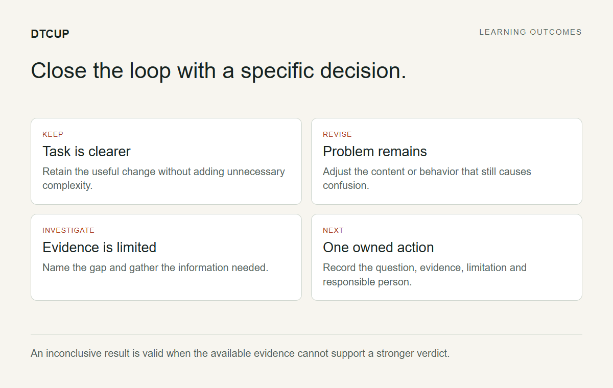
At the review point, return to the same definitions and inspect the actual change. Confirm that the revised page was live during the intended period and that the distributed links reached it. A comparison is difficult to interpret if half the audience saw an older cached version or a different destination.
Look at the primary question first. Can visitors understand the contents and next step more easily in a direct review? Are there new support questions or obvious interaction issues? Then examine available analytics under the selected dates, source coverage, and attribution model. Keep direct usability observations and commercial measures distinct.
If the result is mixed, describe the tradeoff. The contents may be clearer while the page becomes longer. The action may be easier to find while some practical detail needs better wording. A mixed result can lead to a focused refinement rather than an all-or-nothing judgment on the entire design.
If performance moved, consider alternative explanations before assigning credit. Campaign volume, offer conditions, seasonality, and source coverage can matter. A before-and-after comparison can inform a decision without establishing causality. State the strength of the evidence rather than borrowing certainty from the size of the percentage.
For our example team, the conclusion might be to keep the clearer contents section, simplify one interaction, and gather more evidence before changing spend. That is a useful learning outcome. It does not need a heroic narrative in which one accordion single-handedly saved the quarter.
Keep the next action smaller than the next debate
Translate the review into one or two concrete actions with owners. If the content still confuses readers, revise the specific answer. If the interaction causes friction, adjust the behavior. If the evidence is too limited, improve the measurement conditions or wait for an appropriate review point rather than redesigning out of impatience.
Keep a short decision note containing the question, the change, the evidence, the limitation, and the chosen action. This is an intentional record of a decision, not an invitation to automatically save a new report every time someone changes a filter. The useful artifact is the reasoning that a future teammate needs to understand.
When a change works for the task, resist immediately adding complexity. A clear contents section does not need a carousel, animation, and personalization system to justify its existence. Improvements often become less useful when the team treats a successful simple idea as permission to decorate it indefinitely.
If a proposed improvement fails, preserve the lesson without dramatizing the failure. Perhaps the original diagnosis was wrong, or the implementation did not solve the named problem. That information can sharpen the next question. A learning workflow is allowed to discover that the team’s first idea was not the best one.
The tools support this cycle by making each step concrete: evidence, question, drawing, prototype, check, distribution, and review. Their combined value is the continuity of the reasoning. You can see why the next action follows from the previous observation instead of treating website work as a sequence of unrelated opinions.
Close a learning cycle before opening five more
Website teams are excellent at beginning investigations. Closing them requires a little more discipline. Before moving to the next idea, state whether the current question was answered, partly answered, or left unresolved. Name the evidence that supports that status. A task should not remain permanently “in review” because nobody wants to write a conclusion with a limitation in it.
For the gift-page example, the team may establish that the revised contents section is easier to find in direct review, while the commercial comparison remains inconclusive. Those are two separate conclusions and can coexist comfortably. Keep the usability improvement if it is sound, and avoid attaching an unsupported revenue claim to it merely to make the project sound more successful.
Remove obsolete instructions from the next handoff. If the approved version no longer uses a selector, do not leave the old selector prototype presented as current. If the campaign naming changed, make the updated convention easy to find. The next cycle should begin with the decisions you actually made, not a museum of every possibility considered along the way.
Choose the next question based on importance, not novelty. A broken practical detail may deserve attention before an exciting new animation. A recurring customer question may deserve clearer content before another analytics view. The learning process works best when the team follows unresolved visitor needs rather than the newest feature available in its tools.
This closing step is deliberately small: a status, a reason, an owner, and the next question. It gives the work a useful stopping point while keeping improvement continuous. Without it, a website can accumulate endless activity and remarkably little shared understanding of what became better, what remains uncertain, and why anyone changed that button in the first place.
Choose the right tool for the next uncertainty
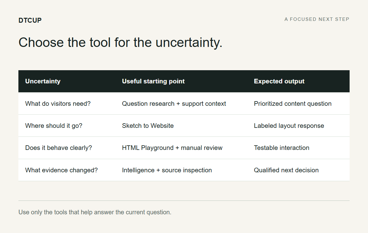
If the uncertainty concerns channel evidence, begin in Intelligence. If it concerns customer questions, begin with research and real support context. If it concerns arrangement, draw. If it concerns interaction, prototype. If it concerns a public page’s technical findings, inspect it. This order is more efficient than opening every tool and hoping one of them announces the answer.
The same discipline prevents overclaiming. The model viewer does not verify product specifications. The schema generator does not guarantee rich results. The robots checker does not promise discovery. The link builder does not prove causality. Each tool becomes more useful when its output is connected to the decision it can actually support.
For small teams, this approach also reduces coordination cost. One person can move through several roles while leaving clear handoffs for themselves. For larger teams, the same artifacts help specialists collaborate without losing context. The research question reaches the designer, the design intent reaches the implementer, and the measurement limitation reaches the person making the business decision.
Start with the next uncertainty that matters to your visitors. Make it specific enough to investigate, choose the tool that helps, and carry the result forward honestly. A better website does not emerge from a dashboard with no questions or a redesign with no evidence. It emerges from a team that learns something useful and then makes the next page a little easier to use.
Sources
Try a related toolWebsite Tools ↗
Still have a question?Ask the DTCUP Community ↗