
Try the Frontend Idea Before the Meeting: DTCUP HTML, CSS and JavaScript Editor
Test a frontend idea with source, visual editing and responsive preview. Learn what the browser playground can demonstrate, how to keep your work and what production still needs.

7 years of experience building and operating brand websites, specializing in website development, paid advertising and SEO. Built a brand website from launch to US$10 million in annual sales.
The Short Answer
The HTML, CSS and JavaScript Editor gives you a focused place to test a frontend idea before integrating it into a real website. Use source and visual editing for content, Preview for styling and behavior, and the console for investigation. Save or download deliberately, and verify backend connections and real devices during implementation.
Key takeaways
- Give a prototype one uncertainty to resolve.
- Preview width helps inspect reflow but is not complete device emulation.
- A working demo interaction is not a connected production service.
Some website discussions would be much shorter if everyone could see the idea. “Make the cards feel lighter” can mean less text, a thinner border, more space or an entirely different color. “The button should do something” is more worrying, because a button that does nothing has already achieved a remarkably specific behavior. Words are useful, but sometimes a small working example is the fastest way to discover whether people mean the same thing.
The DTCUP HTML, CSS & JavaScript Editor provides a browser workspace for that kind of experiment. You can work with structure, presentation and behavior, use a visual editor for content, inspect a preview at selected viewport sizes and download a standalone HTML document. There is no account requirement and no source-code upload to DTCUP. It is a practical place to make a frontend idea concrete before deciding how it belongs in a real site.
The tool is also described as a playground, which is appropriate provided nobody interprets that as permission to put an infinite loop on the slide. It is designed for browser code and small prototypes. It is not a production hosting platform, a Shopify runtime or a backend service. Understanding that scope lets you use it confidently for the work it actually helps with.
This guide follows an illustrative service business preparing a clearer package-selection section. We will move from a simple content structure to a responsive interaction and a useful handoff. The example is a prototype scenario, not a real offer or a claim about a customer’s results. Its purpose is to show how a small experiment can resolve a large amount of uncertainty.
Give the prototype one question to answer
Start by deciding what you need to learn. For the service business, the question might be whether visitors can compare three package types without reading a dense table. That is specific enough to prototype. “Build a better website” is not. A small question keeps the experiment focused and makes it easier to decide when the work is useful enough to review.
Write the expected behavior in plain language. The visitor should see the purpose of each package, identify the relevant option and reach a clear next step. If the prototype includes an expandable detail, describe what appears when it opens. This gives the code a job and prevents the session from turning into an extended investigation of decorative shadows.
Use realistic content lengths without inventing business facts. You can label the packages as illustrative and use example descriptions that fit the intended structure. Do not add fake prices, testimonials or guarantees simply to make the layout feel complete. A prototype can look convincing enough that an invented detail survives into production unless it is clearly marked and reviewed.
Decide what the prototype will not answer. It might not connect to a booking service or submit data. It might use placeholder imagery. Write those boundaries beside the example so that reviewers do not confuse a frontend demonstration with a complete operational feature. A useful limitation is one people can see before they click.
If the overall page structure is still unsettled, begin with Sketch to Website to draw the reading order and main action. Then use the editor for a focused behavior or layout question. The tools support different stages: one helps express the page idea visually, while the other lets you work directly with browser code.
Understand what belongs in each editor tab
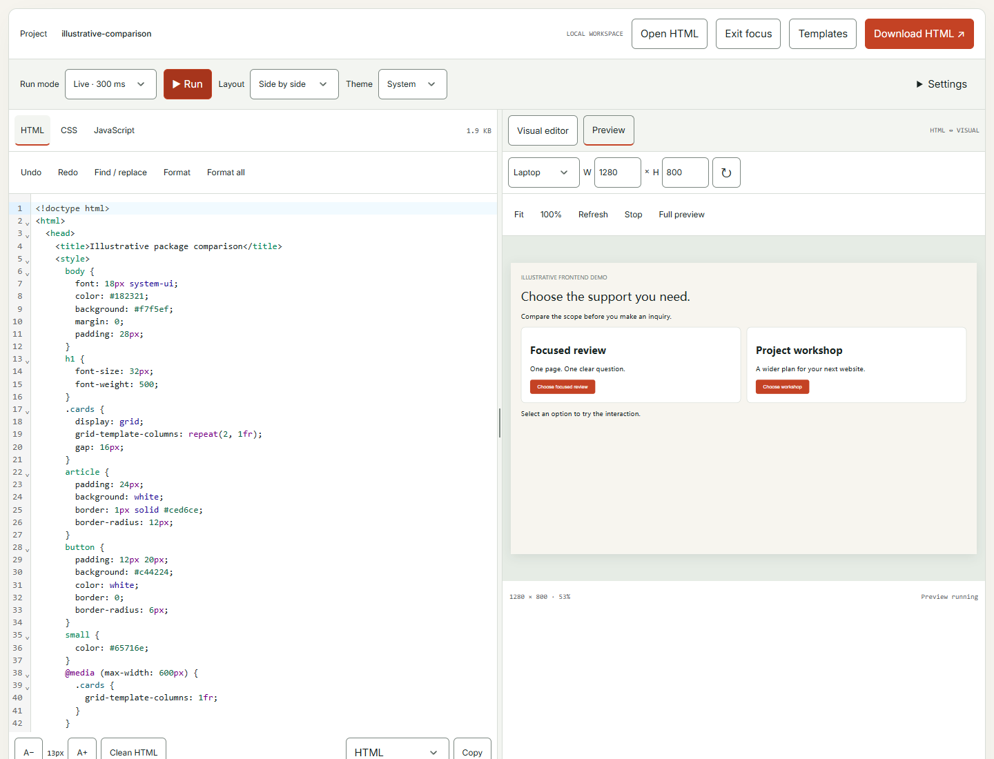
HTML supplies the structure and content. CSS controls presentation and layout. JavaScript adds behavior. The separate tabs help you keep those responsibilities visible while working on one preview. For a package-selection example, the headings and descriptions belong in the content structure, the card arrangement belongs in styling and any interactive change belongs in behavior.
Begin with the HTML before polishing the appearance. Can the content be understood in a sensible order? Are headings descriptive? Is the next action clear? A coherent structure gives you something worth styling. If the prototype is confusing before color is added, color may simply make the confusion more attractive.
Add CSS to support the intended relationship between elements. For example, consistent spacing can make the package descriptions easier to compare. A responsive layout can let the same content remain readable at smaller widths. Keep the initial styling simple enough that you can tell which change produced the effect you are reviewing.
Add JavaScript only when the question needs behavior. A static comparison may not require it. If a detail control needs to expand information, make that interaction explicit and understandable. Avoid adding motion merely because the tab exists. The presence of a programming language in the interface is not a contractual obligation to animate the headings.
Keep the files readable as the example grows. Use descriptive names, consistent formatting and short comments where they explain a decision. The prototype may be temporary, but another person should be able to understand it. Readable experiments make better handoffs and reduce the chance that a reviewer approves behavior nobody can easily locate in the code.
Use visual editing for content and Preview for behavior
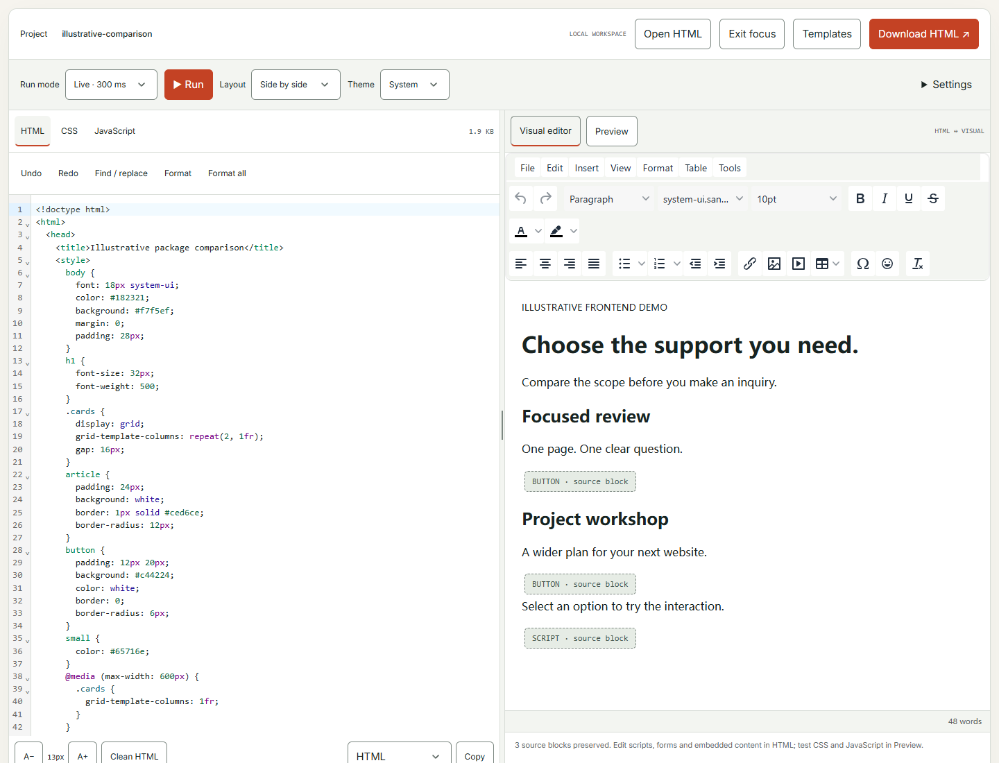
The visual editor lets you type and format content while keeping the HTML source in sync. This is useful when the immediate task is wording, structure or basic formatting rather than an interaction. A non-specialist can work on the visible content, while a developer can inspect the resulting source. Both views refer to the same material, but they are not identical editing experiences.
Visual editing normalizes HTML formatting, and scripts, forms or unsupported blocks are retained as source blocks rather than treated as ordinary visual content. Keep that distinction in mind when opening a more complex document. The visual view is a convenient editing surface, not a promise that every possible HTML construct can be manipulated like a paragraph in a word processor.
Use Preview to test the effect of CSS and JavaScript. A content edit that looks correct in the visual editor still needs review in the actual preview, especially if the stylesheet changes layout or the script modifies elements. The two modes answer different questions: what the content says and how the browser presentation behaves.
For our package section, start by editing the package names and explanations visually if that is comfortable. Then inspect the HTML hierarchy and switch to Preview to review the card layout. This sequence lets the business owner contribute meaningful wording without implying that the finished interaction has been tested merely because the text appears correctly.
After moving between editing modes, verify the part you changed. If the structure is important, inspect the source. If the behavior is important, exercise the preview. A small review after each meaningful edit is easier than discovering at the end that the content and interaction have been making different assumptions for the past hour.
Choose Live or Manual mode to suit the work
Live mode refreshes the preview after a short pause in editing. This is useful for immediate visual feedback while adjusting text, spacing or a small style rule. You can see the effect without repeatedly pressing Run. For simple experiments, that short loop makes it easier to understand the relationship between the code and the result.
Manual mode runs when you choose. Use it when you want to finish a set of edits before executing the code or when you are reviewing unfamiliar JavaScript. It gives you more control over when the preview updates. That does not make unreviewed code harmless; it simply helps you avoid running every intermediate edit automatically.
Keep the run mode visible in your own mental model. If you change code in Manual mode and the preview does not change, the first question is whether you ran it. This sounds elementary, but it is a very common way to spend several minutes debugging a perfectly innocent line of CSS.
For the package prototype, Live mode may be convenient while arranging the cards. Switch to Manual if you are adding a more involved interaction and want to inspect the complete change first. The appropriate mode can change during the session. You do not have to choose one and defend it as a personal philosophy.
After a run, inspect both the visible result and relevant console output. A preview that looks correct at first glance can still contain an error affecting a later action. The editor’s short feedback loop is most useful when you use it to observe behavior deliberately rather than only admire the latest arrangement.
Arrange the workspace so the idea has room to breathe
The editor supports side-by-side, stacked, editor-only and preview-only layouts. Choose the arrangement that fits the current task and screen. Side by side is useful when you want to connect a code change with its effect. Preview only can help a reviewer focus on the experience without being distracted by implementation details.
Use the focus workspace control when you need more working room. A prototype should not have to squeeze into a tiny area while unrelated page content occupies the screen. The purpose is to make editing and inspection comfortable, especially when comparing the structure with the rendered result.
Adjust the balance between editing and preview where appropriate. A code-heavy moment may need more editor width. A layout review may need more space for the preview. This is a working environment, not a fixed screenshot, so let the layout serve the task rather than treating the default arrangement as compulsory.
Theme and text-size choices can make the workspace easier to read, but distinguish the editor’s appearance from the prototype’s styling. Changing the workspace theme is not the same as implementing a dark theme for the page. If the prototype needs a different visual mode, that behavior belongs in the code and needs its own review.
Before sharing the screen in a meeting, choose the view that answers the audience’s question. Show the preview to discuss the user experience, then show the relevant code when implementation matters. Switching intentionally is more effective than asking everyone to interpret a narrow rendered panel beside several hundred lines they did not come to read.
Test responsive behavior with the actual preview width
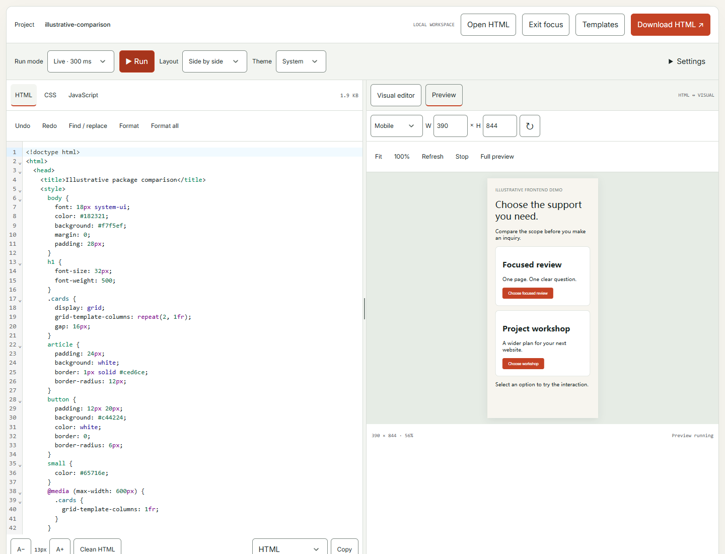
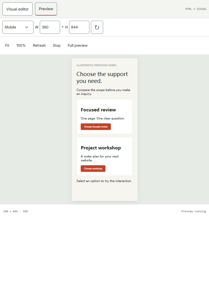
The Preview controls offer device-size presets and custom dimensions. Use them to inspect how the layout responds at different viewport widths. The tool distinguishes the preview’s actual CSS viewport from the scale at which it is displayed on your screen. That distinction helps you avoid confusing a smaller-looking desktop layout with a genuinely narrower responsive layout.
Fit changes the on-screen scale so that the preview can be seen within the available workspace. It does not change the selected viewport width used by media queries. Use the native-size view when you need to inspect the rendered size directly. Read the width and height rather than judging the test only by how large the preview appears in the browser window.
For our package section, inspect whether the cards remain understandable when they stack. Check the order of names, descriptions and actions. A row that looks balanced on desktop may become a long sequence on mobile. The question is not merely whether it avoids horizontal overflow; it is whether a visitor can still compare the options without losing the point.
Try widths between the presets as well. Content can become awkward before or after a chosen breakpoint. Long labels, realistic descriptions and translated text can reveal weaknesses that a short placeholder hides. The prototype is a good place to discover those problems because changing it is still inexpensive.
Remember that viewport testing is one part of responsive review. A production page still needs testing on relevant devices and in its actual environment. Fonts, integrations and surrounding content may behave differently after implementation. The editor helps you inspect the layout logic, not certify every future deployment condition.
Use templates as starting material, not finished products
Templates can help you begin with a structure instead of an empty editor. Open the available choices and select one whose purpose resembles the experiment. Then replace the content and inspect how it works. A template is most useful when it accelerates the first concrete step, not when it determines the entire experience regardless of the brief.
Loading a template replaces the current HTML, CSS and JavaScript after confirmation. Download important work before making that choice. Per-file undo is not the same as a complete project history, and the tool does not provide cloud version backups. Knowing this behavior lets you explore deliberately without relying on a recovery mechanism that is not there.
Treat storefront templates as frontend demonstrations. They do not run Shopify Liquid, provide live product objects or connect a checkout simply because their visual language resembles a store. Replace placeholder claims and use the appropriate development environment when the task moves from a visual example to platform-specific behavior.
For the package prototype, a simple card layout may provide a useful starting point. Remove elements that do not support the comparison. If a template includes decorative sections or unrelated controls, do not keep them just because they arrived together. Editing out unnecessary material is part of making the example fit the actual question.
Before reviewing the prototype, identify what came from the template and what you changed. This helps a developer understand the intended behavior and prevents a reviewer from assuming every visible detail has been consciously approved. A starting point can contain useful ideas without becoming a set of invisible requirements.
Make one interaction understandable before adding another
Choose the smallest behavior that demonstrates the idea. For example, a package detail control could reveal additional information without leaving the comparison. Specify the open and closed states and the text that explains the action. The prototype should make it clear what the visitor can do and what changes when they do it.
Use an appropriate interactive element for the action and review it with the keyboard as well as the pointer. A clickable visual block is not automatically a comfortable control. The editor lets you exercise the behavior, but you still need to assess names, focus and state changes. These details are part of the experience, not optional polish reserved for later.
Keep the information available in a sensible reading order. If the interaction reveals details, the relationship to the selected package should remain clear. Avoid placing the result far away without an obvious connection. A technically working script can still leave the visitor asking whether anything happened, which is not the kind of mystery a service page needs.
Test repeated use. Open and close the details, switch between options and return to the initial state. Look for duplicate output, stale labels or a state that becomes impossible to recover from. Small interactions often fail in the second or third action rather than the first impressive click shown in the meeting.
Once the behavior answers the original question, stop adding features long enough to review it. A prototype can become harder to evaluate as unrelated controls accumulate. The goal is to learn whether this interaction helps the visitor compare packages, not to discover how many buttons can fit inside one card before the card begins to look nervous.
Use the console to investigate what actually happened

The console provides messages, warnings and errors from the preview, with filtering and a clear control. Use it when a behavior does not match your expectation. Read the relevant message and connect it to the action you just performed. An error is evidence about a particular execution path, not a general verdict that the whole idea is broken.
Keep logging purposeful. A short message can help confirm whether a handler ran or which state was selected. Excessive logging makes the useful signal harder to find. The console retains a bounded set of messages, so treat it as a working diagnostic view rather than a permanent record of every experiment.
Clear old output when starting a focused investigation unless you intentionally need to preserve it. Otherwise, a resolved error can remain visible and confuse the next review. When preserving logs, distinguish earlier runs from the behavior you are testing now. The value of a message depends on knowing when and why it appeared.
Change one likely cause at a time when practical. If the package detail does not open, confirm the element and event relationship before rewriting the layout. A systematic investigation teaches you more than replacing several parts at once and hoping the issue disappears. It also makes the eventual explanation easier to share with a developer.
When you ask for help, include the smallest relevant code and the steps that reproduce the problem. The standalone download can be useful for this purpose. A recipient who can open a focused example has a better starting point than someone receiving a screenshot of an error beside the message “It was working earlier.”
Use basic checks without mistaking them for a full audit
The Problems area flags some parser issues, duplicate IDs and missing image alt attributes. These checks can catch useful mistakes during a prototype session. Review what they identify and inspect the relevant code. A simple structural correction may resolve a confusing behavior or make the example easier to understand.
The checks are deliberately basic. They are not a complete standards validation, security review or accessibility certification. A prototype with no listed problem can still have unclear content, poor contrast or an interaction that needs manual work. Use the checks as one source of feedback rather than a final approval stamp.
For our package example, a duplicate ID might help explain why an interaction targets the wrong element. A missing image description might remind you to decide whether a visual is informative or decorative. Those are useful prompts, but the right correction depends on the role of the element and the intended experience.
After implementation on a public page, the Website Page Checker can provide a broader initial inspection of technical SEO, laboratory speed and supported accessibility findings. That is a separate stage with its own limits. The prototype and the deployed page deserve different checks because they exist in different contexts.
Keep acceptance criteria tied to behavior. Can a visitor understand the options, operate the control and recover from a mistake? Does the content remain available at the intended widths? A quiet Problems panel is welcome, but the prototype earns approval by answering the user-facing question it was built to investigate.
Be deliberate with external resources
Your source code is not uploaded to DTCUP, but resources referenced by that code can load from their own hosts. Images, fonts and network requests have their own behavior. If you include an external URL, understand that the browser may contact it. Local editing does not mean every resource used by the preview is local.
Use assets you are authorized to use and keep the prototype’s requirements proportionate. An example designed to compare package wording probably does not need several remote libraries and a large video. Fewer dependencies make the experiment easier to open, explain and hand off. They also reduce unrelated reasons for the preview to behave differently between reviewers.
Requests remain subject to browser and sandbox restrictions, including the external service’s access rules. DTCUP does not proxy requests simply to make them succeed. If a request fails, investigate the actual requirement rather than assuming the editor should bypass it. A prototype may need a local illustrative response until the real integration is built in an appropriate environment.
Keep illustrative data clearly separate from operational data. If you show a sample availability state, label it as a demonstration. Do not make a fake successful booking look like a real submission. The interface may be convincing, but the purpose is to explain behavior, not to create evidence of a transaction that never occurred.
If the prototype relies on a model, inspect the supplied asset first with the Online 3D Viewer. That can help establish whether the file renders as expected before you investigate how it belongs in a larger interface. Asset review and integration review are related tasks, and separating them often makes debugging less speculative.
Respect the boundary between preview and production
The preview runs in a sandboxed frame that separates it from the main DTCUP page. It does not receive the same-origin access needed to read the parent page, its cookies or storage. Certain actions, including form submission and top-level navigation, are restricted. These boundaries are part of why a prototype should be evaluated as a preview rather than a fully connected application.
Sandboxing does not give a script unlimited computing resources. Heavy code or an infinite loop can still freeze a browser tab. Use Manual mode when inspecting unfamiliar code and keep the experiment small. A responsive preview can be stopped; a frozen tab may need to be closed. There is no benefit in demonstrating that your loop is extremely committed to its work.
Do not put secrets or production credentials into a frontend prototype. Browser code is not the right place for private server credentials. If the proposed feature requires authenticated operations or private data, describe the interface and move the integration work into the appropriate development environment. The editor can help clarify the experience without pretending to supply the entire system behind it.
For Shopify work, test Liquid, theme objects, platform APIs and checkout behavior in their actual supported environment. A storefront-shaped HTML example does not execute those features. The prototype can show the desired arrangement and interaction, while the implementation plan identifies what needs platform-specific development and verification.
This boundary is an advantage when used well. The editor lets you make a small decision without touching a live storefront. It gives the team something concrete to discuss before committing to integration work. The next step becomes clearer because the prototype demonstrates the intended experience and states what remains unconnected.
Keep your work in a form you can reopen
The editor can retain a draft in the browser’s local storage when that storage is available. That is not a cloud account or a cross-device project library. Clearing browser data or moving to a different device can remove access to the local draft. Download important work instead of relying on the browser to remember it indefinitely.
Download HTML creates one document containing the HTML, CSS and JavaScript. External resources remain external, so the file may still need a network connection for those resources. Open the downloaded file and inspect it before using it as a handoff. A file that exists is not necessarily a file that contains the exact state you intended to share.
Use a clear project name and a short accompanying note. Explain the prototype’s purpose, the tested behavior and the parts that are illustrative. This helps the next person distinguish the intended feature from incidental styling or example content. The exported code should not have to communicate every project decision by itself.
When opening an existing HTML file, review how its content and resources appear in the workspace. Do not assume that every environment-specific behavior will be reproduced. If the file depends on a server or platform runtime, identify that dependency instead of treating a browser-only preview as a complete execution environment.
Keep only the artifacts your workflow needs. The tool does not offer a project version history or cloud backups, and your handoff should not imply otherwise. A deliberate download at a meaningful milestone gives you a concrete output without turning a small experiment into an uncontrolled collection of files named final, final-new and final-actually-this-one.
Use formatting and cleanup with a specific purpose
Formatting can make source easier to read without changing the intended behavior. Use the format controls when consistent indentation helps you understand the structure. Then inspect the result. Clean code presentation is useful during a review because it lowers the effort required to find the relevant element or rule.
The HTML cleanup feature offers choices about what to remove, such as certain imported attributes, comments, inline styles, classes or empty elements. These choices have consequences. Removing a class can affect styling or behavior; removing an inline style can change appearance. Select cleanup options according to the problem you are solving rather than treating every removable item as unnecessary.
For content pasted from another editor, cleanup may help reduce unwanted formatting. Review a small representative section first. Confirm that the meaningful structure remains and that the preview still communicates the content correctly. The goal is a clearer document, not the smallest possible number of characters regardless of what they were doing.
Use undo when a cleanup result does not match your intention, and keep a downloaded copy before a substantial replacement. Per-file editing controls are useful, but they do not replace a complete project history. A careful workflow makes experimentation comfortable because you know what you are changing and how you will retain important work.
If the code is being handed to a developer, avoid cleaning away information they need without discussion. A comment explaining an unresolved integration may be valuable. A class name may represent a planned component relationship. Readability includes preserving useful meaning, not merely making the source look unusually tidy in a screenshot.
Turn a prototype review into a decision
Ask reviewers to complete the task the prototype was built for. In the package example, have them identify the option that suits a stated need and explain what they expect the next action to do. Observe where they hesitate. This is more useful than asking only whether they like the design, which often produces opinions about colors before anyone has understood the comparison.
Separate observations from interpretations. “The reviewer did not notice the detail control” is an observation. “We should make every button orange” is a proposed response. Keep the relationship visible so that the team can test a focused improvement instead of treating the first design suggestion as the only possible solution.
Record the decisions that survive the review. Perhaps the comparison needs shorter descriptions, a clearer primary action or an always-visible key detail. Update the prototype accordingly and recheck the task. You do not need a complete production build to learn whether the revised arrangement communicates better in the inspected scenario.
When content questions remain, use the Query Fan-Out Explorer to investigate related reader needs. Evaluate those suggestions against actual customer knowledge. The goal is to improve the explanation inside the interface, not to attach a long list of generated questions to a component that only needed one clear sentence.
End the meeting with an outcome: proceed to implementation, revise a specific part or stop because the approach does not solve the problem. A prototype is successful when it supports a better decision, including the decision not to build something. Avoid measuring its value solely by whether it eventually appears on the live website.
Prepare a handoff that connects code with intent
Give the implementer the downloaded example and a short explanation of the approved behavior. Identify the main states, the responsive expectations and the content that is still illustrative. List integrations that remain to be built. The developer should not have to guess whether a nonfunctional button is a deliberate prototype boundary or an overlooked requirement.
Explain which visual details are requirements and which are provisional. The package layout might need a specific reading order while the exact spacing remains open to the site’s existing design system. This distinction helps the implementation fit the real website without accidentally changing the decision the prototype was meant to preserve.
Include semantic and content expectations. If the section needs an understandable heading hierarchy or meaningful link labels, say so. Where accurate structured data belongs on the final page, the Website Schema Generator can support that separate task. The markup should reflect real visible content rather than the prototype’s placeholder claims.
Coordinate review and release dates with the Campaign Time Zone Planner when the work involves people in different locations. Agree on the actual review moment and the preparation deadline. A prototype shared five minutes before an international launch is unlikely to receive the thoughtful discussion it deserved.
Keep the handoff focused on the user-facing outcome. The code is useful evidence, but the intended experience is the reason for the work. A clear explanation lets the implementer choose an appropriate production approach while preserving the important behavior. That is better than requiring every exploratory line to survive unchanged simply because it happened to work in the first demo.
Leave a useful stopping point for the next session
Before closing the editor, write down the one question the next session should address. Perhaps the package descriptions are now clear, but the expanded state still needs a mobile review. Perhaps the interaction is agreed and only the production integration remains. A precise stopping point saves you from reopening the file later and spending twenty minutes rediscovering why a particular element is bright pink.
Remove temporary diagnostic output that would confuse the next reviewer, or label it clearly if it still serves a purpose. Keep any unresolved behavior visible in the handoff note. The goal is not to make the prototype appear more finished than it is; it is to make its actual state easy to understand.
Download the current example and open it once to confirm that it represents the intended stopping point. Then separate the agreed decisions from remaining questions. This makes the prototype a useful project artifact even if nobody returns to the editor immediately. The work has produced a clearer answer and a defined next step, rather than only a browser tab everyone is afraid to close.
Review the deployed experience as a new context
Once the feature is implemented, inspect it on the actual page. Surrounding styles, scripts, fonts and content can affect the result. Test the agreed task again at the relevant widths and with the required input methods. A successful prototype reduces uncertainty; it does not remove the need to verify the finished integration.
If the page’s discovery settings are part of the release, inspect the declared rules with the AI Bot & Robots Checker. Keep that work distinct from testing the interaction. A functional component and a correctly intended crawl policy answer different questions, and both need the right evidence.
Use the UTM, QR & Campaign Links tool when the new page or section is promoted through a campaign. Test the finished links against the live destination. The measurement convention should match the campaign plan so that later review does not depend on deciphering several inconsistent names for the same activity.
Where connected sources permit, DTCUP Intelligence can support questions about activity around the released experience. Do not infer that a change in attributed orders proves the prototype’s design caused it. Use appropriate evidence, account for other changes and distinguish an observed association from a demonstrated effect.
The editor’s advantage is the short route from an idea to something you can inspect, change and share. Visual editing, source tabs, responsive preview and a portable download make that route accessible for small frontend experiments. Use it to settle one useful question at a time, and the next meeting can begin with a working example instead of fifteen different interpretations of the word lighter.
Sources
Try a related toolHTML, CSS & JavaScript Editor ↗
Still have a question?Ask the DTCUP Community ↗