
Sketch a Campaign Landing Page That Gives Visitors a Clear Next Step
Plan a campaign page around message match, product evidence and one useful action. Use a travel-bag example to sketch, brief, review and hand off a focused landing page.

7 years of experience building and operating brand websites, specializing in website development, paid advertising and SEO. Built a brand website from launch to US$10 million in annual sales.
The Short Answer
A campaign landing page should recognize the promise that brought the visitor there and provide a clear route to the next step. Draw that route before generating a design. Use verified product evidence, a specific brief and a mobile review, then connect the implemented page with deliberate campaign links and an appropriate measurement plan.
Key takeaways
- Match the landing headline to the real invitation.
- Place evidence beside the question it answers.
- Keep launch timing, destination checks and campaign labels in the handoff.

The advertisement is ready. The email has a subject line everyone can live with. The campaign calendar contains a launch date, which makes the whole project feel reassuringly official. Then someone asks where the traffic should go. After a short silence, the team selects the homepage, because it already exists and has never complained about extra responsibility.
Sometimes the homepage is a good destination. Sometimes it asks visitors to reconstruct the campaign they just clicked through from. They saw a specific promise, but arrive at a general introduction, a navigation menu and a photograph that has been doing heroic work since last spring. The visitor now has to find the offer again. Not everyone wants a treasure hunt before breakfast.
A campaign landing page gives that promise a more deliberate destination. It can explain the relevant offer, answer the questions that stand in the way and make the next action clear. Drawing the structure first helps the team decide what belongs on the page before visual polish makes every block feel too precious to remove.
With DTCUP Sketch to Website, you can draw a rough campaign layout, add direction and brand material, generate a design preview and review it at different widths. This guide explains how to use that process for a focused landing page. The example is an illustrative launch for a modular desk organizer, not a real customer campaign or a claim about conversion results.
Define the campaign promise before drawing the page
Start by writing what the visitor has just been told. Perhaps the advertisement introduces a modular organizer for small desks and invites people to explore the launch collection. The landing page should make that connection obvious. If the first screen talks about an unrelated brand story, the visitor has to decide whether the click took them to the right place.
Write the intended audience as specifically as the campaign allows. “People arranging a small home-office desk” gives the design more direction than “everyone who likes products.” The page can lead with the space problem, show the organizer in use and explain the available configurations. A different audience, such as office procurement teams, may need different information and a different action.
Identify the main action. Is the visitor choosing a product, joining a launch list, requesting a sample or reading a detailed comparison? These are not interchangeable outcomes. A page inviting a purchase needs different supporting information from a page inviting an expression of interest. The button label should describe the action honestly.
List the campaign conditions that must be clear. Availability, pricing, eligibility and timing should come from confirmed business information. If the details are not final, keep them provisional in the project. A countdown and a confident headline do not make an unconfirmed offer ready. They merely give uncertainty a more energetic wardrobe.
Now write a one-sentence page brief: “Help people with small desks understand the modular organizer, compare the relevant configurations and continue to the product they want.” This sentence becomes a reference for every section. If a proposed block does not help that visitor or action, ask why it belongs on this particular page.
Map the questions between the click and the action
A visitor may like the idea of a product while still needing practical answers. How large is it? What fits inside? Can the pieces be rearranged? Which configuration is appropriate? What information is available about materials and care? The landing page should answer the questions relevant to the decision, rather than assuming that interest and readiness are the same thing.
Gather those questions from actual product knowledge, customer conversations and available research. The Query Fan-Out Explorer can help expand a topic into related questions and possible content directions. Use the output as a prompt for investigation. It does not establish that every suggested question has meaningful demand or that your product satisfies every imagined requirement.
Group the questions by timing. Some are needed before the main action, such as the basic function and relevant dimensions. Others can be answered on the linked product page or in a supporting guide. Some are not relevant to this campaign at all. A focused page should be helpful, but it does not need to become the complete encyclopedia of desk ownership.
Turn the essential questions into content jobs. “Show the organizer on a small desk.” “Explain the modular arrangement.” “Compare the available configurations.” “Provide a clear path to the relevant product.” This gives the sketch a structure grounded in the visitor’s decision rather than a list of fashionable section types.
Keep objections separate from imaginary persuasion. If people need to understand dimensions, show accurate dimensions. Do not replace that information with a vague claim that the product is “perfect for every space.” Specific answers are often more useful than louder reassurance. They also make the page easier to review because the team can verify what it says.
Decide what the landing page should leave out
Campaign pages often become crowded because every team sees the launch as an opportunity to add one more message. The product team wants the full feature list. The brand team wants the origin story. The content team wants three articles. Someone wants a newsletter box because it was in the previous template and nobody knows why. The page slowly becomes a committee with a scroll bar.
Use the brief to make choices. The origin story may belong if it explains a meaningful product decision. A detailed article may be a useful secondary link. A generic subscription block may distract from the primary action if the campaign already asks visitors to make a different commitment. Each element needs a reason beyond its availability.
Do not remove essential navigation or practical information mechanically. A focused page still needs to help visitors understand where they are and access information they reasonably need. The right amount of navigation depends on the task and the broader site. Focus is about hierarchy and relevance, not trapping the visitor in a page with no useful exits.
Avoid repeating the same promise under several headings. A feature section, a benefit section and a “why us” section may all be useful when they contribute different information. If they all say the organizer makes a desk tidier, the page is spending a lot of space agreeing with itself. Combine repetition and use the room for a concrete explanation or visual.
Write a short exclusion list for the project team. For example: no invented reviews, no unconfirmed discount, no unrelated product range and no countdown without a confirmed time rule. These boundaries keep the generated preview from looking more complete by adding material that the campaign cannot support.
Draw the first screen around recognition
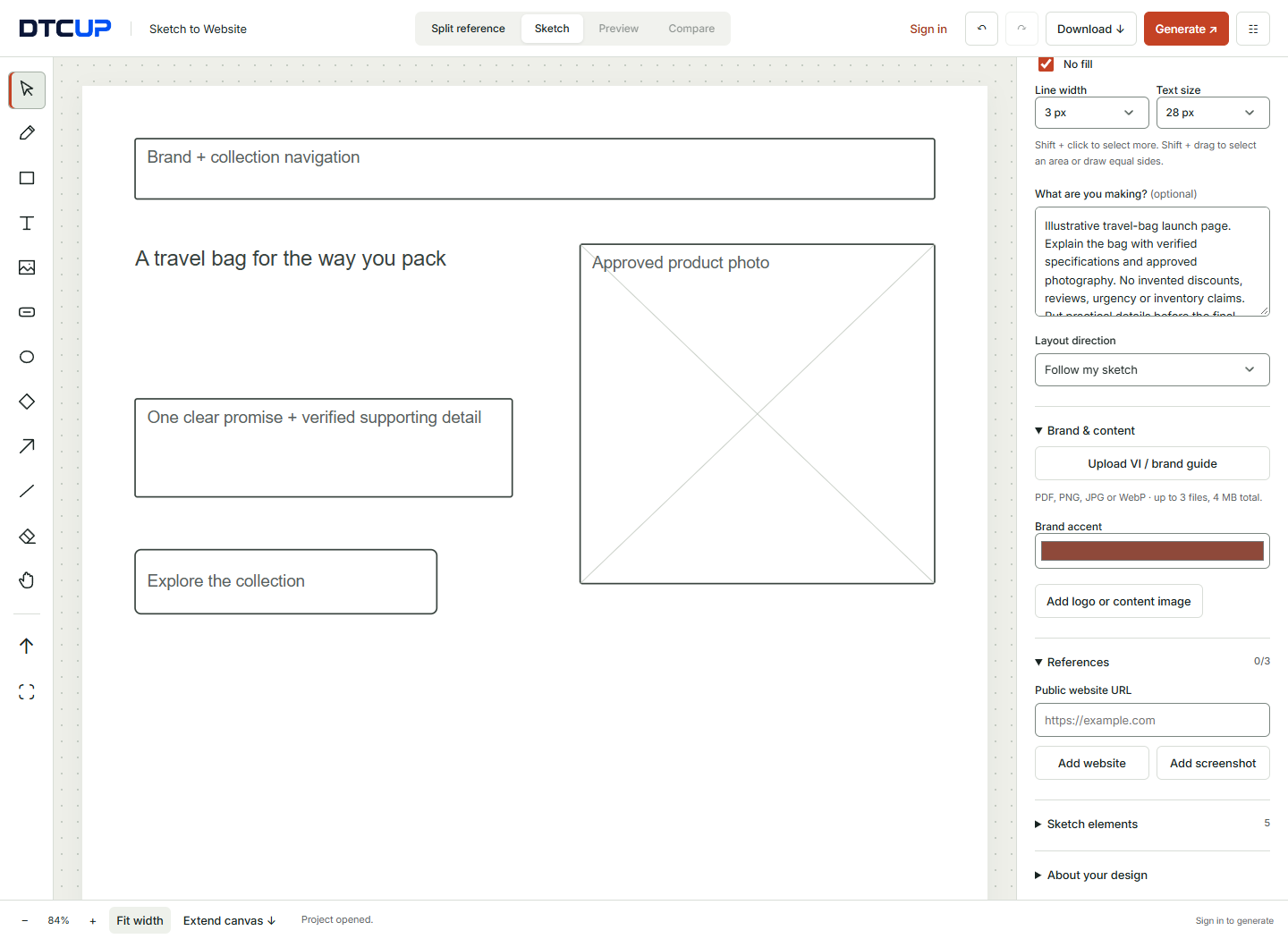
The first screen should confirm that the visitor has reached the destination promised by the campaign. Draw a heading that describes the same idea as the advertisement, a relevant product visual and a clear next step. You do not need identical wording everywhere, but the relationship should be obvious without a detective’s notebook.
For the organizer example, the heading might describe a flexible arrangement for a compact desk. Beneath it, a short explanation can identify the product and the available choice. Use working copy that is accurate enough to guide the layout. Placeholder phrases that sound impressive but explain nothing make it harder to judge whether the first screen works.
Draw the image region with its purpose in mind. If the main question is whether the organizer fits a small workspace, an authentic in-context photograph may be more useful than a dramatic isolated crop. Label what the image should show and any details that must remain visible. Product proportions should not change simply to make the composition more convenient.
Place the primary action near the information that makes it sensible. “Explore configurations” is different from “Buy now.” Choose the label that matches the next real step. If the preview shows an action that will eventually link to a product selection, record that requirement in the handoff. A generated button can communicate the idea before its actual destination is implemented.
Include only the supporting details needed at that point. A short, confirmed availability note may help. A row of unrelated badges may not. The first screen should create understanding and direction. It does not need to prove every possible advantage before the visitor has even learned what the product is.
Show the product before asking the copy to perform miracles
Some product questions are easier to answer visually. A diagram can explain how modules relate. An accurate photograph can show the scale relative to a desk. A sequence can illustrate a simple configuration change. Choose the visual format that clarifies the question instead of expecting a paragraph to do the work of an image while also sounding charming.
If you have a suitable 3D asset, inspect it with the Online 3D Viewer before planning an interactive product section. Check the shape, orientation and material appearance from more than one angle. The file should support the explanation you want to give. A model with missing or misleading details is not improved by placing it in a larger section.
Do not assume that using a 3D asset is always the best choice. A clear still image may answer the visitor’s question faster. An interactive presentation may be valuable when rotation reveals an important relationship or feature. Decide based on what people need to inspect, not on whether the team would enjoy telling everyone that the page has a 3D viewer.
Label sample visuals clearly in the design process. If the final image is not ready, identify the placeholder and describe its intended content. The preview may look convincing enough that people forget the asset is provisional. Keep a list of materials that must be replaced or approved before launch.
Review images alongside the copy they support. A caption or nearby sentence can direct attention to the relevant detail. Avoid asking the visitor to infer a technical claim from a photograph alone. The best combination is an honest visual and a short explanation that helps the reader understand what it demonstrates.
Build a comparison that helps people choose
If the campaign includes several configurations, draw a comparison section around meaningful differences. For the organizer, those might be confirmed dimensions, included modules or intended use. Do not fill the table with identical benefits simply because a table looks reassuringly analytical. A comparison is useful when it reduces uncertainty about a choice.
Give each option a clear label and the same kinds of information. Inconsistent detail makes comparison harder. If one card lists dimensions, another lists a slogan and a third lists a color, the visitor must perform extra work to establish the relationship. Use a structure that lets them scan the actual differences.
Avoid presenting an unsupported “best” option as a universal recommendation. You can explain which configuration fits a stated need when the product facts support it. “For a narrower workspace” is a context. “The smartest choice for everyone” is a claim in search of evidence. Useful guidance respects differences between visitors.
Plan how the comparison behaves on mobile. A wide table may need a different presentation or a deliberate horizontal interaction. The important labels and differences should remain understandable. Do not assume that shrinking the desktop table will produce a readable phone experience. Review the actual smaller layout after generation and again after implementation.
If the comparison needs a specific frontend behavior, try a focused prototype in the HTML, CSS & JavaScript Editor. Use representative content and test the behavior you are considering. The experiment should answer a concrete question, such as whether the option labels remain clear when cards stack or whether a disclosure reveals the necessary details.
Place proof where it answers a real concern
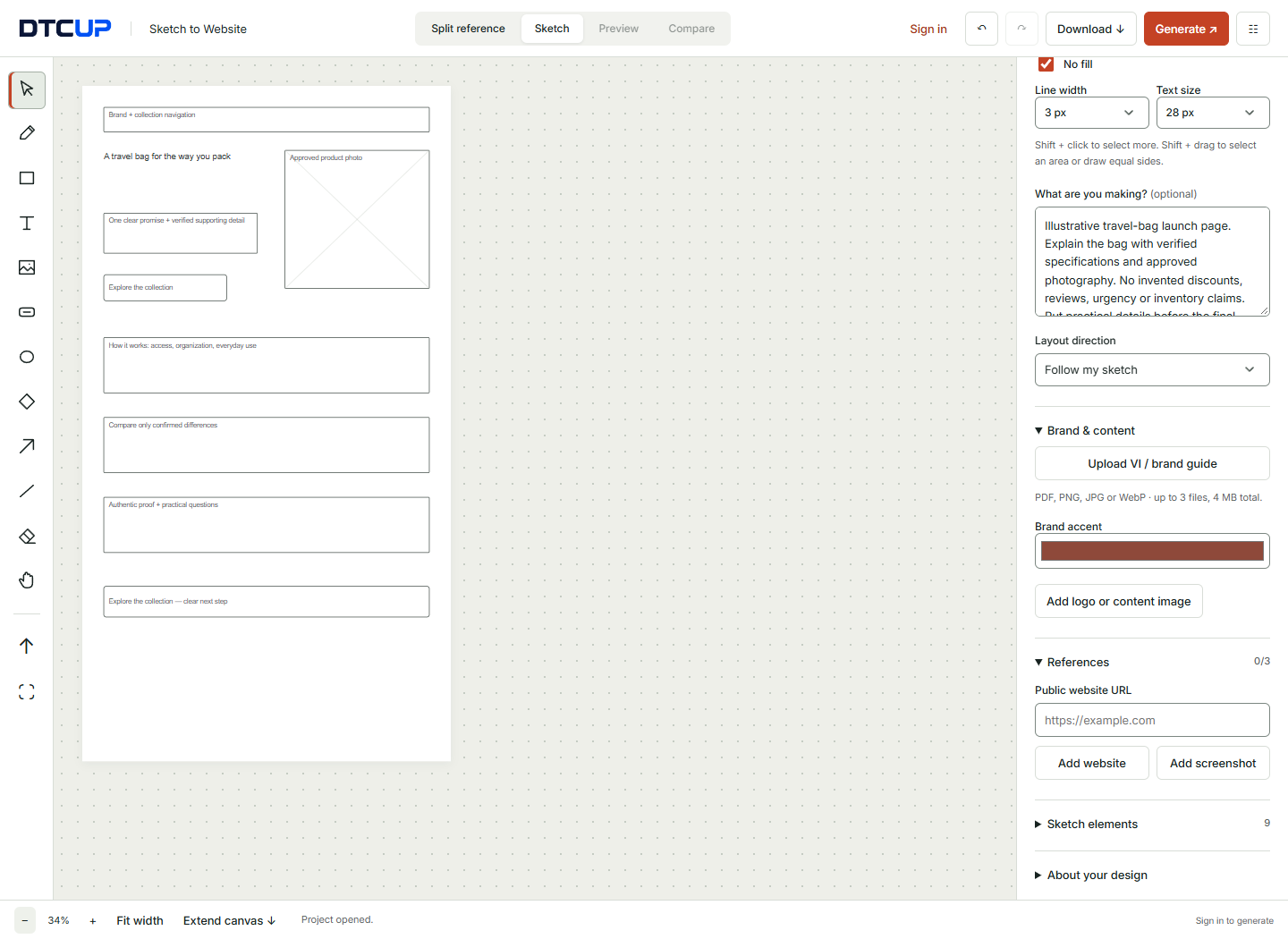
Evidence works best when it is relevant to the claim beside it. If you explain a material choice, use accurate product information. If you show a configuration in use, use an authentic visual. If you include customer feedback, use genuine, permitted feedback that relates to the decision. Do not ask the generation tool to manufacture testimonials because the layout seems to want three of them.
Different products have different kinds of evidence. A demonstration may be more useful than a quotation. A clear dimension diagram may be more persuasive than a broad statement about quality. The goal is to help the visitor evaluate the offer, not to decorate the page with symbols that resemble trust.
Keep claims proportionate. If the organizer helps arrange small items, explain that function. Do not escalate the copy into a promise that it will transform productivity or rescue every home office. Specific benefits are easier to understand and easier to substantiate. The page can be engaging without making the product responsible for the reader’s entire professional life.
Place practical qualifications where they matter. If a configuration requires an accessory or a dimension depends on the arrangement, explain it near the relevant choice. Hiding important context at the bottom may make the top look cleaner while making the decision less informed. Good design makes necessary information easier to use.
Review proof during content approval, not only during visual approval. The team responsible for product facts should confirm the relevant material. A designer can make a statement legible, but cannot establish its truth through spacing. Treat factual review as part of preparing the page, not as an optional check after the campaign is already live.
Add brand direction without copying the reference’s business
Upload relevant VI or brand-guide material when it helps establish the visual rules. Include the approved logo treatment, colors, typography and useful image guidance. A concise packet focused on this page is easier to interpret than a large document containing several unrelated campaigns and retired visual directions.
Select references for specific qualities. One might show the clarity of a comparison section. Another might illustrate a suitable image rhythm. Use the reference controls to identify the aspect and whether the reference should participate in generation. You do not need three references simply because three slots are available.
Use a screenshot when the visual appearance matters. The reference pane supports static material rather than assuming that every external site permits embedding. A reference image is useful for arrangement and style, but it does not reproduce the original site’s interactions. Open the original separately if you need to inspect how a control behaves.
Tell the tool what should take priority when inputs conflict. For example: “Follow the sketch’s campaign sequence. Use the brand guide for color and type. Use the reference only for the comparison layout, not its copy, imagery or offer.” This helps preserve your campaign’s purpose while learning from a relevant visual pattern.
Keep the campaign recognizable as part of the brand. A focused landing page can have its own emphasis without becoming a different company for the afternoon. Review the tone, logo use and image treatment alongside the rest of the site. Consistency helps the visitor connect the advertisement, the landing page and the eventual product or inquiry experience.
Write a generation brief that can be checked
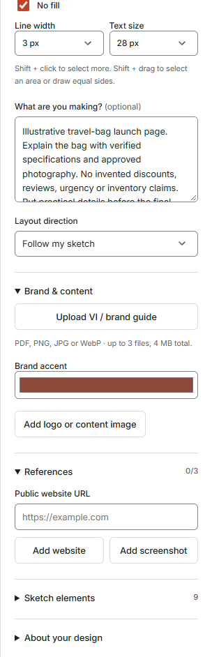
A good brief describes the audience, the promise, the desired action and the essential constraints. For the organizer example: “Create a clear launch landing page for people arranging a small desk. Lead with the real product in context, explain the modular idea, compare the confirmed configurations and link each choice to its product page. Follow the sketch and do not invent reviews or discounts.”
This is more useful than “make a high-converting page.” The latter names an ambition without explaining the visitor or offer. No generation tool can reliably derive the correct business facts from the phrase “high converting.” Give it a page it can understand and a result you can review.
Keep the prompt consistent with the drawing. If the sketch leads with the product but the prompt leads with the founder story, resolve that difference. If the campaign’s next action is to explore configurations, do not also ask for a newsletter-first layout. Conflicting instructions produce results that are difficult to evaluate because the brief itself has not chosen a direction.
Include realistic content lengths where possible. A comparison heading, a product name and a practical explanation need enough room. The final copy may change, but plausible text helps reveal whether the design can support the information. A page designed around three-word placeholders can become much less elegant when the real product names arrive.
Generate after signing in, then review the result as a draft. The tool creates a design preview. Forms and unlinked buttons do not automatically submit information or complete a purchase. Keep the required destinations, integrations and error states in the implementation notes so the apparent completeness of the preview does not obscure unfinished functional work.
Review the page from the visitor’s point of entry
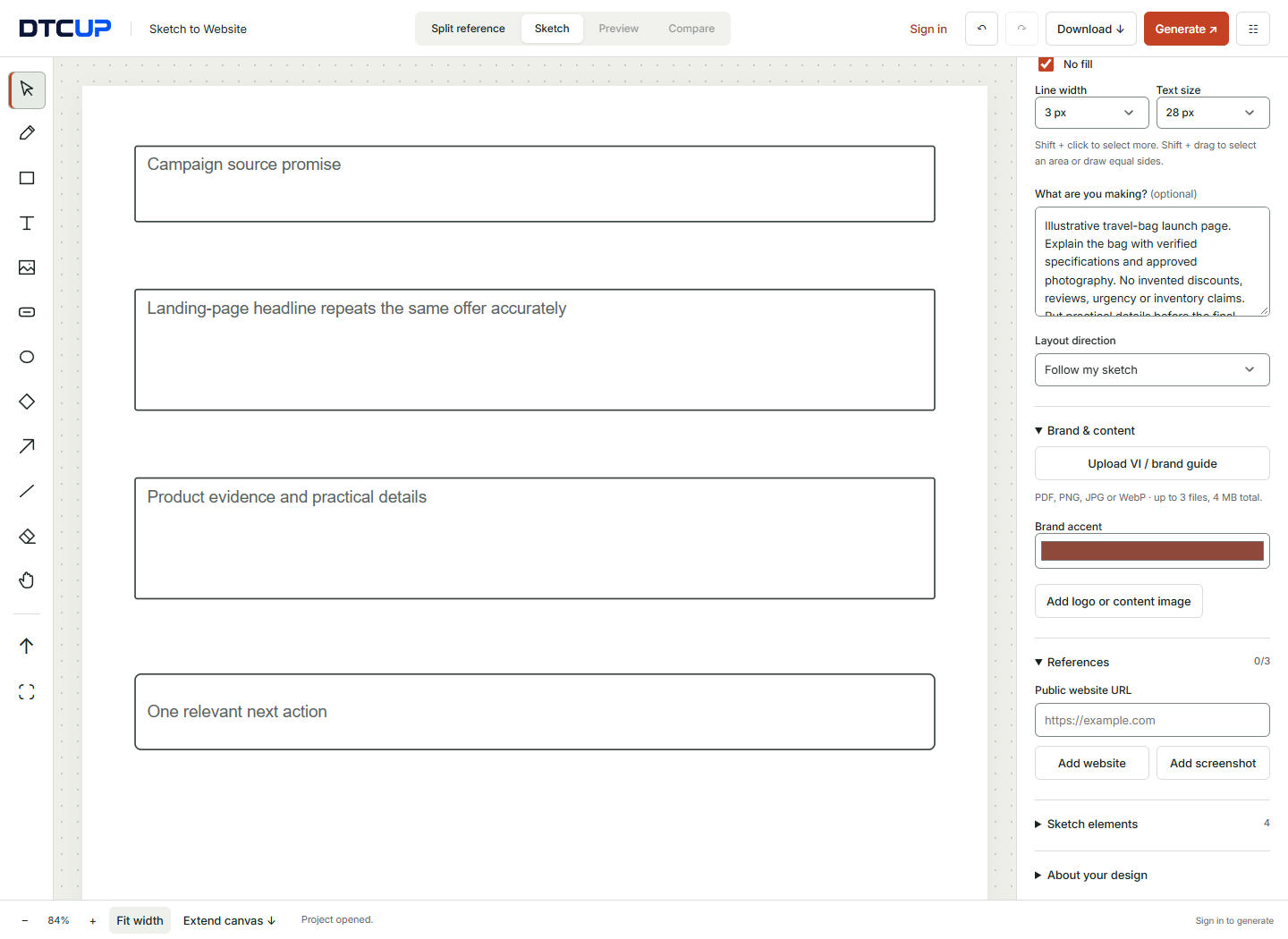
Place the advertisement or email beside the preview during review. Read the campaign promise, then look at the first screen. Is the connection immediate? Does the page use compatible language and imagery? A visitor should not need insider knowledge to recognize why the destination is relevant.
Follow the intended path through the page. Identify the point where the visitor has enough information to take the main action. If that point arrives before the action becomes visible, consider the placement. If the action appears before the offer is understandable, consider the supporting information. There is no universal section count that solves this question for every campaign.
Review secondary links in context. A care guide or detailed specification page may help a cautious buyer. A large unrelated promotion may pull attention away from the campaign’s purpose. The question is whether the link supports the decision, not whether every link away from the page is automatically bad.
Look for content that appears polished but says little. Phrases such as “designed for life” can be appropriate as part of a brand voice, but they should not replace practical explanation. The visitor still needs to know what the organizer is, how the configurations differ and where to find the relevant details.
Write feedback as a specific change. “Show the dimensions beside each configuration” is actionable. “Make it feel more complete” is vague. “Keep the product photograph larger than the decorative illustration” clarifies hierarchy. “Make it pop” mostly clarifies that the review meeting has reached its traditional vocabulary limit.
Give mobile visitors a complete path
Many campaign visits happen on smaller screens, but the exact device mix depends on the campaign and audience. Use the mobile preview to evaluate the experience rather than assuming a desktop design will take care of itself. The first message, comparison and action all need to remain understandable after the layout changes.
Inspect the first screen without scrolling. It does not need to contain everything, but it should orient the visitor. Check headline wrapping, image prominence and the next step. If a decorative element consumes most of the screen while the offer remains unclear, reconsider its size or position.
Follow the stacked order of each section. An image and its explanation should remain connected. Comparison labels should not disappear when the arrangement changes. Long blocks of text may need clearer structure, not simply smaller type. Readability deserves to remain employed on mobile.
Check interactive elements in the implementation, not just the preview. Buttons need appropriate destinations, forms need clear labels and errors, and the main path should work with keyboard access as well as touch. A screenshot can show placement but cannot prove the complete behavior of a purchase or inquiry journey.
Use the Website Page Checker on the public page to investigate SEO basics, laboratory performance and detectable accessibility barriers. Its findings can help prioritize fixes, but a clean automated result does not certify the whole experience. Pair it with direct testing of the campaign path and the actual content people need to read.
Prepare the details that live outside the design preview
Create a handoff list for every action. Identify where product links go, what a form submits, which system receives the information and what confirmation the visitor sees. If the page has an availability state, define what happens when the campaign or offer ends. The design should not be the only place where these requirements exist.
Confirm the page title and description against the final content. A campaign page should explain its own offer rather than reuse a generic description from another page. Keep the wording accurate and useful for the intended audience. The title is part of the visitor’s experience, even when it appears outside the visual layout you spent most of the day reviewing.
Use the Website Schema Generator if the page calls for supported structured data. Choose the type based on the actual content and review the output before adding it to the site. Do not use markup to imply an offer, rating or product fact that is absent or unsupported on the page.
Inspect crawler instructions with the AI Bot & Robots Checker. A campaign page may need a deliberate discovery strategy, and robots.txt is only one part of that conversation. Rules analysis does not guarantee indexing or provide security. Keep private previews protected through the appropriate mechanisms rather than relying on a polite request to crawlers.
Download the design project before leaving the workspace if it needs to be retained. The project is not automatically saved. Include the approved content, assets and implementation notes in the handoff process your team uses. A preview and a clear brief are more useful together than either one alone.
Schedule the campaign as a real moment
Use the Campaign Time Zone Planner to coordinate the launch. Decide whether the campaign begins once worldwide or at the same local clock time in different markets. A shared moment and a set of local launches are different schedules, even if both are casually described as “launching at nine.”
Choose the appropriate cities and review the local dates. A time conversion can place an event on a different day in another location. That matters for the page’s wording, team coverage and the related email or advertising schedule. Write the plan in a way that the operational team can act on without doing mental arithmetic while holding coffee.
Use the country calendar for relevant holiday and planning context. Verify the source and status of the date before committing a campaign. A marketing marker is not necessarily an official platform sale announcement, and a national date may not describe every region. The tool’s distinctions are there to help you ask the right follow-up question.
Include preparation time. The page needs content approval, asset checks, implementation, tracking and a final test before traffic arrives. A launch date without preparation dates is a deadline wearing a disguise. Work backward and assign the tasks that must happen before the page can do its job.
Test the page after the intended launch configuration is in place. If the campaign depends on an offer or a product becoming available, verify that state. A preview checked a week earlier may not represent the final destination. The last review should follow the real path a visitor will encounter at launch.
Name the traffic so the campaign remains understandable later
Build campaign URLs with the UTM, QR & Campaign Links tool. Decide on a consistent naming approach before different team members distribute links. Source, medium and campaign values should help explain where a visit began and which campaign it belongs to. Consistency makes later interpretation easier.
The plain-language fill workflow can help turn a campaign description into suggested parameters. Review the suggestions before applying them. A sentence may leave out a channel or use a term ambiguously. The shortcut is useful when it reduces repetitive entry, but the team still needs to confirm that the final values match its naming convention.
Keep creative distinctions meaningful. If you use a content parameter to distinguish two advertisements, choose names that someone can interpret later. A code known only to one person is fragile documentation. Conversely, putting a long novel into the parameter does not improve clarity. Aim for a short, stable label with a known meaning.
For printed distribution, test the static QR code with the intended destination. Check it at the actual size, on the actual material when possible and with the relevant devices. Confirm the page still opens correctly with its parameters. QR styling should support scanning rather than competing with it for attention.
Remember that parameters help label traffic; they do not create a complete measurement system by themselves. The landing page, analytics and connected sources need to interpret the visit appropriately. Treat the link as one part of the path from campaign message to business evidence, not as a small string that magically explains everything after the click.
Read the results with the right questions
Before launch, decide what you want to learn. Are visitors reaching the configuration choices? Are they continuing to the relevant products? Are inquiries suitable? The exact questions depend on the implemented measurement and available data. Avoid deciding that the campaign succeeded simply because the new page looks better than the old destination.
DTCUP Intelligence can help investigate connected orders, channel credit and customer journeys where the source coverage supports the question. Review the time range, attribution model and data context before comparing results. A number without its definition is often more confident than useful.
Keep attribution separate from causality. A channel receiving credit for an order does not prove that the landing-page design caused the purchase. Campaign targeting, offer details, product availability, seasonality and source coverage can all influence the interpretation. Use the data to investigate rather than to turn one favorable chart into a universal design rule.
Look at the actual destination for the traffic you are reviewing. Does the message match? Does the page work on the relevant device? Are the practical details clear? Data can point to a question, while page inspection helps you understand what a visitor encounters. The combination is more useful than discussing a dashboard and a design in separate meetings that never exchange notes.
Choose a proportionate next change. You might clarify a comparison, move a useful answer closer to the action or fix a broken step. You might also decide there is not enough evidence yet. An honest “we need more information” is better than a dramatic redesign based on three visits and a strong opinion about button corners.
Know when to use this workflow and when to use another one
Drawing first is useful when the campaign has a clear promise but the page structure is unresolved. It helps marketers communicate the path, designers evaluate the hierarchy and developers understand the intended behavior. The generated preview gives the team something concrete to review before the full implementation.
A suitable existing template may be faster when the campaign needs a familiar structure and the main work is replacing content accurately. A mature design system may be the right environment when the page must use approved components precisely. Sketch to Website does not need to replace those approaches. It is particularly helpful when the team still needs to see and discuss the arrangement.
The tool’s distinct workflow combines the drawing, written brief, brand-guide material and selected references. That combination helps when a text-only instruction leaves too much spatial interpretation open. It also gives reviewers a clearer way to say what should remain fixed and what can change.
The preview is not an automatic campaign deployment system. Product destinations, forms, analytics and operational conditions need implementation and verification. Treating those steps explicitly makes the design more useful. It prevents a visually complete page from concealing a functionally incomplete campaign.
Use the workflow to reduce uncertainty. If the uncertainty is the section order or message hierarchy, sketching can help. If the uncertainty is a payment error or a data integration problem, investigate that system directly. The right next tool is the one that answers the current question, not the one with the most exciting button.
Prepare the end of the campaign while you still remember the beginning
A campaign page needs an ending as well as a launch. Decide what visitors should see after the offer changes or the campaign finishes. A printed QR code or an old email can keep sending people to the destination long after the team has moved on. The page should remain understandable to those visitors rather than preserving an expired promise indefinitely.
Write the intended post-campaign state in the handoff. It might be a clear message that the launch period has ended, a link to the current collection or an updated explanation of availability. The correct choice depends on the actual offer and site structure. Do not improvise a misleading redirect or a replacement promise simply because the campaign date has passed.
Assign an owner for checking that state. Someone needs to confirm which copy changes, which product destinations remain appropriate and whether advertisements or scheduled messages still point to the page. This is ordinary operational work, but it is easy to omit when every planning conversation ends at the launch moment. The internet, inconveniently, continues operating afterward.
Keep a concise record of what the campaign was intended to test and what was actually implemented. Include the destination, the relevant traffic labels and any material changes made during the campaign. This context helps later interpretation. If the offer changed halfway through, a comparison of the entire period should not pretend that visitors saw one unchanged experience.
Use those observations to improve the next page brief. Perhaps people needed the dimensions earlier, or the configuration labels caused confusion. Perhaps the page worked as intended but the campaign reached the wrong audience. Carry forward the specific lesson that the evidence supports. The most useful reusable asset may be a clearer question list, not a screenshot that becomes the compulsory template for every future campaign.
A launch-page session you can finish with confidence
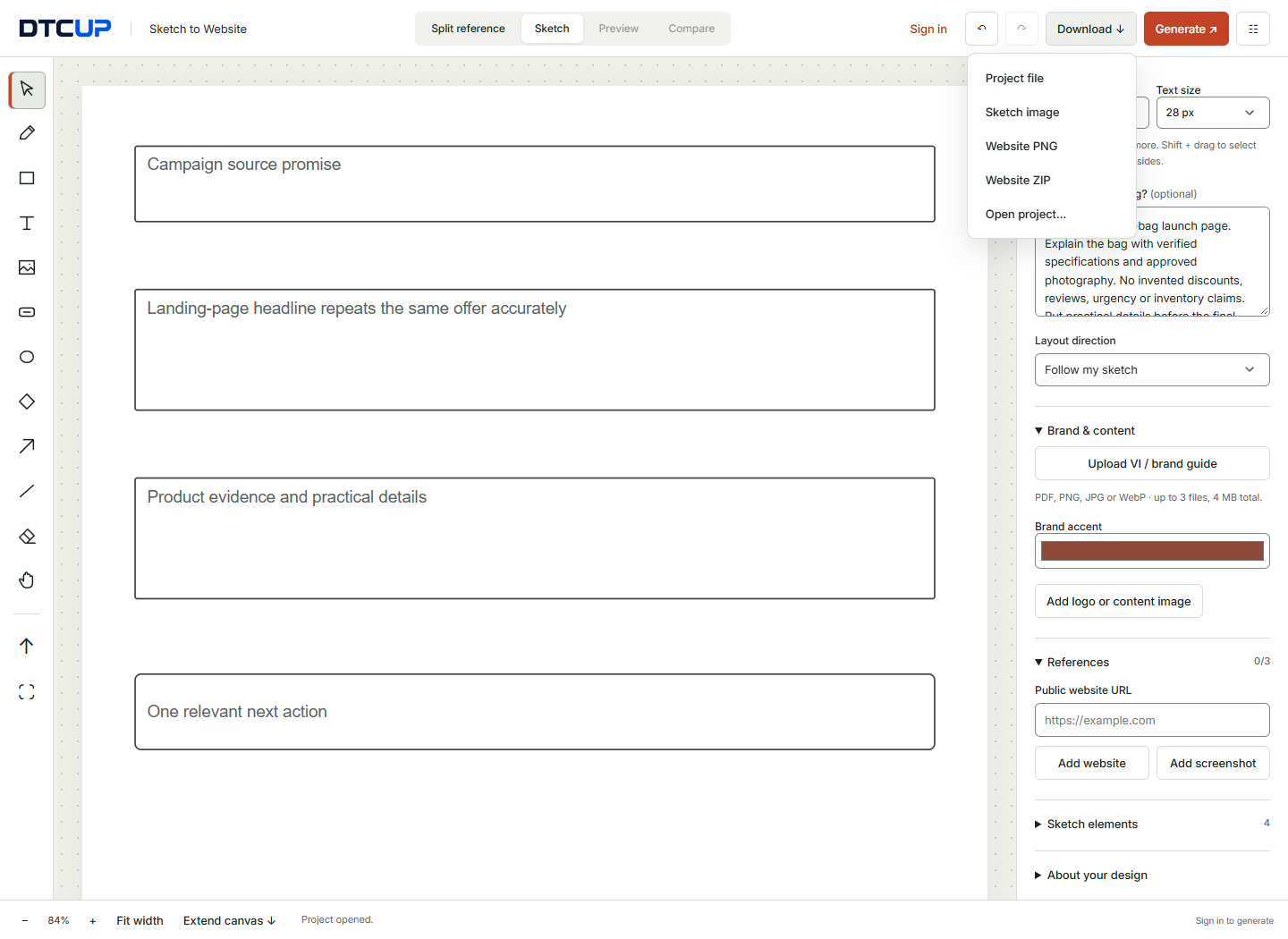
Write the campaign promise, the visitor and the intended action. List the essential questions and confirmed offer details. Draw the first screen so it clearly connects to the campaign, then arrange the supporting sections around the decision. Use real assets where possible and label every provisional fact or image.
Add brand direction and a small number of purposeful references. Generate after signing in, review the structure and content, then inspect the mobile path. Make specific refinements and download the project. Record every action that still needs a real destination or integration.
Prepare the launch with a verified schedule, consistent campaign links and a complete test of the public page. Review structured data and crawler instructions where relevant. Use page inspection and connected business evidence to decide what to improve after launch, while keeping the limits of that evidence clear.
The aim is not a landing page that shouts louder than the advertisement. It is a destination that completes the conversation the campaign started. When the promise, explanation and next step fit together, the visitor has less work to do. That is a better starting point than sending everyone to the homepage and hoping the navigation develops a talent for mind reading.
Sources
Try a related toolSketch to Website ↗
Still have a question?Ask the DTCUP Community ↗