
From a Messy Brief to a Clear Website: Draw Your First Useful Wireframe
Replace vague website briefs with labeled wireframes. Follow a tutoring-page example from customer questions and section order to mobile review and a clear developer handoff.

7 years of experience building and operating brand websites, specializing in website development, paid advertising and SEO. Built a brand website from launch to US$10 million in annual sales.
The Short Answer
A useful wireframe explains what each section needs to do. Begin with one visitor, one question and one next action, then label a simple arrangement that a colleague can understand. Sketch to Website helps carry that arrangement into a design draft; the drawing and the accompanying brief should resolve different parts of the same decision.
Key takeaways
- Use labels that describe content jobs.
- Give mobile visitors a complete reading path.
- Record agreed decisions alongside the downloadable project.
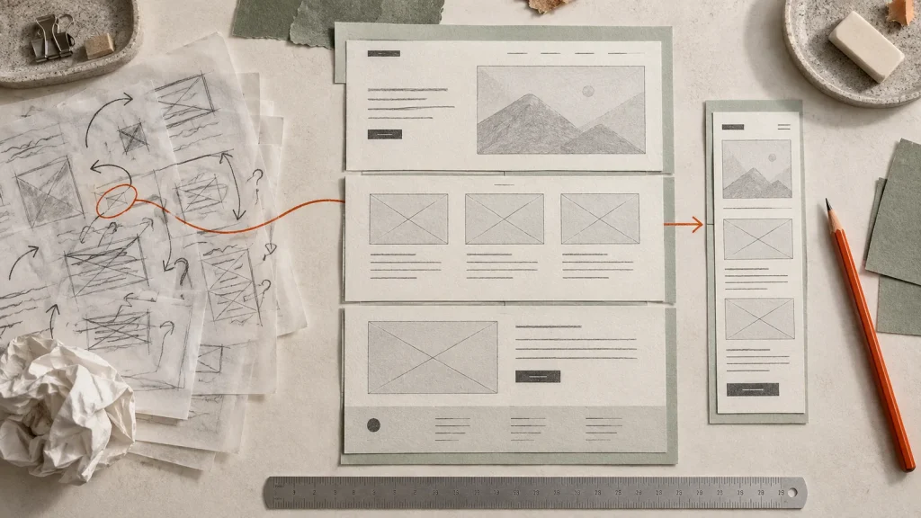
There is a particular kind of website brief that sounds completely reasonable until someone tries to design it. “We want it to be clean, but with personality. Simple, but informative. Different, but familiar. Could we also make the product pop?” Everyone nods. Nobody knows where the product goes. The meeting ends with a shared vocabulary and several incompatible mental pictures.
A wireframe gives those pictures a chance to meet. It is a rough arrangement of the page: which information leads, which elements belong together and what the visitor should do next. You can make one with boxes, labels and a few arrows. If your drawing skills peaked at a house with a triangular roof, you are already qualified to begin.
The point is not to become a designer in an afternoon. It is to become a clearer participant in the design process. A useful wireframe turns “I think it should feel different” into something people can inspect. You can point to an overloaded section, compare two orders of information and explain why the booking button belongs beside the available options rather than halfway down a separate page.
DTCUP Sketch to Website gives you a full-screen place to draw that structure and turn it into a generated design preview. This article focuses on the work before generation: choosing a page purpose, mapping the visitor’s questions, making a legible sketch and reviewing the result without accidentally approving a beautiful misunderstanding.
A wireframe is a decision map wearing rectangular trousers
It is tempting to treat a wireframe as an unfinished visual design. That interpretation makes people worry about whether the rectangles are straight and whether the text is attractively positioned. Those details matter later. At the beginning, the wireframe is more useful as a map of the decisions you want the page to support.
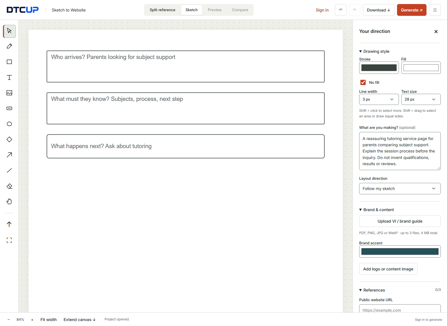
Consider a tutoring service. A parent arrives with several questions: Does this service cover the subject my child needs? Who provides the tutoring? How are sessions arranged? What happens next? The page needs to answer enough of those questions to make an inquiry feel reasonable. A wireframe can arrange the answers without first deciding whether the buttons should be navy, green or the color of freshly sharpened pencils.
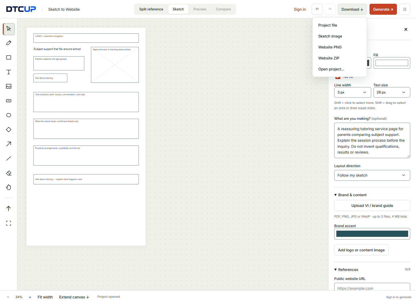
The large top block might explain the subjects and age groups. A second section could show how sessions work. A third could introduce the actual tutors, followed by the inquiry process. This is already a point of view about the visitor’s needs. If the team disagrees with the order, it can discuss the order directly. No one has to pretend the dispute is about the font.
That is why labels matter more than artistic polish. “Explain how sessions are arranged” tells the team what a section must accomplish. “Three cards” tells the team how many rectangles you drew. Both can be useful, but the first is harder to misinterpret. Start with the information job, then suggest a layout that serves it.
A wireframe also reveals omissions. If there is no place for price expectations, eligibility, location or another practical question, someone can notice before the page is built. It does not mean every question needs a large section. Sometimes a short sentence near the action is enough. The benefit is that the omission becomes a choice you can discuss instead of an accident you discover after launch.
Choose one page, not the whole internet
Your first exercise should have a boundary. Choose a homepage, a service page, a campaign landing page or a product introduction. Do not begin by trying to redesign every page and invent an account system at the same time. That is how a harmless drawing session becomes a small, underfunded software company.
Write down where the visitor comes from. Someone following a specific email offer arrives with different expectations from someone discovering the brand through a broad search. The page may need to repeat a promise from the email, explain an unfamiliar service or help a visitor choose between several options. The wireframe should respond to that context.
Then choose the main outcome. For the tutoring service, it might be a request for an introductory conversation. For a product page, it might be choosing the appropriate version. For an article, it might be understanding a process and following one relevant next step. These outcomes imply different page structures, even when all three pages use attractive photography and rounded buttons.
Keep secondary outcomes visible but subordinate. A visitor may want to read more before contacting you. That is reasonable. You can offer a link to the process or a relevant guide without giving it the same visual weight as the primary action. A page can support more than one path without pretending that all paths deserve the same signpost.
Write a boundary sentence as well: “This drawing covers the service page, not the booking software.” It helps prevent scope drift during review. If someone asks where the customer account dashboard belongs, you can acknowledge the question and put it in the appropriate workstream. The service page does not need to grow a dashboard merely because there is still white space on the canvas.
Build a question list before a section list
Most people start a page outline with familiar section names: hero, features, testimonials, pricing, FAQ. That can be a useful shorthand, but it can also smuggle assumptions into the design. A tutoring service may need to explain suitability before features. A technical product may need compatibility information before emotional storytelling. The section names should follow the visitor’s questions, not replace them.
Gather questions from real conversations when you have them. Sales calls, support messages and direct customer feedback can reveal what people actually struggle to understand. Keep the wording close to the customer’s language. “Can sessions work around school?” is more concrete than “scheduling flexibility proposition.” The latter sounds as though the calendar has hired a consultant.
Use the Query Fan-Out Explorer if you need help expanding a topic into related questions and possible content directions. Its output can prompt useful investigation, but it does not prove how frequently every question is searched or whether each suggestion belongs on this page. Review the ideas against the audience you selected and the material you can honestly provide.
Sort the questions into three groups: needed before the main action, useful for some visitors and better answered elsewhere. For tutoring, subject coverage and the session process may belong before the inquiry. A detailed study guide might be a supporting article. Internal administrative information probably belongs nowhere near the public decision path. You are building a page, not emptying a filing cabinet onto the browser.
Turn the first group into content jobs. “Show subject and age coverage.” “Explain the first conversation.” “Introduce real tutors.” “Clarify the next step.” Now you can draw sections with a reason for their existence. The wireframe becomes easier to simplify because removing a block means discussing which question would become unanswered, rather than defending a decorative preference.
Prepare content that is rough but believable
You do not need final copy before drawing, but you do need plausible copy. A two-word placeholder can make a section look effortlessly elegant. The actual heading may contain a service name, a location and an important qualifier. If you design around an unrealistically short phrase, the final content will eventually arrive and ask where it is supposed to sit.
Write a working headline that describes the offer. For the tutoring example: “Subject support that fits around school.” That may change later, but it is a more useful starting point than “Headline goes here.” Add a short explanation beneath it so you can estimate the amount of reading. Give the primary button a meaningful label, such as “Ask about tutoring,” rather than “Click here.”
List the real assets you can use. Do you have tutor photographs? A photograph of the learning environment? A logo with a suitable version for a light background? If an image does not exist yet, label the block by the image’s intended purpose. “Approved tutor photograph” is clear. “Happy customer photo” is risky if nobody has supplied a real customer image or permission to use it.
If a page will contain a product model, use the Online 3D Viewer to inspect the available file before assigning a major section to it. That inspection helps establish whether the model is useful for understanding shape, scale relationships or material appearance. It also prevents the wireframe from depending on an asset that is incomplete or unsuitable for the intended presentation.
Make uncertainty visible. Use labels such as “confirmed price needed” or “replace with approved image” in your working material. Those labels are for the project team, not final customer copy. Their purpose is to stop unknown details from becoming accidental facts. A polished preview can make provisional material look authoritative, so keep a clear list of what still requires confirmation.
Learn a small drawing vocabulary
You can communicate most early page structures with five visual ingredients. A rectangle represents a content region. Text names its purpose. An image placeholder identifies a visual asset. A button marks an action. A line or arrow explains separation or sequence. You do not need twenty-seven symbols before the page becomes understandable.
Use the full-screen canvas to give those ingredients enough room. Start with broad regions rather than detailed decoration. Draw the header, the first screen and the next few content sections. Place labels inside the boxes or close enough that their relationship is unambiguous. A label floating between two sections creates a small mystery that neither your colleague nor the generation tool needs.
Keep size meaningful. A large image block communicates emphasis. A narrow text band suggests a short supporting message. If everything is the same size, the drawing does not explain priority. You can exaggerate hierarchy slightly in an early sketch to make the intention obvious, then let the design refine the proportions later.
Use freehand marks for quick ideas and basic shapes when you want cleaner relationships. The select tool lets you move existing elements; drawing tools add new ones. Switching deliberately between those modes avoids accidental marks. Undo is there for exploration, so do not treat the first arrangement as a sacred artifact. Most useful wireframes improve because someone moves something.
Add only enough detail to answer the current question. If the team is deciding whether proof belongs before or after the offer, you do not need a fully drawn footer. If the team is deciding the first-screen hierarchy, a rough indication of lower sections may be enough. Low detail is a feature when it keeps attention on the decision you are trying to make.
Draw the first screen as a promise and a next step
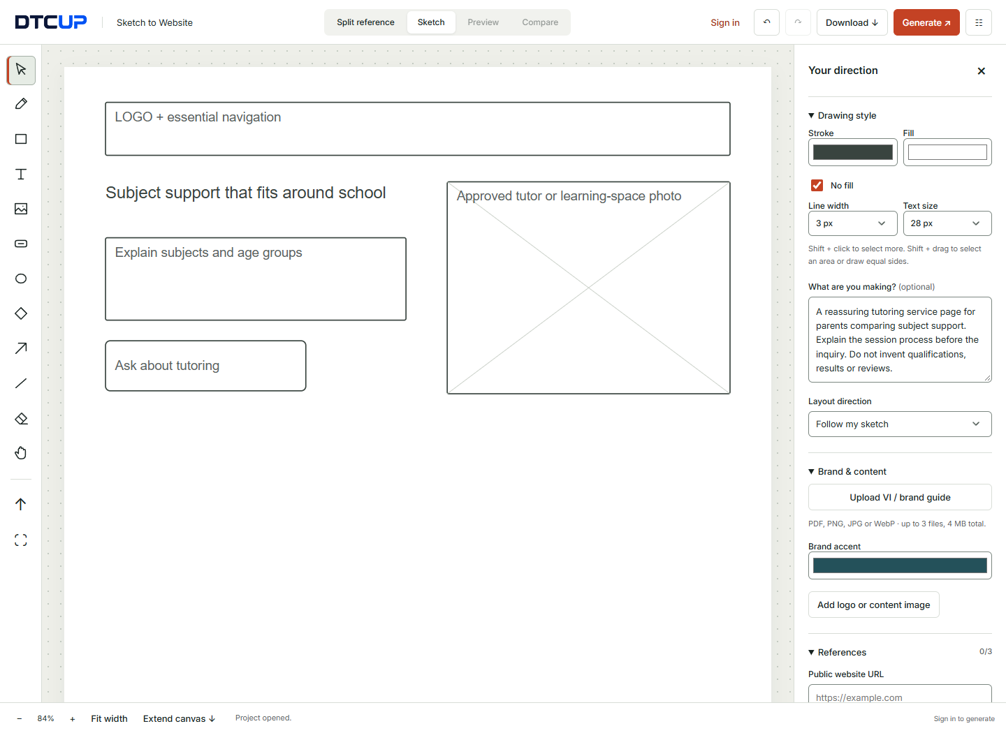
The first screen does not need to tell the entire story. It needs to orient the visitor and make the next useful step understandable. For the tutoring service, that means identifying the kind of support, showing who it is for and offering a clear path toward learning more or asking a question. Decorative complexity should earn its place after those jobs are covered.
Draw the headline and explanation together. They should read as one unit. If the sketch puts the explanation far away, the visual design may reinforce that separation. The visitor should not have to scan the whole screen to discover what the headline was talking about. A clever line can be charming; a clear line is more dependable when someone is in a hurry.
Place the main image where it supports understanding. An authentic photograph of the service environment might help visitors form expectations. A generic abstract image may contribute atmosphere but explain less. Neither is automatically wrong. Label the role so the choice is intentional: evidence, illustration, orientation or mood. “We had a picture” is not a design strategy.
Draw the primary action close to the information that makes it sensible. “Ask about tutoring” works better when the visitor already understands what kind of tutoring is offered. If there is a secondary action, show it as quieter. The wireframe can communicate this with a smaller outline button or a text link rather than two equally dominant blocks.
Review the first screen with a simple test: what would someone say this page offers after a brief look? Ask a colleague who was not in the planning meeting. If their description is wrong, do not begin by defending the headline. Investigate what the arrangement suggests. The wireframe is supposed to reveal misunderstandings while they are easy to change.
Arrange the middle around reassurance, not repetition
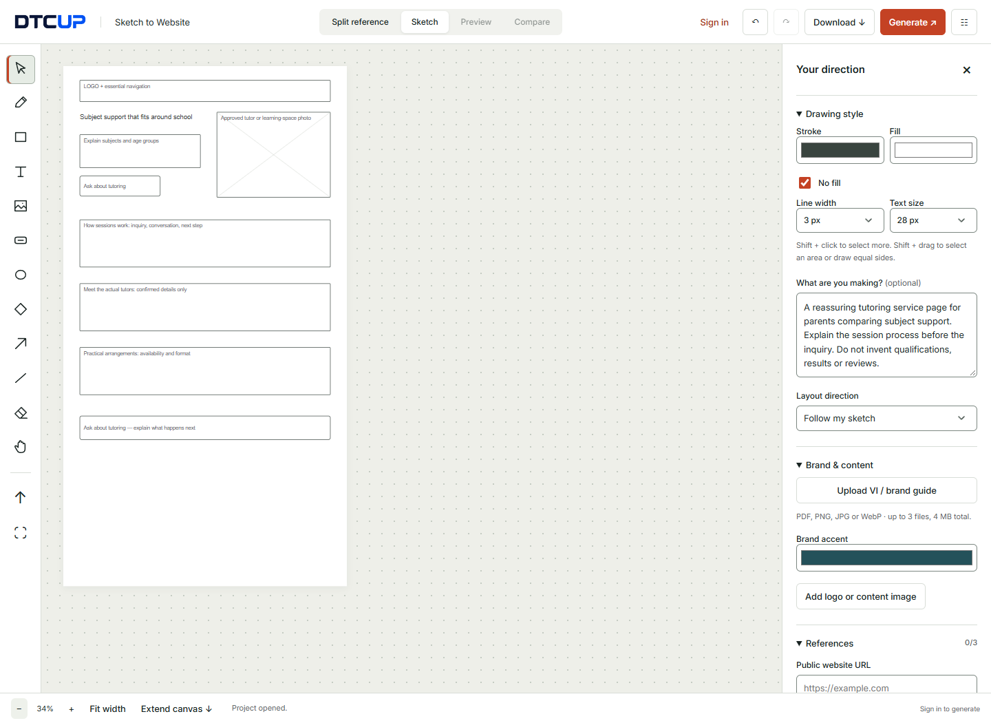
Once the visitor understands the offer, the middle of the page should answer the questions that stand between interest and action. For tutoring, this could include how sessions work, what subjects are covered and what the introductory conversation involves. These sections should build understanding rather than repeat the same promise in slightly different trousers.
Give each section a distinct responsibility. One might explain the process in three steps. Another could show the actual people delivering the service. A third might explain practical arrangements. If two sections do the same job, combine them or make the difference explicit. Long pages are not inherently bad; unexplained repetition is what makes them feel long.
Place evidence beside the claim it supports when possible. If you discuss a teaching approach, explain what that means in practice. If you use a testimonial, keep it genuine and relevant. Do not reserve all evidence for a generic “trust us” block if a more immediate placement would help the visitor understand a particular point.
Think about transitions. After explaining the process, a link to ask a question may be useful. After a dense comparison, a short summary can help the reader decide. These transitions are part of the wireframe. A page is not merely a stack of sections; it is the movement between them. A good transition makes that movement feel natural.
Keep the final action consistent with the beginning. If the page starts by inviting an introductory conversation, the ending should not suddenly demand a different commitment without explanation. The visitor should recognize the next step and understand what happens after it. Consistency makes the page easier to use even before colors and typography enter the room.
Make a mobile version of the idea, not a tiny desktop poster
A desktop wireframe can hide weak priorities because there is room to place several things side by side. A mobile layout asks a more direct question: what comes first? That makes it a useful thinking tool even before you inspect a generated design. Sketch the sequence you want a phone user to experience.
If a wide section contains text and an image, choose the order deliberately. Sometimes the image provides the context for the explanation; sometimes the explanation makes the image meaningful. The correct order depends on the content. Do not assume that whichever element happened to be on the left must always lead on a smaller screen.
Look at the first action. Can a visitor find it without moving through a long decorative introduction? Does the button label make sense by itself? If the page contains a form, are the required fields proportionate to the action? A simple inquiry rarely becomes more welcoming because you have added a field for every fact the company might someday find interesting.
Use realistic text lengths in the mobile sketch. Long headings and labels are easier to evaluate when you see how much vertical space they need. Shortening the copy may be more effective than reducing the text size. Readability is not an optional luxury that disappears when the viewport gets smaller.
After generation, inspect the available mobile and tablet previews as well as desktop. Those previews help evaluate layout, but the implemented site still needs real interaction testing. The Website Page Checker can later identify detectable issues on the public page. Pair its findings with keyboard checks, form testing and a human review of whether the content still makes sense in sequence.
Write the prompt as the explanation beside the drawing
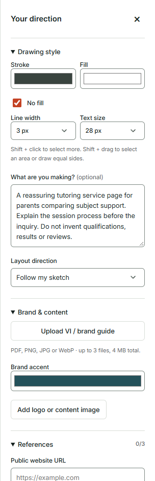
Your prompt should supply context that the wireframe cannot show cleanly. Name the visitor, the intended action and the desired tone. Identify the content that must remain accurate. If you want a restrained visual style, explain what restraint means for this page: fewer competing colors, readable type and no decorative elements that obscure the service information.
For the tutoring page, a useful prompt might say: “A reassuring service page for parents comparing subject support. Explain the session process before the inquiry form. Use the supplied tutor information and keep the tone clear and friendly. Do not invent qualifications, results or reviews.” This instruction is specific without pretending you know the exact pixels in advance.
Describe how closely the design should follow the sketch. If the section order is part of the decision, use the appropriate layout direction and reinforce it in the prompt. If you are exploring alternatives, allow more freedom. Be explicit about what is fixed and what is flexible. Otherwise, an attractive rearrangement may undo the very reasoning the wireframe was meant to preserve.
Avoid using the prompt to repeat every visible label. A short, complementary explanation is easier to review than a wall of instructions that describes the same rectangle six times. Save detail for the parts that are genuinely ambiguous: what a reference is for, which audience matters and what the page must not claim.
Before generating, read the prompt and look at the sketch together. Are they asking for the same thing? If the prompt says “lead with pricing” while the drawing places pricing near the bottom, resolve the conflict. A contradictory brief does not become consistent merely because it is delivered through two different input methods.
Use brand materials without turning the sketch into a brand workshop
Brand materials can guide the appearance while the sketch guides the structure. Upload a relevant VI or brand guide through the brand area when you have one. Focus on the portions that help with the current page: colors, typography, logo treatment and representative digital examples. The entire corporate archive is rarely necessary for deciding the visual treatment of a service page.
If you do not have a formal manual, provide the assets and direction you can verify. Use the approved logo, select a suitable accent and explain the intended tone. Do not invent a complex brand system just to fill the upload area. A small set of coherent decisions is more useful than a grand document that nobody intends to follow.
References should have specific roles. You might use one page for its calm typography and another for the clarity of its process section. Select only the references you want included during generation. A reference that you added out of curiosity does not need to influence the result. The individual inclusion controls let you make that distinction.
Use a screenshot when the visual appearance matters. A reference URL is not a guarantee that an external website can be embedded or that every visual detail will be available. The reference pane supports static visual material, including explicit capture or upload. This lets you work beside the appearance you actually want to discuss.
Keep the focus on the visitor’s task. If a reference looks spectacular but makes the tutoring information difficult to find, it may be a poor model for this page. Design inspiration is useful when you can explain what it contributes. Admiration alone is not a requirement, although it can be an excellent way to acquire twelve open tabs.
Review the first output with a question order
When the design appears, resist the urge to begin with personal taste. First ask whether it communicates the offer correctly. Then ask whether the section order supports the visitor’s decision. Next inspect content accuracy and the main action. Only after those checks should you spend much time on whether the visual treatment feels right.
This order prevents a common review trap: improving a detail inside a structure that should be changed. You can spend a surprising amount of time adjusting the color of a button that belongs somewhere else. Resolve the purpose and placement first. The design will offer plenty of opportunities for small refinements once the main decisions are sound.
Write feedback in terms of the problem and the desired change. “The inquiry feels too demanding; explain that the first conversation is exploratory before the form” is more useful than “make this friendlier.” “The subject list is hard to scan; group it into clearly labeled categories” is more useful than “the middle feels busy.” Specific feedback gives the next iteration a job.
Keep a distinction between a design problem and missing information. If the page does not explain session availability because the business has not supplied it, the solution is to provide the information. Rearranging the layout will not manufacture an accurate answer. A design review should surface these gaps rather than asking visual polish to disguise them.
Use comparison to evaluate whether a change helped. A new version is not automatically an improvement simply because it is new. Ask whether the revised layout answers the original question more clearly. If it introduces a different problem, keep the useful part and refine again. Iteration works best when the team remembers what it was trying to improve.
Keep review meetings short enough for everyone to remain a person
Before sharing the preview, state the decisions you want from the review. For an early wireframe, those might be the first-screen message, the section order and the main action. Tell reviewers which details are provisional. This prevents a meeting about information hierarchy from becoming an unexpected referendum on photography that has not yet been commissioned.
Ask each reviewer to connect feedback to a visitor or a business requirement. “I prefer blue” may be a real preference, but it is less actionable than “the primary action is difficult to distinguish from secondary links.” The second observation describes a usability issue that can be investigated. The first may simply reveal that the reviewer has a favorite color, which is lovely but not necessarily a page requirement.
Record disagreements rather than smoothing them over with vague compromise. If one team wants visitors to contact sales and another wants them to compare options independently, that is a strategic choice. A wireframe can show both approaches, but somebody must decide which path serves the intended audience. Making both buttons equally loud often postpones the decision by handing it to the visitor.
End the review with a small list of decisions and unresolved questions. Identify who supplies missing content and who approves the next version. The purpose of the visual artifact is to make coordination easier. It should not create a larger pile of opinions that nobody can translate into action.
Download the project before closing the page if you need to preserve the work. Sketch to Website does not automatically save the project. Give the file a name that identifies the page and the version being reviewed. “Tutoring-service-structure-v2” is easier to understand than “new-final-approved-maybe,” which is less a filename than a cry for help.
Turn a chosen wireframe into a clear implementation brief
An implementation brief should explain what the approved design is meant to do and which behaviors still need building. For the tutoring page, the form might need to send an inquiry to a particular system, show a useful confirmation and handle submission failures. A generated preview helps place those elements, but it does not make the operational workflow real.
List each interactive element and its intended behavior. A navigation item should go somewhere specific. A button may open a form, move to a section or follow a link. A form requires validation, submission handling and a confirmation state. If the interaction has not been decided, label it as an open requirement rather than assuming the developer will infer the business process from the shape of the button.
For a small frontend behavior, the HTML, CSS & JavaScript Editor can help test a focused idea before it becomes part of the live page. Use it to explore a component or layout behavior with sample content. A prototype can answer a narrow question without requiring the entire site to be changed first.
Keep content ownership in the brief. Who confirms tutor qualifications? Who supplies session details? Who checks location and contact information? Those are not decorative concerns. They determine whether the page can communicate accurately. The design should make the information readable, while the business remains responsible for the facts.
Include mobile expectations and the intended reading order. If a wide comparison becomes a stack, explain how the options should be labeled. If the primary action repeats later in the page, explain why. A brief that records these decisions reduces the chance that the implemented version accidentally loses the reasoning that made the wireframe useful.
Add the launch checks that a wireframe cannot perform
Once the page is implemented, inspect the actual public output. Check that headings, links, images and form labels are present as intended. Test the main action from beginning to end. A wireframe can show a good path, but only a working-page test can confirm that the path is connected. The visitor does not get to experience the beautiful intentions in your project folder.
Use the Website Schema Generator when structured data is appropriate for the real page content. Choose a supported type that matches what you are publishing and review the output. Do not use markup to add claims that the page does not support. Structured data should clarify the information, not become a secret second website with more impressive facts.
Review crawling instructions with the AI Bot & Robots Checker. This helps inspect rules and test paths, but it is not a substitute for authentication, security controls or a complete indexing investigation. The practical benefit is visibility into a part of the website that is easy to forget while everyone is discussing the hero image.
Run a relevant public-page inspection with the Page Checker and decide which findings matter for the launch. A missing label in the inquiry path deserves attention. So does content that is difficult to read or a loading problem that blocks the first useful action. Scores can help organize investigation, but the actual visitor task should remain central to prioritization.
Complete a human review as well. Read the page aloud, follow its links and try it on a phone. Ask someone unfamiliar with the project to explain the offer and find the next step. Their confusion may reveal something that the entire project team has learned to overlook. Familiarity is useful for building a page and remarkably good at hiding its problems.
Connect the page to a campaign without losing the original purpose
If the page supports a scheduled promotion, use the Campaign Time Zone Planner to align launch times and local calendar context. A tutoring campaign may involve a regional school-season message, but do not assume the calendar contains every school holiday or local schedule. Confirm the specific dates relevant to the campaign before treating them as facts.
Decide whether all audiences see the campaign at the same moment or at the same local time. The distinction affects scheduling and coordination. It also affects what a page should say if availability changes during the launch. A clear schedule helps keep the page content, advertisements and operational team working from the same plan.
Create distribution links with the UTM, QR & Campaign Links tool. Use consistent source, medium and campaign naming so the traffic story remains understandable. If printed material points to the page, test the static QR code at the actual size and destination before printing a large quantity. Paper is not famous for its rapid deployment cycle.
Do not overload the page with every campaign message. If different audiences need materially different explanations, consider whether they need distinct landing experiences or clearer on-page choices. The original wireframe should remain a reference for the visitor and outcome the page was designed around. A page that gradually accepts every request can become less useful while becoming much longer.
Use DTCUP Intelligence where connected sources and available history support the question you want to investigate. Look at the traffic context and the relevant business outcomes, but keep attribution and causal conclusions separate. A channel receiving credit does not prove that a layout change caused the result. Use the evidence to identify the next question, not to award the wireframe an imaginary medal.
Common mistakes that make a simple sketch harder to use
The first mistake is drawing decoration before hierarchy. If the main action is unclear, adding a pattern behind the heading is unlikely to help. Resolve what the visitor should understand and do first. Decorative decisions become easier when they serve an agreed structure rather than trying to create one.
The second mistake is using unlabeled boxes. A rectangle can mean a photograph, a form, a video, a comparison or a brief moment of geometric enthusiasm. Add enough text to explain the intended content. The label does not need to be polished, but it needs to remove ambiguity.
The third mistake is asking the generated design to invent missing business facts. If you do not know the offer, price, eligibility or process, collect that information. You can explore a layout with placeholders, but keep them visible as placeholders in the project. The final page should not inherit invented details because nobody remembered which sentences came from where.
The fourth mistake is reviewing only the top of the desktop page. The middle, ending and mobile sequence all contribute to the experience. A strong first screen can create expectations that the rest of the page fails to satisfy. Review the complete path, including what happens after the action is selected.
The fifth mistake is treating a preview as a launch. Generated forms and unlinked buttons do not automatically connect to live workflows. Make a list of the operational requirements, test them after implementation and keep the project file if you need to revisit the design. The drawing is valuable precisely because it makes decisions visible; it should not make unfinished work invisible.
Your first wireframe, in one practical session
Choose a single page and write three short statements: who arrives, what they need to understand and what action should follow. Gather the real content you already have and identify what is missing. Use customer questions to decide the sections. Resist the temptation to add a block simply because every template you remember seems to contain one.
Draw the first screen with a clear message, a purposeful visual and an obvious action. Add the next sections in the order that supports the visitor’s decision. Label every block by its job. Sketch the mobile sequence or at least write the intended stacking order. You should be able to explain the drawing without translating a private system of mysterious arrows.
Add a concise prompt, relevant brand materials and selected references. Generate after signing in, then review structure, content and actions before visual taste. Choose a few specific improvements and refine with those questions in mind. Download the project and record the decisions that are ready for implementation.
Finally, remember what success looks like at this stage. You do not need a perfect website by the end of the session. You need a clearer agreement about the page. If the team can explain its purpose, follow the visitor’s questions and identify what still needs building, the wireframe has done its job. Straight rectangles are optional. Shared understanding is the part worth keeping.
Sources
Try a related toolSketch to Website ↗
Still have a question?Ask the DTCUP Community ↗