
Make AI Website Designs Feel Like Your Brand: VI Guides, References and Better Direction
Give website design drafts a recognizable identity. Combine a VI guide, a labeled sketch and purposeful references, then review color, typography and mobile consistency.

7 years of experience building and operating brand websites, specializing in website development, paid advertising and SEO. Built a brand website from launch to US$10 million in annual sales.
The Short Answer
Use a VI guide to define brand rules, a sketch to define the page structure and references to explain selected visual qualities. Sketch to Website lets you combine these inputs and choose which references participate in generation. The strongest review checks whether the resulting page is recognizable, readable and factually accurate rather than simply similar to an inspiration site.
Key takeaways
- Prepare a small, relevant brand packet.
- Choose references for typography, color or another explicit contribution.
- Verify real content and review mobile brand consistency.
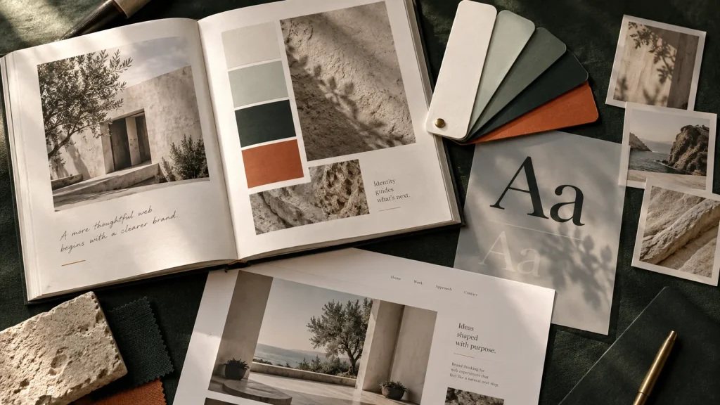
You upload a logo, choose your brand color and ask for a website. The result arrives looking perfectly respectable and suspiciously unrelated to your business. The button is the right orange. Everything else appears to have been selected by a committee of polite strangers who have never met your customers.
This is a familiar problem with visual generation. A brand is more than a logo and a hex code. It includes what the business emphasizes, how it speaks, how it uses images, how dense or spacious its pages feel and what it avoids. If the input only explains one small piece of that system, the output has a great deal of guessing to do.
DTCUP Sketch to Website lets you combine a drawing with written direction, uploaded VI or brand-guide material, content assets and selected website references. Those inputs can work together: the sketch explains the arrangement, the brand guide explains visual rules, the references illustrate specific qualities and the prompt resolves the gaps between them.
This guide is about making that combination useful. It is for founders, marketers and designers who want an AI-assisted preview to feel connected to an actual brand rather than merely decorated with its color. We will use an illustrative homeware brand throughout. The example is a teaching scenario, not a customer case study or a claim about measured results.
Begin with what should stay recognizable
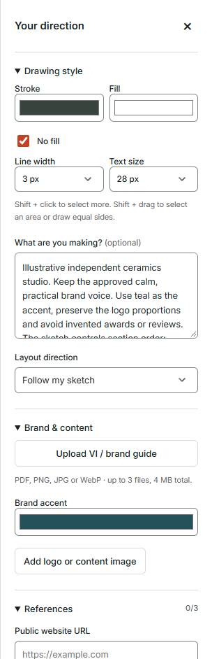
Before collecting references, identify the brand features that should survive from one page to another. These might include a restrained color palette, a particular relationship between large headings and quiet body text, natural product photography and concise descriptions. The list should be short enough to guide a decision. A hundred loosely ranked preferences tend to produce a hundred opportunities for disagreement.
For our homeware example, the brand might value calm, practical presentation. Products are shown in real domestic settings, copy explains material and care clearly, and the accent color appears mainly on actions. That gives the design a direction without requiring every page to have exactly the same layout. Consistency is a family resemblance, not a rule that every room must contain the same chair.
Separate non-negotiable rules from flexible choices. Logo proportions and approved versions may be fixed. The exact arrangement of a feature section may be flexible. A font license may restrict how a typeface can be used. A campaign may allow a different accent treatment while keeping the main visual language. These distinctions help prevent the generation process from treating every preference as equally optional.
Write the rules in observable terms. “Premium” is difficult to verify on its own. “Use real product photography, avoid crowded badges and keep headings concise” is more useful. “Friendly” becomes clearer when you explain that the copy should sound direct and welcoming, with ordinary words instead of formal sales language. Turn the adjective into something a reviewer can see or read.
Finally, identify the business purpose of the page. A brand system should support the visitor’s task, not compete with it. A product comparison page may need more structure and factual detail than a campaign introduction. Both can feel like the same brand while making different design choices. The question is whether the treatment is coherent and useful in context.
A VI manual is a source of rules, not a magical brand personality upload
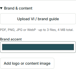
A visual identity manual can contain color values, logo guidance, typography, photography direction and examples of how the brand appears in different places. Uploading relevant pages makes those instructions available during generation. It does not guarantee perfect interpretation of every rule, and it does not remove the need to review the result.
The current brand-guide control accepts PDF and supported image formats, with the file-count and combined-size limits shown in the interface. Use that space thoughtfully. If your manual is large, prepare the pages that matter to this design. The model does not need the packaging production appendix to understand how the website should use headings, unless that appendix somehow contains an unusually important heading.
Prefer a concise, readable selection over a compressed document that is technically small but visually illegible. Text should remain clear in the uploaded material. Color swatches should have labels. Logo examples should show the intended background and spacing. A brand guide is only helpful if its important instructions can actually be understood.
If the manual contains several alternative directions, explain which one is current. Historical proposals, retired logos and example campaigns can be valuable records, but they can also confuse a new design task. Label the approved rules and omit obsolete material when practical. Otherwise the input can accidentally ask the tool to reconcile a brand with its own previous identities.
Think of the manual as one member of the brief. The drawing still explains the page structure, and your prompt still explains the audience and objective. A beautiful identity system does not tell the tool whether this page should encourage a product comparison, a store visit or a contact request. The brand guide explains how the business presents itself; the page brief explains what this particular presentation needs to do.
Build a small, useful brand packet
Start with the logo rules that affect the page. Include the approved version, its background requirements and any clear-space guidance that must be preserved. Avoid uploading several unexplained alternatives and expecting the tool to identify the official one by instinct. Name the files clearly and describe the intended usage.
Add the color rules. Identify the main text color, background colors and accent. Explain whether the accent is reserved for actions or can appear in larger areas. Color proportions often matter as much as the values themselves. A brand that uses a small amount of orange on a calm neutral background does not become more accurate when every section turns orange out of enthusiasm.
Include typography guidance that distinguishes display text from functional text. A distinctive headline typeface may work well for a short campaign statement while being unsuitable for long paragraphs or tiny form labels. Explain the roles, not just the font names. If the exact typeface cannot be used in the eventual implementation, that needs to be resolved during development rather than ignored because the preview looks close enough.
Choose a few image examples that illustrate the intended treatment. For the homeware brand, that could mean natural light, honest product proportions and uncluttered environments. Explain whether the examples show an image style or actual assets to use. A reference photograph is not automatically licensed content for the final website.
Finish with a short voice sample. Two or three representative sentences can clarify tone better than a long list of adjectives. A product description that says “A sturdy everyday bowl with a matte finish” communicates a different voice from “Elevate your dining ritual with an exquisite vessel.” Both might fit different brands. The useful part is choosing deliberately rather than allowing every paragraph to adopt a different personality.
Let the sketch control the page’s argument
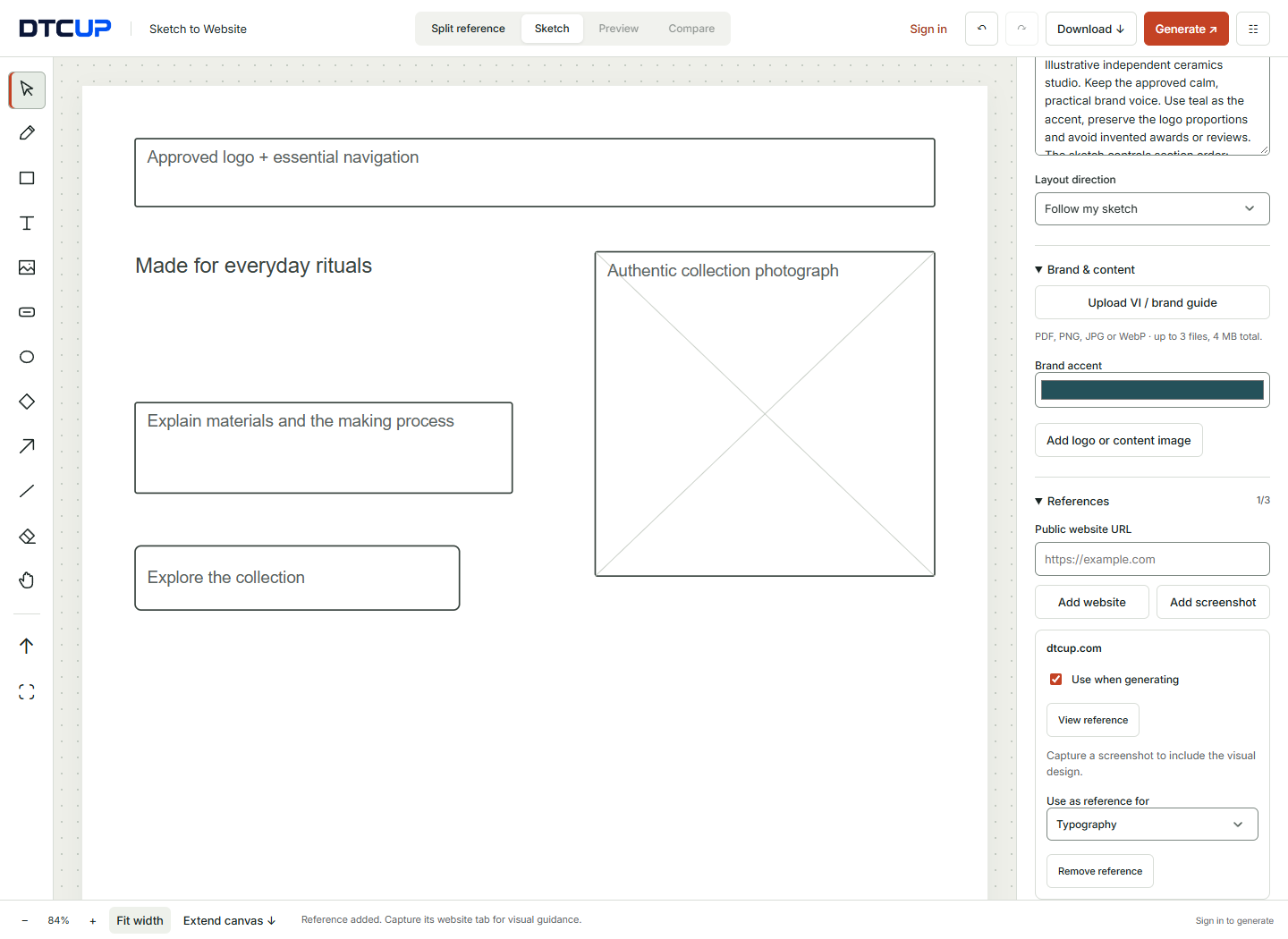
The visual identity should not have to carry the entire brief. Draw the section order and the relationships that matter. For a homeware collection page, you might lead with the collection, explain material and care, show a few practical use cases and finish with a clear shopping action. The drawing tells the generation process what story the page should unfold.
Use labels that connect the layout to real content. “Collection photograph, preserve product proportions” gives the image region a specific job. “Care information in a short scannable block” identifies both content and presentation. “Primary action: explore the collection” explains the intended next step. Those labels help the brand treatment support the structure instead of replacing it with a familiar generic page.
If you already know the questions buyers need answered, build them into the sketch. If you do not, use the Query Fan-Out Explorer to explore related concerns and content opportunities. Evaluate those suggestions against real product knowledge. A research tool can help you notice missing questions; it cannot decide which unverified product claim would be convenient to make.
Keep the layout direction consistent with your intent. If the structure is approved, ask the tool to follow the sketch. If you are exploring, allow more freedom while stating which elements must remain prominent. A useful brief identifies what may change and what should not. “Surprise me, but preserve every detail” is less a direction than an argument waiting for a preview.
Review the sketch without its visual styling. Would the page still make sense in plain boxes and text? If the answer is no, more brand material may not solve the problem. Good visual treatment strengthens a clear structure. It is less reliable as camouflage for a page that has not decided what it is trying to communicate.
Choose references by contribution, not by admiration
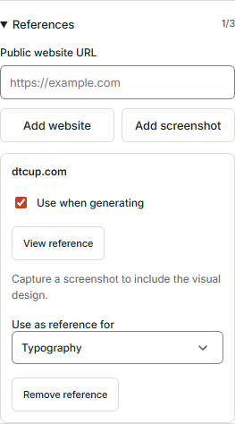
It is easy to collect websites you like. It is harder, and more useful, to explain what you like about each one. A reference might demonstrate readable typography, a strong product-image hierarchy, a calm use of color or a clear comparison pattern. Choose the quality you want to learn from before adding the reference to the project.
Sketch to Website allows up to three references, each with an inclusion choice for generation. You do not need to fill every slot. One well-chosen reference can be more informative than three sites with incompatible visual systems. A reference set should provide direction, not recreate the group chat where everyone sends a different favorite website and then goes offline.
Assign a role to each reference. For example, one could guide typography, another could guide the treatment of photography and a third could illustrate a particular section layout. Use the available aspect choices to make those roles explicit. Reinforce the distinction in the prompt when necessary: “Use the first reference for type and spacing; the drawing controls the section order.”
Consider whether the reference solves a similar visitor problem. A dramatic fashion campaign may be visually impressive but a poor model for a detailed compatibility page. A quiet editorial layout may work for a brand story while under-serving a product comparison. Similar visual taste does not automatically mean similar communication needs.
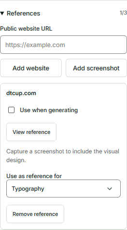
Remove references that are no longer useful. The individual selection controls let you keep a reference in the workspace without including it in generation. That helps when you are comparing directions or have decided a particular influence is distracting. More input is not always better input. Sometimes the most productive design decision is to stop inviting another website to the meeting.
Understand what a website URL can and cannot show
A public URL identifies a page, but it does not guarantee that the page can appear inside another site’s frame. Many websites restrict embedding. Some require scripts, permissions or account access that are not appropriate for a reference pane. A failed embedded view is not proof that the page does not exist; it often means the original site controls how it may be displayed elsewhere.
The reference workflow therefore supports static visual material through screenshots and explicit browser-tab capture. You can keep an image beside the canvas while sketching. The snapshot is a visual reference, not an interactive copy of the website. Open the original separately if you need to inspect navigation, animation or a complete interaction.
Capture the part of the page that illustrates your point. If you are referencing the hero arrangement, a clear first-screen image may be enough. If you care about the rhythm of several sections, capture a suitable longer view or choose the most relevant region. A tiny image of an entire long page may contain everything while explaining almost nothing.
For a mobile reference, capture the mobile layout you actually want to discuss. A desktop page shrunk into a narrow pane does not reveal its responsive behavior. The reference image should show the arrangement, text wrapping and controls at the intended size. Label it so the distinction remains clear during generation and review.
Use public material appropriately and keep private information out of screenshots. A reference should not include customer records, account details or unrelated browser content. The goal is to show a design principle. A carefully chosen public section is usually enough, and it keeps the conversation focused on the visual decision rather than on everything else that happened to be open on the screen.
Separate inspiration from content ownership
You can learn from another website’s hierarchy without using its copy. You can admire the clarity of its comparison table without borrowing its product claims. You can notice that a restrained palette helps photography stand out without taking its logo and declaring the result a new brand direction. These distinctions are practical as well as ethical: copied content is often inaccurate for your business.
Describe the principle in your own words. “I like that the page explains material and care before the purchase action” is a useful instruction. “Make ours exactly like this” leaves too many questions unanswered. Which content is relevant? Which imagery is yours? Which interactions can your site actually support? A principle transfers more cleanly than an entire identity.
Use actual product assets where possible. For a homeware page, that means the real product photographs, accurate dimensions and confirmed material information. If the design calls for a 3D presentation, inspect the file in the Online 3D Viewer first. The model should represent the product faithfully rather than becoming an attractive but misleading visual shortcut.
Keep placeholder assets visibly provisional in the project. A reference image may help explain a layout during exploration, but the handoff should identify that it needs replacement. The closer a preview looks to a final website, the easier it is for temporary material to be mistaken for approved content. A short asset list prevents a surprising amount of confusion.
Do not let the pursuit of an “on-brand” appearance override product truth. A color treatment that makes a material look different, a crop that hides an important feature or invented praise can undermine the page even if the composition looks consistent. Brand presentation should make the real offer easier to understand, not improve it by quietly changing what is being offered.
Write a prompt that resolves the relationships between inputs
The strongest prompt often explains how to use the other material. For the homeware example: “Create a calm collection introduction for first-time visitors. Follow the sketch’s order. Use the brand guide for color and typography. Use the selected reference for image spacing, not its copy or logo. Keep the product information factual and make the collection action easy to find.”
Notice that the prompt assigns responsibilities. The sketch controls sequence, the manual controls brand rules and the reference contributes a particular visual quality. This is easier to interpret than a prompt that says “make it like our brand but also like these websites.” The latter can produce a compromise nobody intended because the input never established which source should lead when they conflict.
Explain any known conflict directly. If the reference uses a dark background but your brand guide calls for light product pages, state that the reference is only about layout. If the reference has elaborate animation but you want a calm static presentation, say so. The tool should not have to infer which parts of the source you consider irrelevant.
Use a short list of important constraints rather than a long list of prohibitions. “Preserve image proportions, use approved colors and avoid invented reviews” is focused. A page of disconnected negatives can make the brief harder to understand. Each constraint should protect something that matters to the visitor, the brand or the implementation.
Read the complete input as a reviewer would. Does the drawing agree with the prompt? Does the uploaded guide contain the current rules? Are the selected references still the ones you intend to use? A few minutes spent resolving those questions can make the next generation more useful than repeatedly asking for a different result without changing the contradictory brief.
Use the first generation to test interpretation
The first result is a chance to see how the inputs were understood. Review it as an interpretation of the brief, not as a verdict on the brand. Ask where the design follows the intended hierarchy and where it appears to have inferred something else. That information can help you improve the next instruction.
Start with the page purpose. Does the collection introduction make the products and next step clear? Does the design preserve the content order that the sketch established? If the structure is wrong, address it before fine-tuning visual details. The correct shade of a misplaced button is a small achievement in the wrong neighborhood.
Then inspect brand consistency. Are the colors used in the intended proportions? Does the logo have space around it? Is the difference between headline and body text appropriate? Are the images treated consistently? Look for the system behind the details rather than checking only whether individual elements match a swatch.
Review the writing as part of the brand. A calm visual design with exaggerated sales copy can still feel inconsistent. Replace vague claims with accurate descriptions. Check whether headings help readers understand the product or merely sound impressive. The brand voice should support comprehension, especially where the visitor is comparing options or deciding whether the offer fits.
Make the next request specific. “Use the accent only for the main actions and reduce decorative blocks” is clearer than “make it more premium.” “Keep the product information near the images and shorten the introduction” is clearer than “make it more commercial.” Specific instructions help you learn from each iteration rather than treating generation as a slot machine with typography.
Review color as a working system
Look at the distribution of color across the whole page. A brand’s accent may be most effective when it creates a clear action hierarchy. If every label, background and border competes for attention, the accent stops signaling anything. The design may be colorful while being less informative.
Check text against its actual background. A color pair that looks attractive in a large swatch can be difficult to read in a small label. Body copy, form text and secondary information all need attention. Do not assume that an approved palette guarantees that every possible combination within it is appropriate for every use.
Consider how color communicates state. A selected option, an error and a primary action should not be distinguishable only through a subtle hue change. Labels, icons and other cues can help explain what is happening. The preview can reveal some design concerns, but the implemented controls require interaction testing as well.
Review photography alongside the palette. A page with warm product images may feel different from the same layout using cool, high-contrast imagery. This is not a reason to distort product colors. It is a reason to choose authentic assets that fit the intended context and arrange them thoughtfully.
After implementation, the Website Page Checker can help identify detectable accessibility and presentation issues on a public page. Treat those findings as evidence to investigate. An automated scan does not replace a complete review of reading, keyboard use or the visitor’s full journey. The useful combination is a coherent visual system and practical checks of how that system behaves.
Review typography as a reading experience
Typography is not only the choice of a typeface. It is the relationship between the headline, explanation, section headings, product details and controls. A page can use the right font family and still feel unlike the brand because every size, weight and spacing decision creates a different rhythm.
Look at the longest realistic headings. Do they wrap clearly, or do they create awkward fragments? Can the reader distinguish section headings from body copy without excessive decoration? Is the main message visible without forcing the rest of the content into tiny text? These questions are easier to answer with real copy than with perfectly cooperative placeholders.
Inspect paragraphs at a comfortable reading width. Long lines can be tiring, while excessively narrow columns can make even a short explanation feel fragmented. The appropriate treatment depends on the content and the device. A product specification and a brand story may need different structures even when they share a type system.
Check functional text separately. Navigation, button labels, form labels and helper text need clarity before personality. A distinctive display treatment may be appropriate for a short campaign statement and inappropriate for a field that someone must read accurately. Let different text roles do different jobs without making them look unrelated.
If you want to test a specific frontend arrangement, use the HTML, CSS & JavaScript Editor with realistic text. It can help explore a component at different widths before that component enters the live site. Keep the experiment focused on the question you are testing, and carry the approved behavior into the implementation brief.
Keep the mobile page recognizably yours
Brand consistency should survive a smaller screen without preserving every desktop arrangement. A wide image-and-text section may need to stack. Navigation may need a different interaction. A large heading may need a more compact size. The goal is a coherent experience, not a desktop layout squeezed until it apologizes.
Use the mobile preview to inspect the order of information. Does the product still lead when it should? Does the explanation stay near the image it describes? Is the main action easy to find? The brand’s visual qualities should support this sequence. If decorative content pushes the practical information too far away, reconsider its role.
Check whether the same color hierarchy works on the phone. A large colored panel may occupy a much greater share of the smaller screen. A quiet secondary link may become difficult to notice after stacking. Mobile review can reveal that a desktop choice needs a different proportion rather than a completely different identity.
Look at the assets. Product images should preserve important details and proportions. Logos should remain legible without taking over the header. A carefully chosen crop may help, but do not remove information that a buyer needs to understand the product. A brand-consistent image that misrepresents the object is not a successful compromise.
Test the actual implementation on a real device when it exists. Preview widths are useful for design review, but they do not reproduce every browser, input method or network condition. The final page needs to work as a page, not merely resemble one in a controlled frame. Keep the brand review connected to that practical requirement.
Make a review checklist that is short enough to use
A useful checklist covers a few categories clearly: structure, facts, brand rules, readability, actions and mobile behavior. Under each category, write questions that someone can answer from the actual page. “Does the logo preserve its proportions?” is useful. “Does it have good brand energy?” may start a lively conversation but is less reliable as a release check.
For structure, confirm the intended section order and visitor path. For facts, verify product descriptions, prices where present and any claims. For brand rules, inspect colors, typography and asset treatment. For readability, review headings, paragraphs and contrast. For actions, identify which controls are visual placeholders and which have been implemented. For mobile, check sequence and practical use.
Record a few examples when something fails. A screenshot of the problem and a sentence describing the intended change can be more effective than a long message about the page’s overall feeling. Specific examples reduce the chance that different reviewers are discussing different issues under the same adjective.
Distinguish approval from observation. Someone saying “I like this direction” is not necessarily confirming every product fact or every operational behavior. Keep responsibilities clear. The brand owner may approve visual treatment while the product team confirms specifications and the implementation team verifies interactions.
Download the project and retain the agreed reference material in an appropriate place before leaving the workspace. Sketch to Website does not automatically save your project. A clear filename and a short note about what was approved make the next review easier. Otherwise the team may spend the next meeting comparing two files that both claim to be the final one.
Carry the brand into search and campaign details
The visual page is one part of the experience. Its title and description should explain the actual content in a way that fits the brand and helps the intended reader. Avoid turning every page into the same sentence with a different product name. A collection introduction, a technical guide and a campaign landing page serve different questions.
Use the Website Schema Generator where structured data can describe the real page appropriately. The markup should reflect visible, accurate information. Do not add invented ratings or business details to make the output look more complete. Consistency includes the facts machines read as well as the words and images people see.
Inspect crawling rules with the AI Bot & Robots Checker when preparing the public page. This is a separate task from visual branding, but it belongs in the launch conversation. A thoughtfully designed page still needs deliberate decisions about how supported crawlers are instructed to access it. Robots rules are not a substitute for protecting private content.
Prepare campaign links with the UTM, QR & Campaign Links tool. Consistent parameter names help connect distribution to later analysis. If you place a QR code on branded packaging or an event card, test the final code with the real destination and printed dimensions. The visual identity can frame the code, but it should not make the code difficult to scan.
Coordinate campaign timing with the Campaign Time Zone Planner. A polished page should arrive when the campaign and the operational team are ready. Use the calendar’s context thoughtfully and verify relevant dates. Brand consistency is easier to appreciate when the advertised offer, landing page and actual availability agree with one another.
Learn from the page without confusing taste with evidence
After launch, the team may want to know whether the new page is helping. Define the question before looking at results. Are visitors reaching the relevant action? Are they finding the product information they need? Are inquiries clearer? A brand review and a performance review can inform each other, but they are not the same exercise.
DTCUP Intelligence can help investigate connected source data, channel credit and customer journeys where the available coverage supports those questions. Use it to understand context and identify issues worth examining. A change in attributed results is not automatically proof that the visual treatment caused the change. Campaign mix, timing, source coverage and other changes may also matter.
Pair quantitative observations with direct inspection. If a particular audience appears to struggle, look at the actual landing experience they receive. Does the message match the advertisement? Does the mobile page explain the offer clearly? Are the practical details visible? This keeps the investigation connected to something the team can improve.
Keep useful brand rules while revisiting choices that make the page harder to use. A brand system should be coherent enough to recognize and flexible enough to serve different contexts. If a decorative treatment repeatedly obscures important information, improving it does not betray the brand. It may make the brand more useful to the people it is trying to reach.
Document the next decision. Perhaps the page needs clearer product information, a better image or a simpler action. Perhaps it needs no immediate change because the evidence is insufficient. An honest conclusion is more useful than inventing a success story to justify the design work. Good brand presentation earns trust partly by being accurate about what it knows.
When this workflow is the right fit
This approach is especially useful when a team has real brand material but struggles to translate it into a page direction. The combination of sketch, manual, assets and selected references helps make that translation explicit. It gives the generation process more relevant context and gives reviewers a clearer basis for feedback.
It is also useful when a founder and designer use the same words differently. A reference assigned to typography and a sketch assigned to structure can clarify the conversation. Instead of debating whether the page feels “elevated,” the team can discuss spacing, hierarchy and the role of the imagery. Specificity is a surprisingly effective antidote to creative frustration.
A fixed template may be a better starting point when the structure is already suitable and the main task is reliable implementation. A professional design system may be the better environment for precise component work across a large product. Sketch to Website is valuable as a visual briefing and exploration workflow; it does not need to replace every other design method to be useful.
The most important advantage is the ability to combine different kinds of direction in one place. You can show the layout, explain the audience, provide brand rules and identify what matters in a reference. That is more informative than relying on a single adjective or a logo upload. It makes the conversation about the brand more concrete.
The result still needs judgment. Review it, refine it and prepare a clear implementation handoff. The tool can help turn the inputs into a design preview, but the business remains responsible for the truth of the content and the final customer experience. That responsibility is not a flaw in the workflow; it is the part that makes the website yours.
A practical brand-led session you can repeat
Choose one page and one visitor task. Write the non-negotiable brand rules and separate them from flexible preferences. Prepare a concise selection from the current brand guide, approved assets and a small set of references with explicit roles. You should be able to explain why each item is included.
Draw the page structure and label the content jobs. Add a prompt that assigns responsibilities to the inputs: sketch for order, guide for visual rules, reference for a specific quality. Resolve contradictions before generating. More attempts are less useful when each attempt receives the same unresolved argument.
Review the output in a deliberate order: purpose, structure, facts, visual system, reading and mobile behavior. Make a few specific refinements rather than asking for a vague improvement. Download the project and record the decisions that are ready for implementation, including the functional work that the preview does not perform.
Before the handoff, include one concrete example of an approved choice and one example of a rejected choice. For the homeware page, that might be a restrained accent on the collection action versus an entire orange background behind product details. Explain the reason: the approved treatment makes the next step visible while leaving the products and descriptions easy to inspect. This tiny comparison helps the implementation team preserve the reasoning, not just copy the surface appearance. It also gives future reviewers a practical reference when another page introduces a similar decision.
Then carry the same care into the real page. Use accurate content, test the interactions, inspect the public output and learn from evidence after launch. A website feels like a brand when its choices work together. The right logo color helps. A clear, truthful and coherent experience is what makes that color worth recognizing.
Sources
Try a related toolSketch to Website ↗
Still have a question?Ask the DTCUP Community ↗